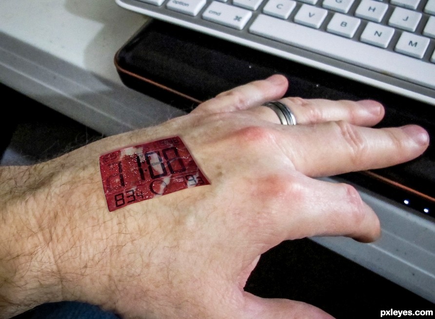
(5 years and 2514 days ago)
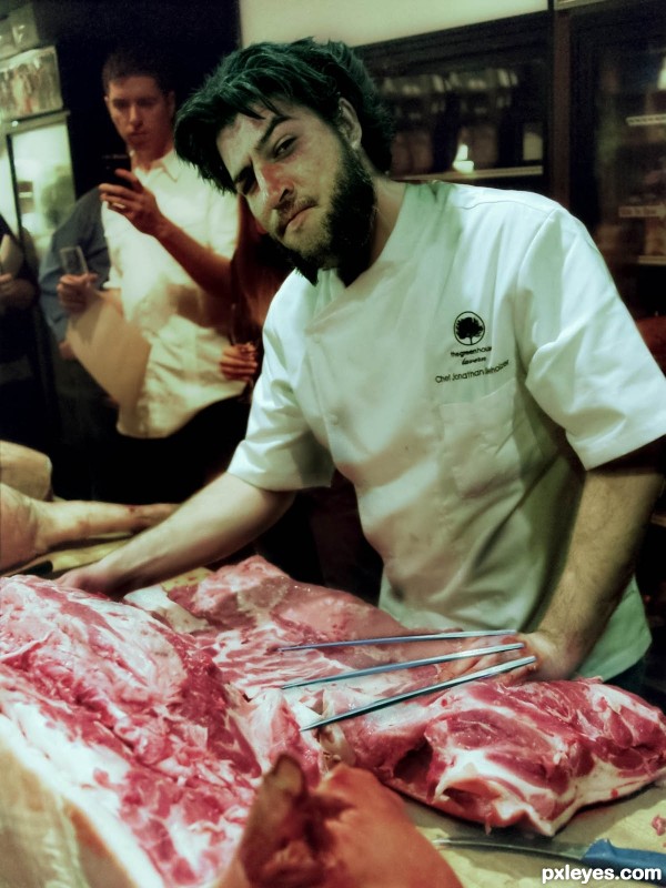
Wolverine found a new job (5 years and 2835 days ago)
Wolvie's claws are curved, but not bad. 
Awesome =)
Thanks for comment. Yes i know in the final edition all that was fixed.
Howdie stranger!
If you want to rate this picture or participate in this contest, just:
LOGIN HERE or REGISTER FOR FREE
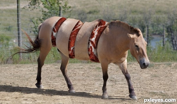
(5 years and 2885 days ago)
Hahaha! I like this one!  Good luck
Howdie stranger!
If you want to rate this picture or participate in this contest, just:
LOGIN HERE or REGISTER FOR FREE
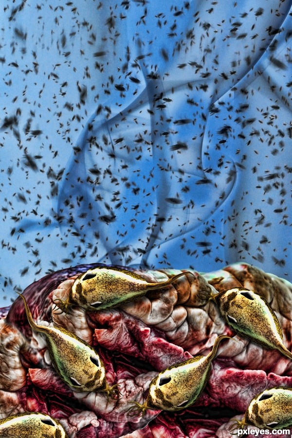
(5 years and 2941 days ago)
totally distinctive style! that radical entry, I felt sorry for seal 
I just love this a looooot!..has to be in my fav list.
Before I scrolled down to see the meat I thought flies, and lots of them, good job!
Wow, I can almost smell it from here where I am... :P
Congratulations on the third place, my dearest friend 
Congrats!
Congrats!!
Howdie stranger!
If you want to rate this picture or participate in this contest, just:
LOGIN HERE or REGISTER FOR FREE
(5 years and 3112 days ago)
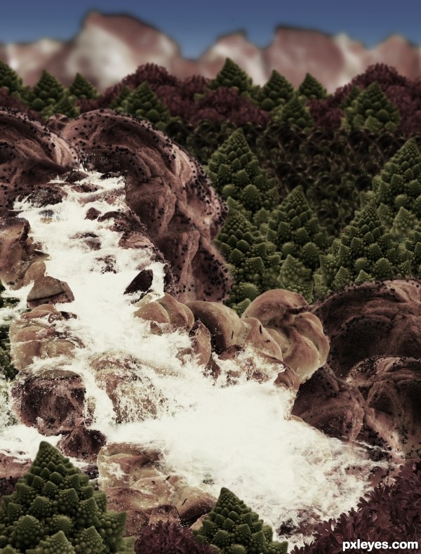
It's so dark and monochromatic, you can neither make out the differences between all the sources you used, nor appreciate the wide variety of different items creating the foodscape.
Carl Warner lets the food be the landscape, not hide it behind overly dark values. Perhaps lighten it up and allow some of the real color to show.
do u think that step 9 will be ok?
step Nine is much nicer then the dark version for being able to see the actual food.. IMHO
EDIT: Much Improved!!!
Thanks a lot Drivenslush!, I'll change it
I would drop the pizza, and I would go back to step 9, desaturate and colorize a little bit. If you blur the farther away parts and the farthest even more, it'll give it some depth. Also, in an actual landscape, the farther hills and mountains are from the camera, the gradually lighter and duller they look. Check out this picture you'll see what i mean
http://www.redbubble.com/people/natureshues/art/2059066-blue-mountains-sunset
I think you have the pieces and everything for a great entry, just needs a little tweaking  hope this was helpful, best of luck!
Changed it, hope it's better now!
WOW! What a difference that made! MUCH much better, I'm glad I waited to vote. High score from me, you've done a wonderful job!
YAY! Absolutely great! What an awesome improvement! You take suggestion extremely well 
Thanks for your comments 
Howdie stranger!
If you want to rate this picture or participate in this contest, just:
LOGIN HERE or REGISTER FOR FREE
Cool...looks very real in a creepy sort of way...
Agree, I thought a transparent sub-dermal atomic watch would be a cool idea.
Howdie stranger!
If you want to rate this picture or participate in this contest, just:
LOGIN HERE or REGISTER FOR FREE