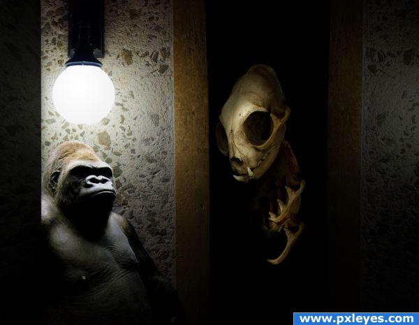
http://pokoachondria.deviantart.com/art/cat-skull-angle-13173212
by pokoachondria on deviant art
http://nickdesignz.deviantart.com/art/Bobby-the-Gorilla-2-115184027
by nickdesignz on deviant art (5 years and 3824 days ago)

Thanks to:
- faestock (http://faestock.deviantart.com)
- mjranum-stock (http://mjranum-stock.deviantart.com)
- aisac (http://aisac.deviantart.com)
- emmytonks (http://emmytonks.deviantart.com)
- Mattox
- dimitri_c
- Falln-Brushes (http://falln-brushes.deviantart.com)
- LoRdaNdRe (http://lordandre.deviantart.com)
- lilnymph (http://lilnymph.deviantart.com) (5 years and 3855 days ago)
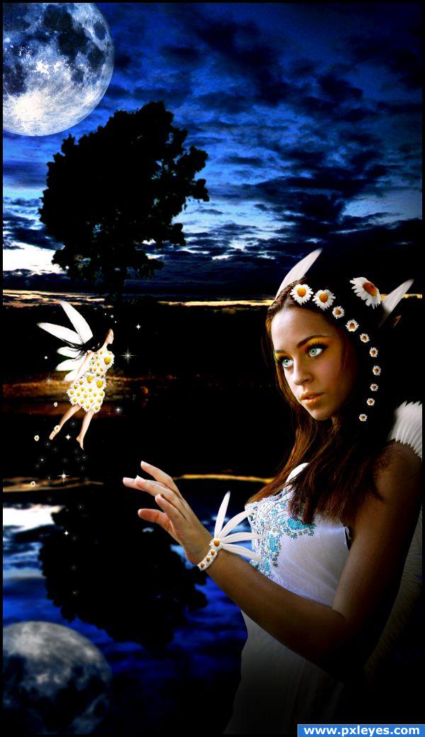
Very nice! Just a bit more shadows on the fairy's dress, and you're good to go! 
Added more shadows to the dress, thanks.
All the blacks in the foreground, middle ground & foreground make this image confusing...
Interesting idea. But I agree with CMYK about the darkness. I feel you need to have the horizon almost visible for the distinction between the reflection, but thats your call. I would work more on your edges - like the fingers. They seem rushed compared to the rest of the image. Also your girl is in focus, the background blurred and the moon is also in focus? GL.
That's the ywwllo line, as you can see it's the really begining of the sky. Added more shadows and lights to her hand.
The background looks very strange, but i like the overall image, good luck!
Well i wanted to place a lake or river and a plain... i tried many lakes and rivers but none looked good, so i decided to create a mirror reflect of the plain and sky
Howdie stranger!
If you want to rate this picture or participate in this contest, just:
LOGIN HERE or REGISTER FOR FREE

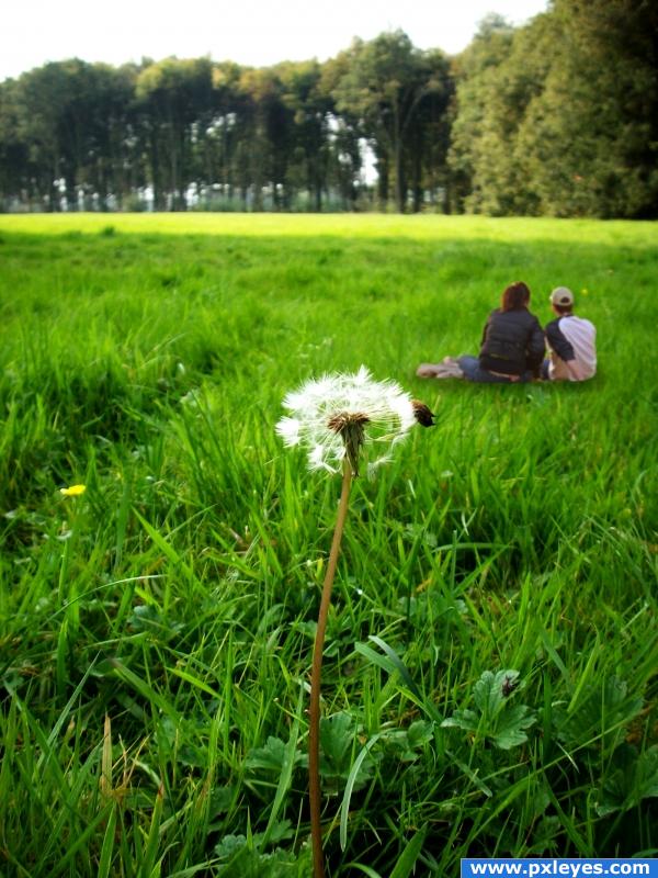
It's very easy work. First I improved contrast and then I added couple from source photo and their shadow.
This work is on http://creativecommons.org/licenses/by-sa/2.0/ license. (5 years and 3862 days ago)
very sweet take on source... you got two more.. be a little more adventurist.. but great start.. good luck
The people are too small, but it's a nice idea, good luck!!
the people are rather small, and when you mask them in, try and put them within the grass a bit and not on top of it, this should help with the distant feel and may just fix the sizing issue..
Nice relaxing feel
its a good idea but those ppl are not sitting IN the grass but ON the grass.. you should redraw some grass over them like in my puss in boots tutorial, also have a look at the shadow tip i give in that tut.
they'r floating?
GL ! 

the people look way too small for some reason.
Howdie stranger!
If you want to rate this picture or participate in this contest, just:
LOGIN HERE or REGISTER FOR FREE

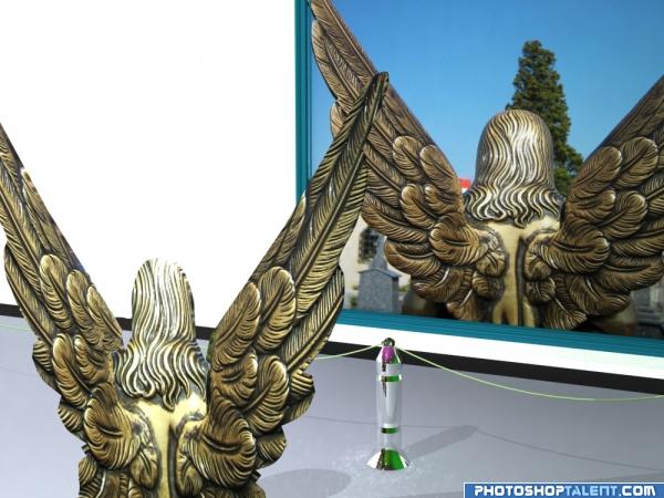
On Pxleyes Forum I have notice that some members asked how to vote on a 3 D entry, what exact is the 3D work. That`s why, on this entry and on few next entries, I shall try to make very detailed SBS about different work problems with 3ds Max. Any question or suggestion is welcome, I shall try to reply from my poor experience with Autodesk 3ds Max. (5 years and 3928 days ago)
I'm a bit confused.. shouldn't the angel be 3d.. I mean I went through your SBS and it was very detailed, but the angel viewing the picture is flat and distorted.. or was that the idea.. also, the head is missing the top pieces.. I appreciate the amount of work in this, I'm just confused as to how I'm suppose to see 3D.. or it could be me.. my eyes aren't the greatest.. good luck on this..  (can you blur the edges in 3d.. that could be the reason)
EDIT: Thank you Author.. always good to learn something new 
GolemAura, agree, final result is not at all spectacular, could be made in 10 min Photoshop.The principal purpose of this entry was to clarify some basics about 3d work,SBS is maybe more important than the entry.About giving volume by modelling with polygons or spline cage is another complex chapter in 3d max and could not be covered in a single SBS. Sorry if that disturb the quality of this contest. And yes, can blur on 3d ,see steps 17 & 18
neat
SBS is all Greek (Or geek?) to me...but I don't think much of the final image, however it was created.
for this design, 3DS Max is required?
just looks like you put image in a frame... along the lines of an OOB image almost. But nothing really looks different to me compared to the original picture... might just be me sorry.
Howdie stranger!
If you want to rate this picture or participate in this contest, just:
LOGIN HERE or REGISTER FOR FREE
oh nice
interesting.
Nice concept.......Good job Author .......G/L.
Nice job on the lighting...
I really like the lighting and source selections!
I am not sure exactly what you were going for. I mean, great use of the contrast and shadows I just don't know what you were trying to theme I guess.
Howdie stranger!
If you want to rate this picture or participate in this contest, just:
LOGIN HERE or REGISTER FOR FREE