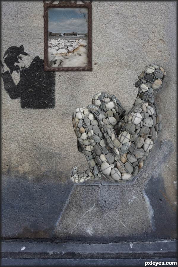
Looking at my homeland.... (5 years and 3304 days ago)
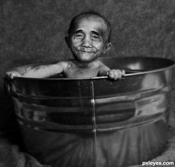
thanks to ~PiratedPictures
http://piratedpictures.deviantart.com/ (5 years and 3335 days ago)
He's so CUUuuUUuUUuUUTTTEEE!!! great job!
good work very well
hahahahaha...great thinking and so cool work...gl author
Howdie stranger!
If you want to rate this picture or participate in this contest, just:
LOGIN HERE or REGISTER FOR FREE
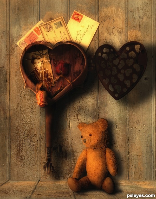
“The past is not dead. In fact, it's not even past.â€
William Faulkner (5 years and 3469 days ago)
Very charming image enhanced by the evocative lighting. The perforated heart should cast a perforated shadow, however. It also seems to me that the middle letter should cast as strong a shadow onto the (light-colored) right-side letter as the right-side letter casts onto the (darker) wall. The wall/floor joint could be better defined IMO. I would expect the wall boards to cast a dark, skinny shadow onto the floor boards going under the wall. (Although it's an artistic choice, I personally think replacing the floor with a bureau top would make more sense.)
lovely!
Love this entry and colours are great! 
It's a terrific entry!!!!!!! Very well done - don't change a thing!!!
This is very different, I like what you did with the violin, and the feeling of this piece, it's sort of sad and happy at the same time. 
very nice scene author...i love the colors...good luck
Congrats on second place!
Congrats on your well done work and your second place.....
Gongrats
congrats rob, well done!
congrats!!
congrats Rob!! 
congosssssssssss 
Congrats!!
Howdie stranger!
If you want to rate this picture or participate in this contest, just:
LOGIN HERE or REGISTER FOR FREE
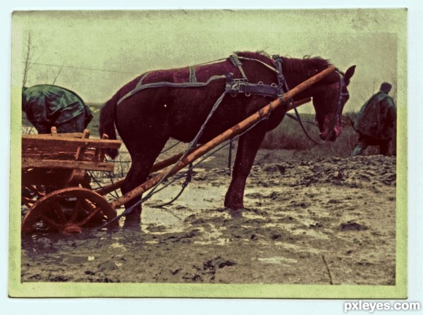
My grandfather in Russia during WWII.
I chose this picture, because it gives me chills. I can never imagine what he and his fellow soldiers had to go through, what it felt like to lose friends in the field and come back all disenchanted and injured.
I am proud to have inhereted all his pics. (5 years and 3469 days ago)
this is very nice piece author.. the story throws it over the top... You may want to weaken the color saturation to give it more earth tones. but that's just for the contest.. the emotional attachment you have for the subject is quite evident.. I'm sure you have done your ancestry proud
GOOD LUCK
(thank you for sharing such a personal image with us)
Good work, but too much green in the final version, especially in the border. IMHO a simple sky gradient in the background & white border would help your image. GL. 
I really liked step 2. I would go from that step but add some brown for the mud and such and possibly some blue to the sky.
Thanks for your comments. I tried your suggestions and liked them, but still felt I wanted it to be dirty and old looking to underline the historical background.
Howdie stranger!
If you want to rate this picture or participate in this contest, just:
LOGIN HERE or REGISTER FOR FREE
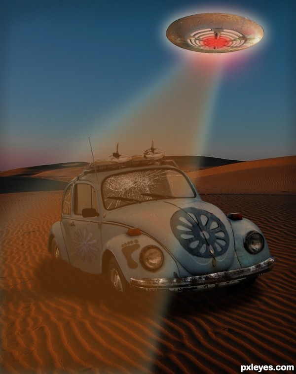
The source has been used in both flowers and the foot, as well as the texture and some color on the car. And how could you not make a 'saucer' from this source?!
Lots of layers on this, more involved than it might seem. Basic layer adjustments and tools. (5 years and 3508 days ago)
The cracks are passing the limit of the glass...
Good observation, and as a matter of fact I was debating on whether or not to erase those further, thinking the black edging was on the inside of the windows. I think you're right, tho, and I have uploaded the revised version. 
Howdie stranger!
If you want to rate this picture or participate in this contest, just:
LOGIN HERE or REGISTER FOR FREE
I like how you changed the pose here, I didn't think there was any other way to pose him. Maybe a little shadow under him would make it look better = )
interesting concept...GL author
Very nice, author, love that you have him sitting.
Howdie stranger!
If you want to rate this picture or participate in this contest, just:
LOGIN HERE or REGISTER FOR FREE