(5 years and 3553 days ago)
(5 years and 3681 days ago)
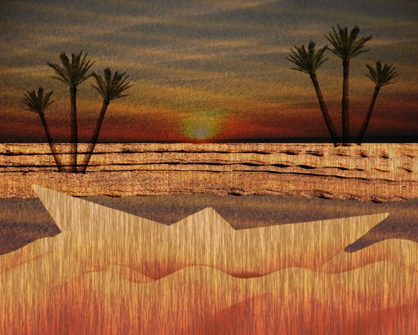
Kind of looks like a water painting. Probably too simple for some people. Might be why you are lacking comments.
Howdie stranger!
If you want to rate this picture or participate in this contest, just:
LOGIN HERE or REGISTER FOR FREE
(5 years and 3786 days ago)
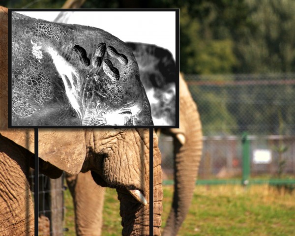
Funny idea, but it's quite hard to recognize the peanut inside the elephant's brain. Is it possible to make that a bit more clear? Perhaps if you add a few more peanuts from the used source? Good luck!
hahahahahha very funny  )
)
Very nice idea but demands more work....maybe to create brain shape with peanuts or something like that...good luck author
nice image, love the concept of the peanuts. 
Howdie stranger!
If you want to rate this picture or participate in this contest, just:
LOGIN HERE or REGISTER FOR FREE
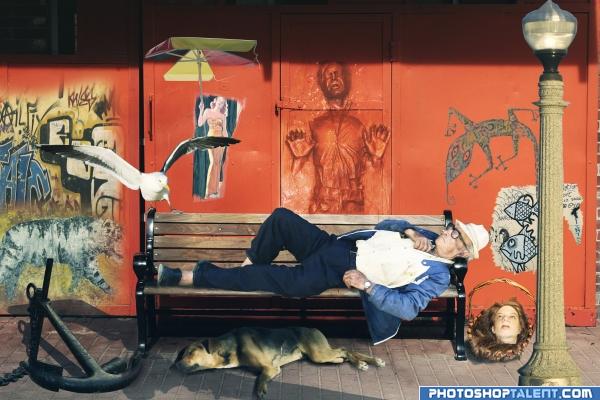
...or the colorful tragic is an illustration of what happens when we dream, all that we love and all that we fear
EDIT: removed lines from hands, added shadow underneath guy and changed some shadow directions..hopefully it looks better (5 years and 3953 days ago)
Author.. you must post all your sources.. and you have a ton of them.. if you don't this piece will be pulled.. I'm pretty sure the Hans solo alone will get you in trouble.. GOOD LUCK THOUGH..
(your picture balance is looking very good)
EDIT: Excellent Source submission..great way to make a piece.. all your own sources..
gl
step by step with sources is in progress
EDIT:added step by step for the photos;
Funny idea, but work a bit further on the shadows (that is, the direction of some shadows, but maybe also add some more shading to make it more a whole, like for the man on the bench). That Han Solo print looks cool, I'd remove the vertical lines from the background (near the hands), so it looks less ghost-like. Good luck!
Awesome Image...Makes you want to stare longer just in case you missed something...IMO the man on the bench is a little "flat" compared to the rest of the image...Great Idea....Good Luck 
Good idea. Multiple light sources in general and lack of shadows on the sleeping guy need correcting. Note that in the original spource pic, the light source is almost directly above.
nice idea -- the bird needs some shadow around the feet and the man has some white showing in the masking and a bit of blurr would help his edges as well
good
Wow, you added like as many sources as you could 
how this must have taken a lot of work....Nice- and good Luck
haha cool
Nice idea, but too many light sources. Love the guy in the door.
Great job. Nice display of many dreams. I would darkent the guy up a little. make him more rustic.
Howdie stranger!
If you want to rate this picture or participate in this contest, just:
LOGIN HERE or REGISTER FOR FREE
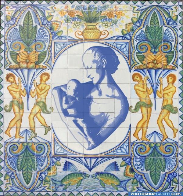
threshold copys clone stamp (5 years and 3953 days ago)
very nice 
this is very well done.. but the central image should be centered I would think.. it's the whole reason behind tile work... she and the baby are around almost one half tile to far up.. .. not a big fix.. but I think it would help in over all balance.. good LUCK!!!
EDIT: BRAVO AUTHOR.. IT really is locked in place now..AWESOME
nice
very nice composition
nice
As a former ceramic muralist, I love this idea. Two small things, though. I would extend the green thing on the left around the character's waste so its not cut off- like you did on the other side. I would also apply a sligh gaussian blur on the center piece to soften those inner edges so they match the blue glaze on the outside. Over all I think this is a nice piece. 
it really forwards the image of ceramic tiles, so nice!
Nice idea! Maybe something you can improve: looking at your used source I only see the drawing on the tiles itself and not inbetween (sorry, dunno well how to call them...the nerves?). In your image you put the whole statue like a grafitti on the wall. In case you can remove the parts inbetween the tiles it will look more like it's meant as tile decoration. Good luck!
nice work
love it & love the idea  wazowski's suggestion sounds good
Interesting display. a little color added might enhance the piec more.
Interesting idea!! 
Wow nice idea! Great execution! GL
good!!
wow! This is great!!!  And very original, before I forget to say


Howdie stranger!
If you want to rate this picture or participate in this contest, just:
LOGIN HERE or REGISTER FOR FREE
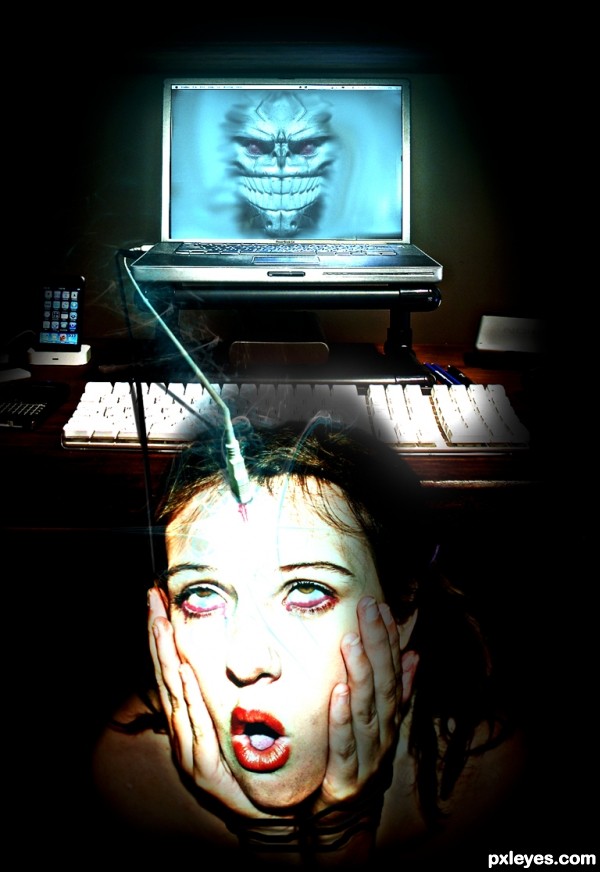
Just how I feel right now! Pretty creepy, author, well done, but is there a source for the creature in the computer, or an sbs for it?
EDIT: omg, excellent find! and perfect name for it.
oops, thanks pearlie , missed that one!
Good idea. IMO there wouldn't be a shadow on the keyboard.
Jesus... is it a brainwashing? But sooner or later such thing is possible to happen... Creepy! And well executed, of course!
agrees about the shadow. This is probably the future of the mouse and keyboard. You know someone's working on it.
I was kind of hoping to see facebook or something on the screen. I agree with CMYK about the shadow, at least it would be pretty mild as the screen is glowing on the background. I like that foggy thing and the colours, reminds me of some rense.com's weekly illustrations.
Glad to see that the iPhone is still around
very cool!
Creative!
Howdie stranger!
If you want to rate this picture or participate in this contest, just:
LOGIN HERE or REGISTER FOR FREE