(5 years and 2553 days ago)

(5 years and 3029 days ago)
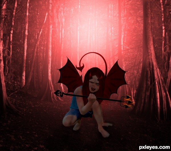
the hair looks really bad in high ress, the hand thats holding the fork is partly erased the fork goes straight thru her thumb and pinky lol, her cutout seems a bit shaky, the colors are okay, I would have added fire behind her though. I think you had a really great idea, the execution just needs to be a little better. holding off my vote for now.
thx for ur comment eladine, ur were right bout the hand lol, missed that, changed that and the hair also, i think the fire bhind here is a personal thing but thx for the suggestion 
yes great improvement author except the thumb the fork now goes behind her thumb instead of her holding it. the pinky is right done now, just use a hard brush to erase some of the thumb and use burn to create a small darker edge where the fork comes out through the bend of her thumb. (hope that made sense) and yes the fire behind her is a personal thing and does not change the quality of your work, just a matter of different taste i think  perhaps if u have the time you could let a tail come from behind her a little bit.
Howdie stranger!
If you want to rate this picture or participate in this contest, just:
LOGIN HERE or REGISTER FOR FREE

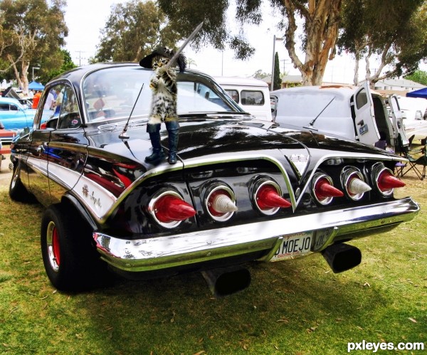
Thank You Eladine for inspiring me to do this. The Puss in Boots was done according to a tutorial Eladine had posted here at pxleyes some time back. All sources used for the cat were taken from that tutorial. (5 years and 3112 days ago)
major zoomer 
LOL Love the carchop  this piece made me laugh out loud, nice work on the car
  the cat lmao got a perfect spot on the car and im terribly sorry but it can use some work.. it dont match with ur car image o.o; Love seeing it arround though
Eladine what should I do to make the cat match the car? What are you seeing? It's not everyday you run across a sword wielding cat wearing hip boots and a Musketeer hat. 
Honestly your carchop looks a lot better then your catchop.. you should put a little more time in fixing up the cat (fur for example and cutouts) the brightness /contrast of both images dont seem to match, your tweeking made the cat even have a lil greenish/yellowish on his chest. Maybe a different source would have looked better with your car.. he seems a lil lost with a heavy night behind him LOL who knows...
Thanks for the feedback Eladine.
well done, very good working on the car, your following of the tutorial is excellent you even added more features, good luck
What a shame man.. 
Howdie stranger!
If you want to rate this picture or participate in this contest, just:
LOGIN HERE or REGISTER FOR FREE

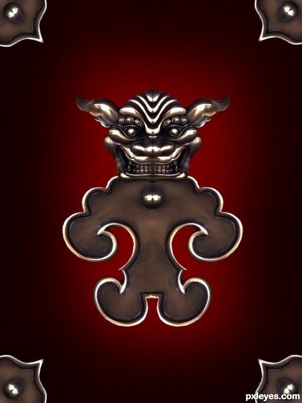
Only source image used. SBS included. (5 years and 3587 days ago)
A grown up version of winnie the pooh 
Howdie stranger!
If you want to rate this picture or participate in this contest, just:
LOGIN HERE or REGISTER FOR FREE

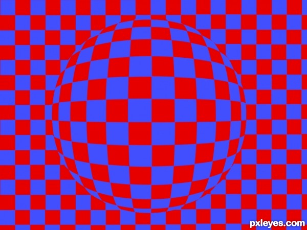
It's a simple one (I don't know if there's a similar, but this one I made by myself), but I think the colors cause a confusion in the mind... (5 years and 3622 days ago)
excellent ! perfectly on theme ! so good 
Ouch - my eyes! Can't stare at this one too long - will get a headache... very well done
amazing. very nice. my eyes are watering! :P
How on earth did you create this and not go blind in the process. Great work I love optical illusions. GL
great work on theme illusion............... all the best to u author ........... 
great job.... good luck 
 close you eyes and sphererise? spelling.
nice idea and it do work. Good luck Author
Cool stuff...good luck
nice
very good
Howdie stranger!
If you want to rate this picture or participate in this contest, just:
LOGIN HERE or REGISTER FOR FREE
Maybe decrease the opacity of the shadow a tad, otherwise it's a convincing image. GL author.
Yeah I agree, shadow lightened up just a tad.
High marks for convincing factor; I can hardly tell which one is the model. Artistic composition is a little lacking IMO but that’s just me.
ozipop thanks for noticing how convincing this is, it happen's to be that both vehicles are models. As for the "artistic composition" you are probably right....it really isn't very artsy, but I was going for realism. Thanks for the "high marks"
Excellent blend! Seriously had to look at the sources to find which was the model....BOTH!...dang!
Howdie stranger!
If you want to rate this picture or participate in this contest, just:
LOGIN HERE or REGISTER FOR FREE