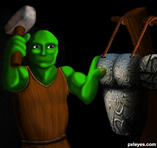
Only source Image was used (5 years and 3326 days ago)
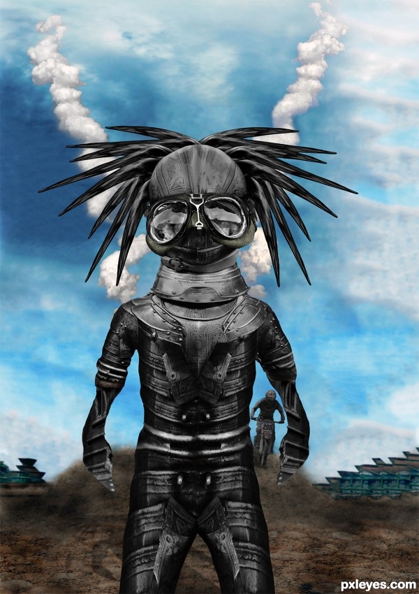
See SBS
The buildings in the back where created with the Content aware System in CS5 Extended on the Rusty Metal Picture
A good example of Content Aware in CS5 can be seen Here http://www.youtube.com/watch?v=NH0aEp1oDOI
;) (5 years and 3401 days ago)
Head's kinda big, arms are kinda short, hands look flat. Source link for sky is missing.
Not bad as creation, and if you wanted to distort the proportions on purpose, well done.
Is just that, when you do difformities, is better to explain in the description that it was by artistique choice, cause well intended people like CMYK might try to help and get undiserved thumbs down ( not that he cares, but you get the principle). Good luck man - i'll check Content Aware, thx 4 sharing.
EDIT: CAS looks like a Really Smart Healing tool, you should check that out folks
Head and the body are well made IMHO...love the background too very much...i know its to late now but would be great if u had the chance to do something with the hands...they look to flat now...any how i love this positive crazy creation...best of luck author
Cool black-beatle headed monster 
Howdie stranger!
If you want to rate this picture or participate in this contest, just:
LOGIN HERE or REGISTER FOR FREE
Credits to =ArtOfDecay-Stock.
(5 years and 3456 days ago)
Nice work!!!!
very playful image author.. good LUCK!!!
Cool work author...
Howdie stranger!
If you want to rate this picture or participate in this contest, just:
LOGIN HERE or REGISTER FOR FREE
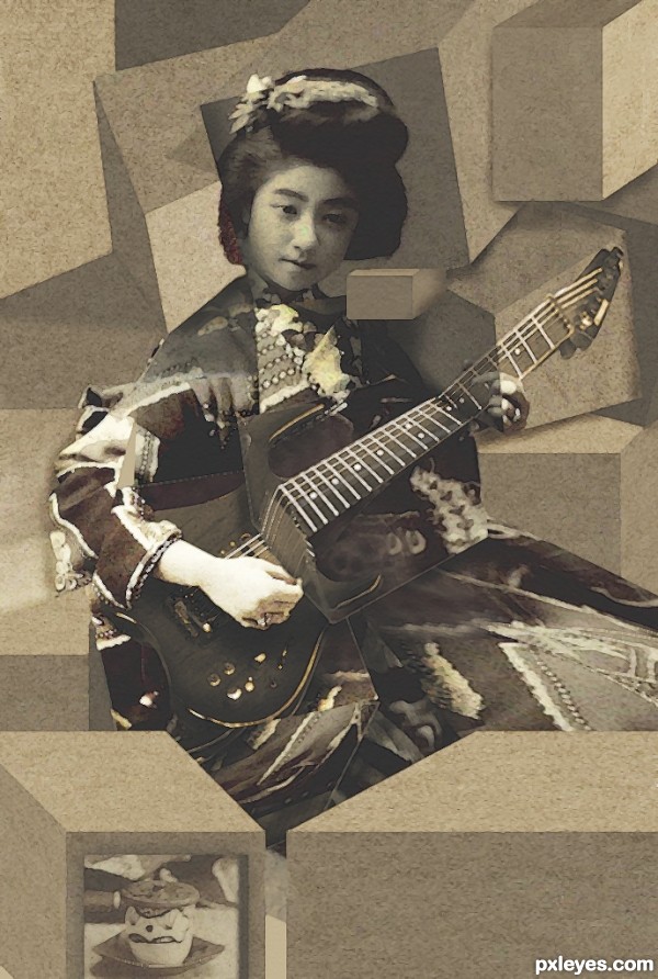
Not traditional cubism I know, more of a literal take on it (5 years and 3524 days ago)
nice job
very nice work,good luck
I think there's no limit for art! Nice entry. 
just like you three guys said....nice....!
Nice idea with the actual3D cubes. The guitar part looks awesome, dunno about leaving the whole head part intact. I wonder if giving some shadows and shading for the boxes would take it out of cubism, not so familiar with the style myself? Good image anyways, quite creative viewpoint.
very awesome i can tell a quality image when i see one
I really think this is interesting using the 3d cubes. I agree that doing something with the head may add another element to it. Nice job!
very nice work...gl
Nice retro look 
Howdie stranger!
If you want to rate this picture or participate in this contest, just:
LOGIN HERE or REGISTER FOR FREE
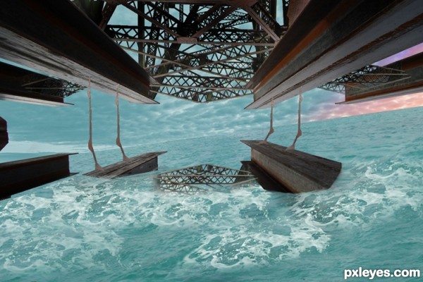
On the side of a Very huge vessel rising out of the sea looking towards the horizon. (5 years and 3525 days ago)
coooool
Not bad but I think by way water looks that its far down from bridge. If you made beames in the water smaller scale it would look better plus add a little wet look where beame comes out of water because fast water curent would go up and down on it
ok next time thanks chuck
this is a great idea! simple and effective. I would change the coloring of the water a bit, though, more shades of blue, to add realism
Howdie stranger!
If you want to rate this picture or participate in this contest, just:
LOGIN HERE or REGISTER FOR FREE
I like your use of the source image although if you were to add a little more detail in texture to your metal smith and his hammer, the whole image would blend together better.
Thanks, I'm still working on him, not sure how to get those kinds of results.
thanks though
k, i tried to add some textures -
Howdie stranger!
If you want to rate this picture or participate in this contest, just:
LOGIN HERE or REGISTER FOR FREE