(5 years and 3108 days ago)

(5 years and 3163 days ago)
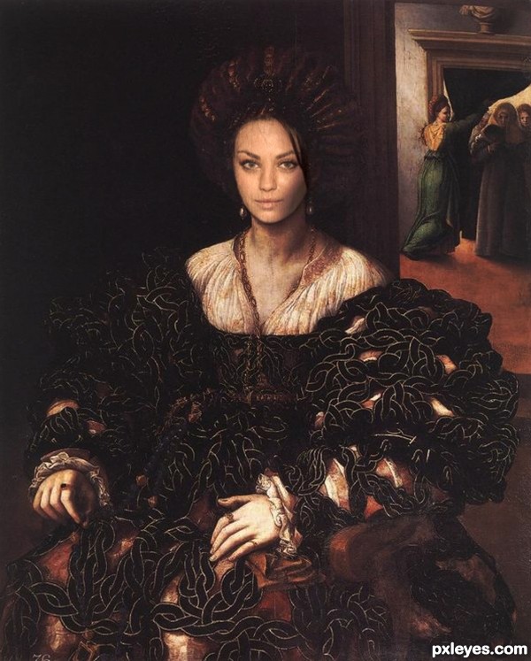
The facial features are too washed out. If you increase the contrast a bit, they will better match the painting.
I think it looks fine, a high resolution would be nice. Pretty subject matter, nice job on the shadow work. Edit: good Hi Res.
Better, but now her face is a bit too pinkish in tone, giving her face a somewhat sunburned look (notice the pale tone on her hands and below her neck). You can try adjusting the Brightness and Contrast, or perhaps Image>Adjustments>Selective Color and then lightening the red tones (possibly the magenta) so that the values match.
looks great author 
Hard to judge with no hi-res. Please realize a hi-res image is pretty much mandatory if you want to get a decent vote.
Nice positioning and good model choice...IMHO shadowing on her face should be bit better...u have to simulate brush moves so regular soft brush is not good for that...maybe u should use chalk brush for starters and try to create that effect in few layers...first start with darker color but with low opacity and then as u bust opacity lower the color tone...just an idea author...any how this image have potential to be one of the best in the contest...best of luck author
Howdie stranger!
If you want to rate this picture or participate in this contest, just:
LOGIN HERE or REGISTER FOR FREE
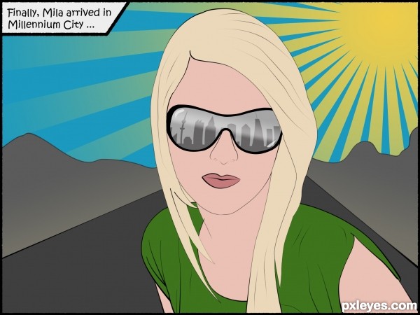
Very well done.. like adult swim without all the sillies LOL.. good luck
Thank you very much, Drivenslush! Your formulation is great.
Howdie stranger!
If you want to rate this picture or participate in this contest, just:
LOGIN HERE or REGISTER FOR FREE