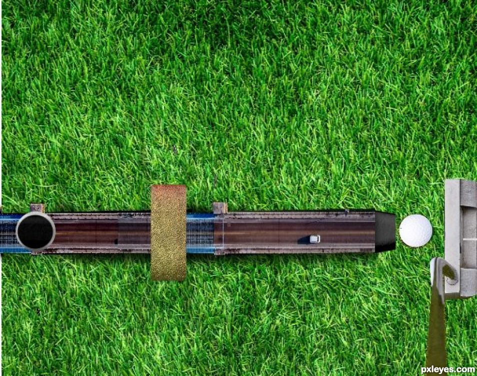
Miniature Golf (5 years and 885 days ago)
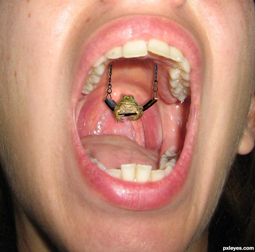
(5 years and 2606 days ago)
Howdie stranger!
If you want to rate this picture or participate in this contest, just:
LOGIN HERE or REGISTER FOR FREE
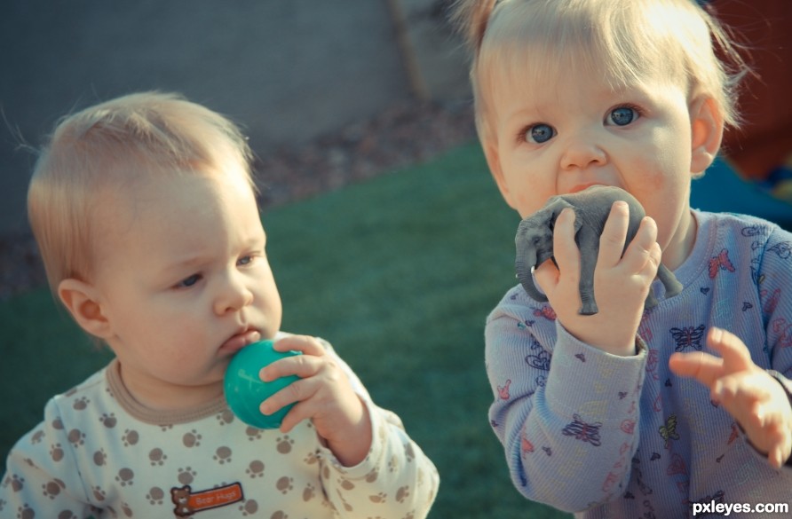
Would you rather lick a plastic ball or a tiny Elephant? (5 years and 2612 days ago)
The shadow of the elephant on the hand is of a color which doesn't fit (give the shadow a darker color of the hand and not gray! A shadow is lack of light on the reflecting object and not a black light projected on that object  ).
).
Another thing which can be improved is that the elephant is way sharper then the hand which makes it stand out.
I do like the photo you used of your children though the expression on the face of the little one fits perfect. Besides that the elephant in the hand is a good find.
Thanks for the comments. Agree with the shadow, adjusted it. The Elephant is actually not drastically different in noise and blur as the hand, it just stands out more. Note the butterflies on the shirt, they look less blurred as well. Blurring that size element at 1 pixel can make a big difference.
I think the issue isn't sharpness it's the levels of darkness/shadow
No.....!!! Don't eat him! I wonder if elephants taste like peanuts? LOL. This is cute. Great idea.
Lol, they taste like chicken, but she's only sucking on him, no worries!
Howdie stranger!
If you want to rate this picture or participate in this contest, just:
LOGIN HERE or REGISTER FOR FREE
(5 years and 3203 days ago)
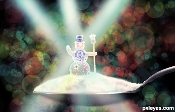
Very nice bokeh effect in the background, it really accents your image well. Nice job!
Thank you so much MossyB! 
MY fav!..
Thanks a lot jordyponce!! 
That is really well done..... good job and good luck.!
Thanks George55!!
Beautiful background and the sweet little snowman is precious 
Thank you so much CorneliaMladenova! 
Congratulations for your second place.... you did a good job.!!!! Keep the good work coming.
Thanks a lot George55!! 
Howdie stranger!
If you want to rate this picture or participate in this contest, just:
LOGIN HERE or REGISTER FOR FREE
(5 years and 3401 days ago)
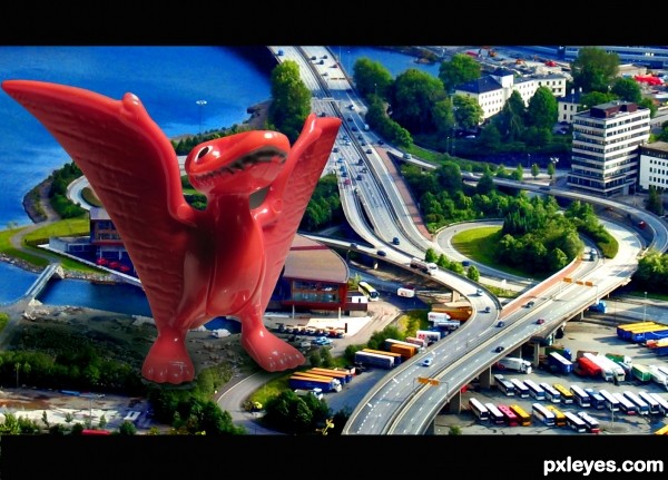
The drop shadow under his left foot makes it look too far above the roadway beneath it. Otherwise, this is very well done.
at first glance, I thought this was a post card 
I like this - gl
thanks and thanks 
Brilliant Author.......Good Luck
thanks zainemma 
very cool work author...GL
thanks erathion..
Howdie stranger!
If you want to rate this picture or participate in this contest, just:
LOGIN HERE or REGISTER FOR FREE
I didn't know how to add in source window that everything else was done with the editing program I use...( like the small bridge)
Please do not post the original sources in the SBS, just a link (as you did) is OK.

When posting them in the SBS we are basically redistributing those sources, which in some cases is not allowed.
The SBS is here to post your intermediate steps.
Good luck with your entry
Howdie stranger!
If you want to rate this picture or participate in this contest, just:
LOGIN HERE or REGISTER FOR FREE