credits and thanks:
http://sinned-angel-stock.deviantart.com (http://www.modelmayhem.com/344097)
http://falln-stock.deviantart.com
http://graphicidentity.deviantart.com
(5 years and 3482 days ago)
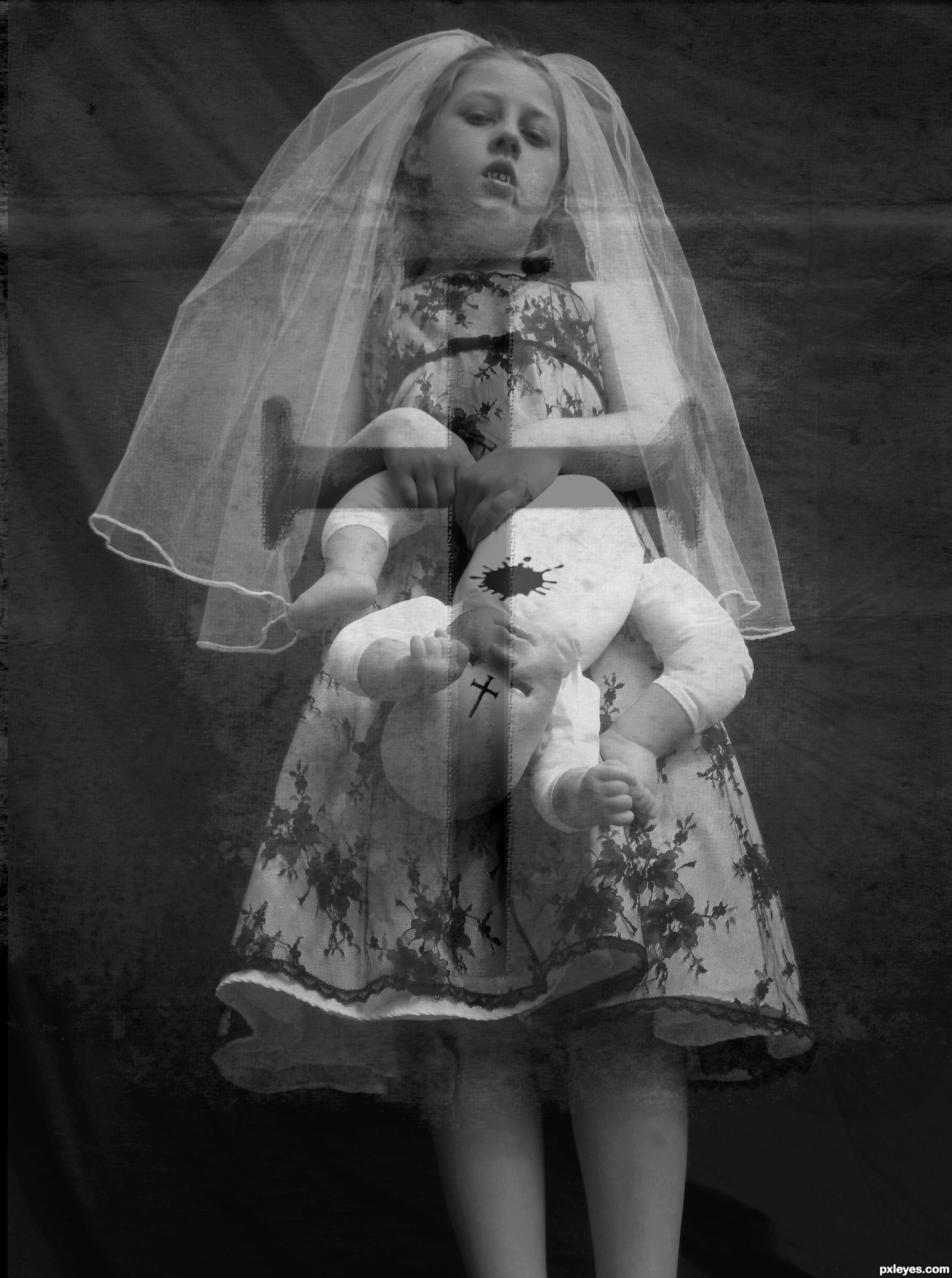
the orig. photo is my own
all i did was copy orig(which i manipulated) over cross picture and lowered the opacity
there is no effect on the cross
picture
through suggestions
i took the color of the blood away thanks to MPMthe1,ba1969 from www.sxc.hu for letting me use thier photos (5 years and 3524 days ago)
There's some potential here. Your SBS doesn't describe the gauzy overlay with the cross [anathema to vampires?], let alone why it's perspective is different from that of the girl. I think the red blood is too bright and thus looks fake. Having her holding a dead baby instead of a doll would be more compelling (disturbing) as would a title that referred to her as a bride.
very cool
i agree with Dan about brightness of the blood,image is scary enough that u don't have to use blood effect at all,its clear that she is vampire.And in this moment something is not OK with the source links...any how i like this image and u how time for some improvements author...good luck
Spooky!
Howdie stranger!
If you want to rate this picture or participate in this contest, just:
LOGIN HERE or REGISTER FOR FREE
(5 years and 3530 days ago)
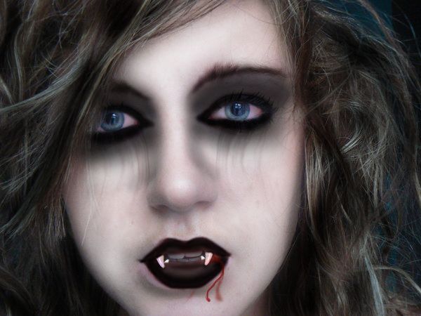
teeth look a little fake
Would there be a shadow under the blood? I only ask - I don't know the answer!
thats not supoos to be a shadow its a dry blood
Um, seems like you could have probably tried to improve some of it based on suggestions. Disco and Tuckinator made good. Sometimes, keep an open mind to what people critique, because I can tell your probably still just playing with PS. It really could have used a little more work in realism.
Howdie stranger!
If you want to rate this picture or participate in this contest, just:
LOGIN HERE or REGISTER FOR FREE
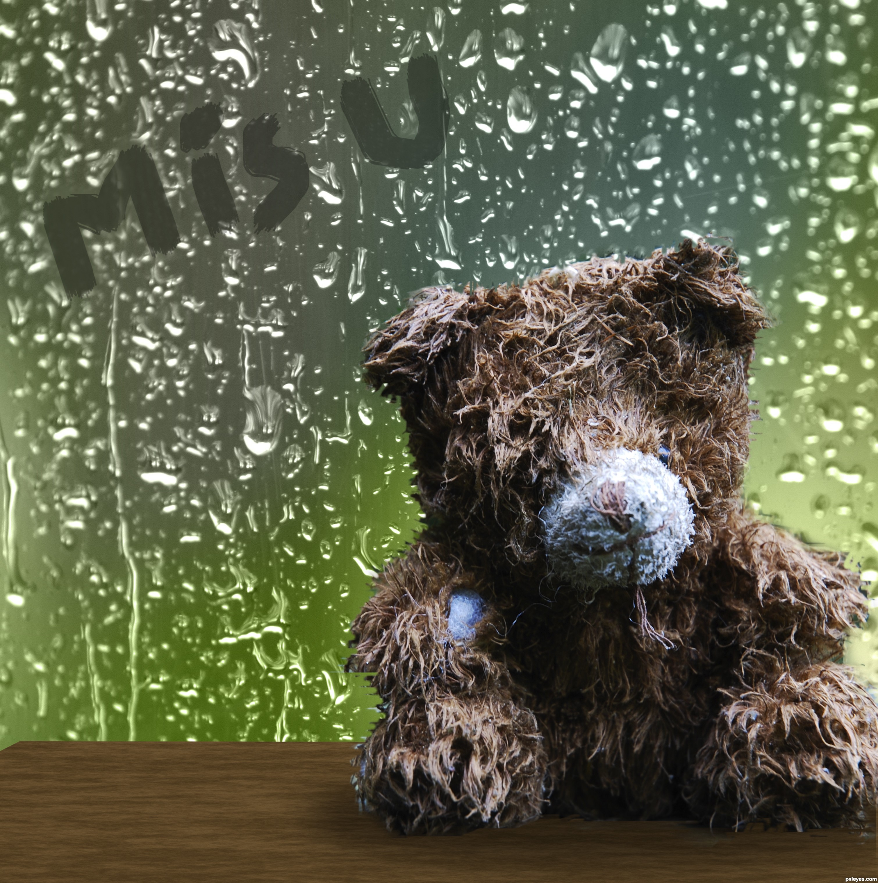
green background is my own (5 years and 3545 days ago)
awwwwwwwww... so sad... i like it
Shadows might need to be a little darker  good luck
Very cute, and sad, right on theme.
Howdie stranger!
If you want to rate this picture or participate in this contest, just:
LOGIN HERE or REGISTER FOR FREE
(5 years and 3604 days ago)
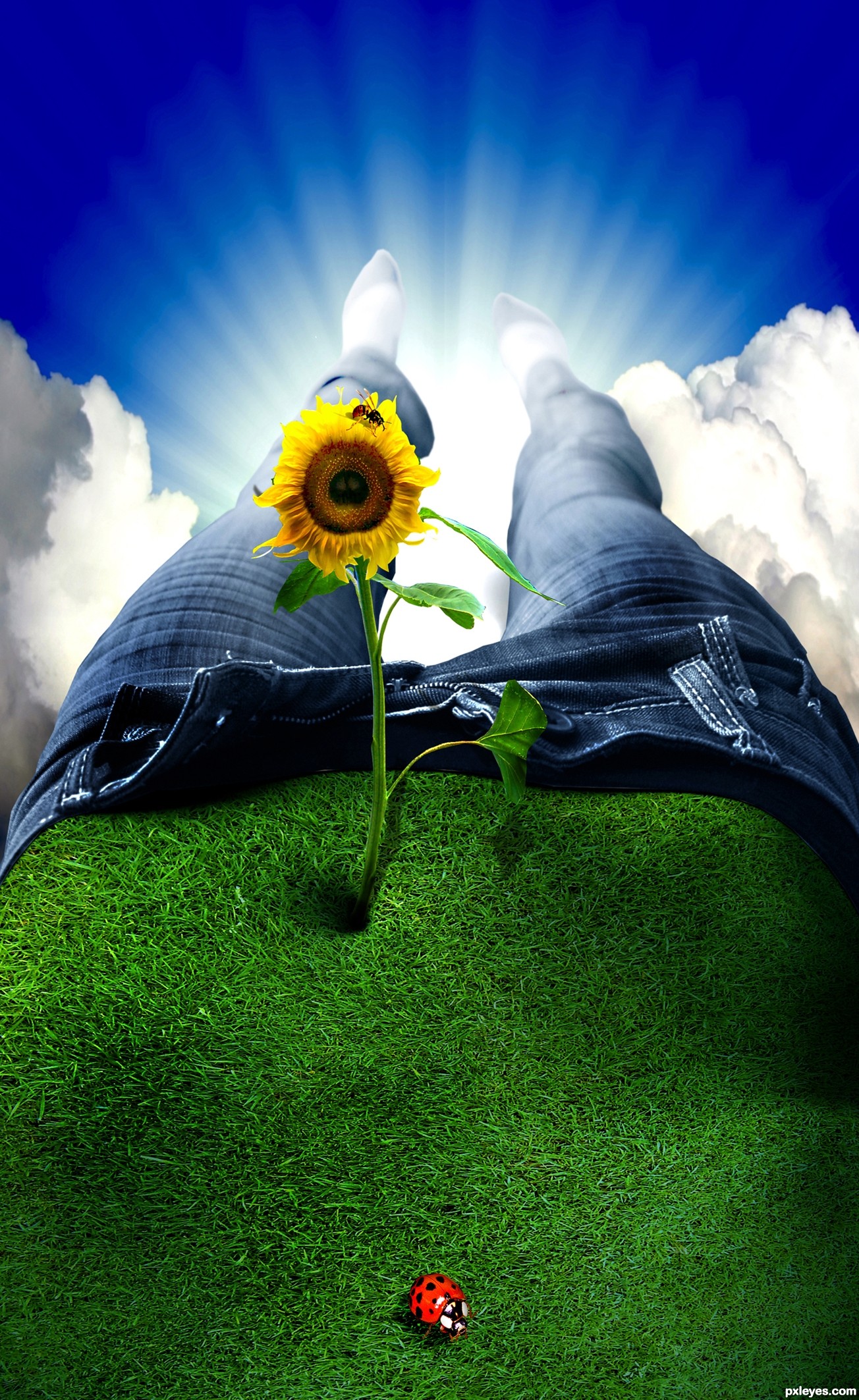
thanks to NoShoes for his pic of the ladybug
This is just amazing...
great idea for this - very cute, nice coloring on the jeans.
Very... fresh!
absolutely wonderful!
very beautiful work ...........gud luck to u........... 
Very very interesting, wish you had an SBS though.
::: wonderful, except the wrong shadow from the flower ... the sun is oposite...
AWESOME!
Very nice.....
thanks to all for your comments
Great! 
C'mon.....no sbs... would love to see some of the techniques you used in creating this one.....good luck!!
:P i would have loved to see an sbs as well. you can tell by the picture that there is alot of work going on here we don't see, and its definately not a beginners entry.
its awesome. but... i still think it needs an sbs.
Dear dollmommy and jadedink, i cannot show you a sbs because i hadn't keep all the picture to doing this one and my english is too poor to explain myself so i gon on in french : au niveau du ventre j'ai travaillé avec la texture du gazon que j'ai passé en filtre produit et puis j'ai joué avec le seuil, les niveaux et pour le jean la balance des couleurs en ce qui concerne la fleur je n'ai séléctionné que la moitié et j'ai effectué une symetrie horizontale et redesiiné une parite de la feuille de droite et pour finir j'ai utilisé l'outils densité plus et moins pour mettre du relief. Ok next time to make an sbs. Thanks for your comment.
ROUGH TRANSLATION = at the level of the stomach I worked with the texture of the lawn using a filter then I played with the threshold, and the levels..... and for the jeans balanced its colors, in the matter of the flower I have selected only half and I carried out a horizontal swap and copied the right leaf and to finish I used the tools density more and less to put relief...... Geexman: wish I had someone so coool to help me beat the system! hehe ( it was a ROUGH translation though)
merci beaucoup pour la traduction 
Thank you very much Geexman you are absoluly cool )
Clever.
amazin
very playful.. excellent job neatest part is that you have no clue what you are looking at at first.. hehehe
I've seen something like this before but not with grass. Concrete road I think.
And congrats for another first place! 
congrats!!!
Thanks to all for all your comments i feel happy today!!
congrats! I'm so glad this made first place. It is so unique!
Congratulations for 1st
Congrats again
Congratulations again!
Congrats!
congrats for ur great win .......... 
congrats
Congrats, beautiful work !!
hahaha... well done... congrats...
Howdie stranger!
If you want to rate this picture or participate in this contest, just:
LOGIN HERE or REGISTER FOR FREE
Photography and photoshop contests
We are a community of people with
a passion for photography, graphics and art in general.
Every day new photoshop
and photography contests are posted to compete in. We also have one weekly drawing contest
and one weekly 3D contest!
Participation is 100% free!
Just
register and get
started!
Good luck!
© 2015 Pxleyes.com. All rights reserved.


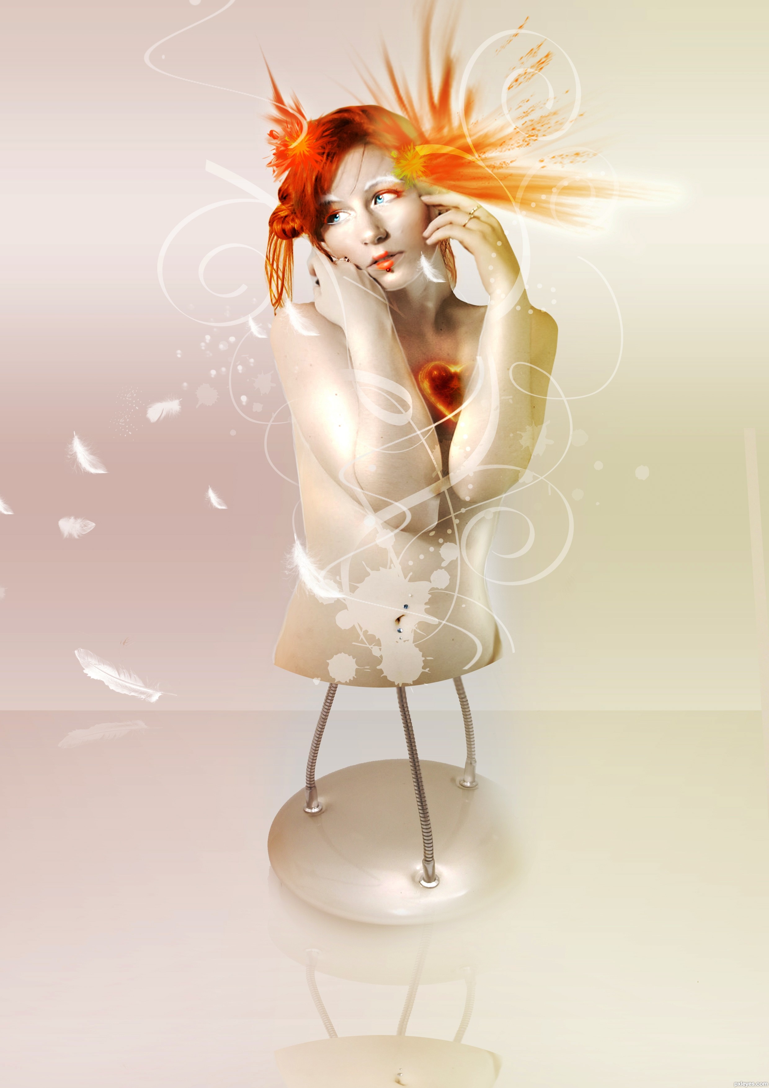
Pretty cool, but rough made. You can see things in high-res that need some work. For example; above the left bottom feather there are some leftovers and theres some stuff left around her right hand from the original source. gl!
Very nice author I like it, GL
Really cool! GL!...
This is awesome! My fav in the contest! GL!
cool
Howdie stranger!
If you want to rate this picture or participate in this contest, just:
LOGIN HERE or REGISTER FOR FREE