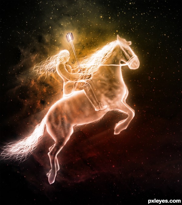
(5 years and 3164 days ago)
- 1: LarissaAllen
- 2: source2
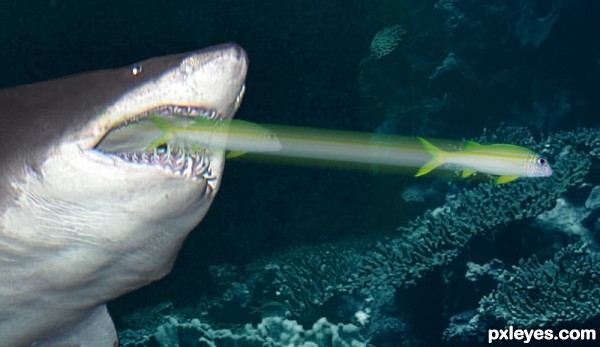
Not interested in being a meal... (5 years and 3542 days ago)
just looks like a shark with a tractor beam...
And you would suggest fixing it how, exactly?
Criticism is fine, but just making a snarky comment with nothing positive to add, nor any suggestion on how to fix it really doesn't contribute much, James.
Try duplicating the fish a number of times and motion blur each one a little then change the transperancy. You could also change it's size and/or shape a tiny bit ... does that help?
Great idea ... fish acutally looks smug about the whole thing!
For realism I would definatly think about the fact that this is all happening in water, the water would have a cone of distortion from begining to end of the fish`s movement also I dont think the line would be so straight, fish use their tails in a side to side motion and although at speed seem to move straight its not really the case.
try taking a picture of a moving fish... (or find a picture that hasn't been taken with a quick shutter speed (as the goal is to make it realistic - not what 'we' think it would look like); Analyse the shot, and then transfer your findings into your image (not literally of course)
Perhaps a gradient transparency mask, so it looks like the blur fades more towards the shark. Good luck!
Howdie stranger!
If you want to rate this picture or participate in this contest, just:
LOGIN HERE or REGISTER FOR FREE
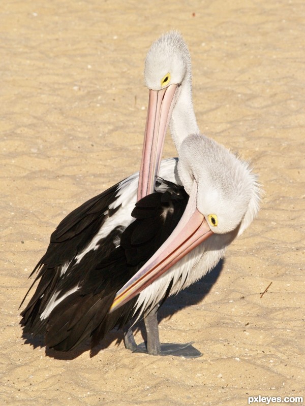
my pelican photos (5 years and 3544 days ago)
Great images and nicely blended -- funny as well
Good image, great title! 
Perfectly and realistically done! 
good work
very nice work author...GL
Howdie stranger!
If you want to rate this picture or participate in this contest, just:
LOGIN HERE or REGISTER FOR FREE
(5 years and 3606 days ago)
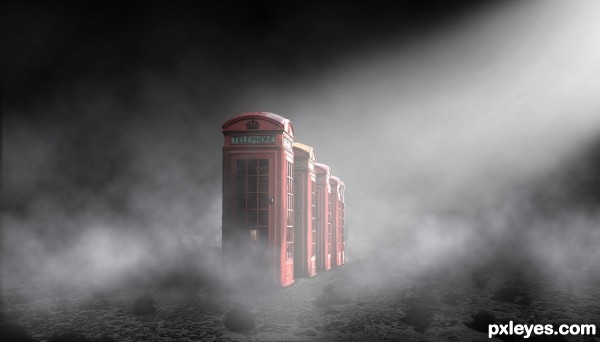
Very cool disturbing mix of title and image. Spacing between phone booths 4 and 5 is too close, however, as it's not consistent with that between the first four booths. Thinking about the Rule of Thirds, I wonder if the impact would be even greater if the booths were shifted to left such that the big, front booth were centered on the left 'third' line.
very nice work...great mood...best of luck
It seems a scene from a suspense movie... 
awesome idea!
GL
nice work ! g l
Interesting. The title is cool too.
Howdie stranger!
If you want to rate this picture or participate in this contest, just:
LOGIN HERE or REGISTER FOR FREE
(5 years and 3618 days ago)
Howdie stranger!
If you want to rate this picture or participate in this contest, just:
LOGIN HERE or REGISTER FOR FREE
nice work. i think that might use a tint of blue
awesome...really nice to see what you came up with using an image most would find useless...great job and good luck
Sbs!!!!!!! Good job
ohhh I love it...though I would get a heart attack seeing this rider on the sky from my window :P
Is really nice but so a poor usage of the source image...
Lots of work here, nice outcome, author!
Howdie stranger!
If you want to rate this picture or participate in this contest, just:
LOGIN HERE or REGISTER FOR FREE