Thanks to EViL-KiTTie-stock at deviantart .
(5 years and 3511 days ago)
- 1: Model
- 2: skull
- 3: spider
- 4: grunge brushes
- 5: Ro-Stock Decay Brushes

Thanks to EViL-KiTTie-stock at deviantart .
(5 years and 3511 days ago)

Could of gone gore plus on this but it is xmas time so I held back!!
Merry christmas everyone on PXLEYES (5 years and 3778 days ago)
very funny
nice but disgusting !
omg, scared the x out off me. very well done!
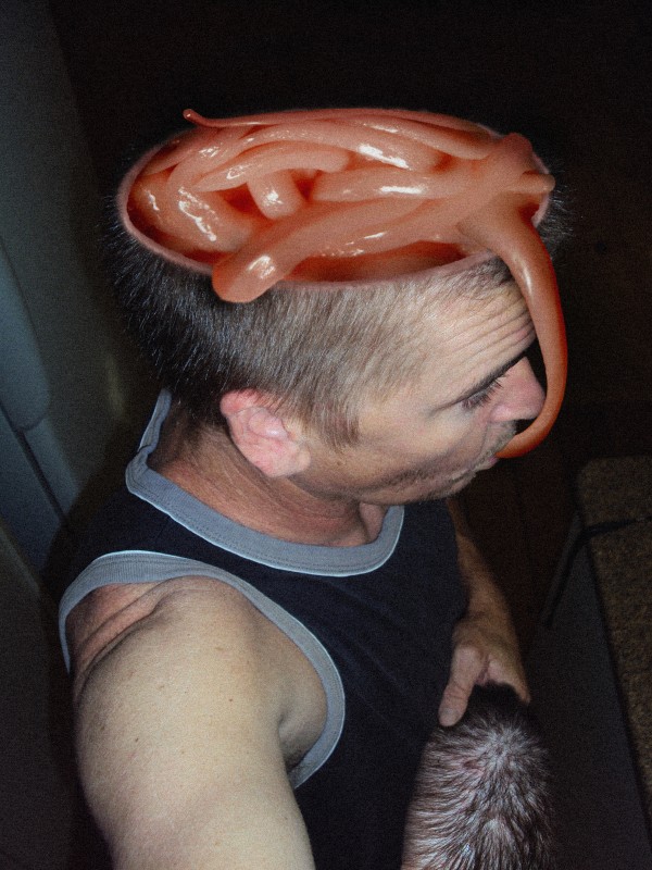
Your restraint is appreciated...maybe a slight more shadow upon his nose from the piece in front of it....nice work.
freaking awesome!!!! great chop!
The fact that he's holding the top of his head is what really makes it for me...good work! 

Definitely a TWISTED entry but the best use of the original source I've seen so far. 
This gives a "WTF" feeling 
Howdie stranger!
If you want to rate this picture or participate in this contest, just:
LOGIN HERE or REGISTER FOR FREE

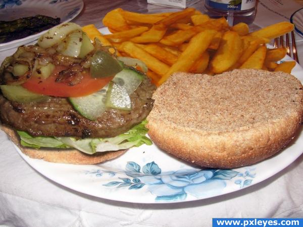
Yummy burger and fries! (5 years and 3882 days ago)
o.o; im hungry!!! finally i got more fries :P
nice idea
The fries look a little blurry compared to the rest. Nice concept.
Howdie stranger!
If you want to rate this picture or participate in this contest, just:
LOGIN HERE or REGISTER FOR FREE
will update with sbs in morning
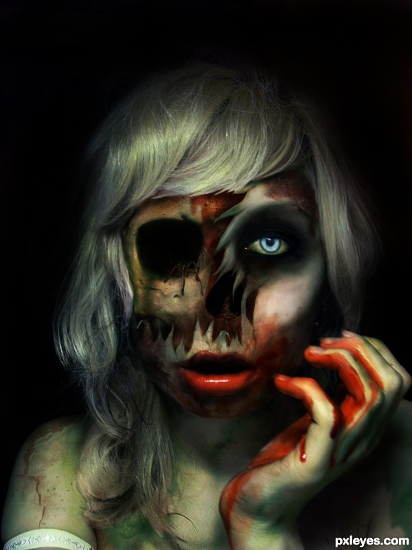
Great effect with the skull behind her skin, also good job blending the blood on ehr face and hand but i'm not sure if the smudged skin was the best choice.
Yep, the smudging's not very convincing. Plenty of time to make this better.
Great effort, sort the smudging/skin and it could be top3. Well done.
i'll work on it, but...aside from saying its not convincing, anyone got a suggestion on how to make it better? if i knew, i'm sure i would have done it differently. this was the best result i ended up with after a few hours of playing around.
suggestions to improve would be nice. like..techniques. not just "its not good"
An alternative would be cracked or broken skin. Use brushes and burn/shadows tools to create a better effect.
Thanks akassa. The cracks didnt look realistic at all, more like bad wallpaper. But I had a friend give me a link to a tut that might prove benificial to what I wanted to achieve. Thanks for coming back with a thought on how to fix it. Its really the best way to critisize, that is to point out the problem and then offer viable ways to fix the problem. Constructive!
Author, I'm not comfortable with giving you the answer to your problems, but would like to point you in the right direction. Get rid of the smudge tool edges. Experiment with better solutions. I know you can do it.
Did you try to blend images of cuts of meat? I don't know if it works, only trying you can get the answer. If you don't want to touch the original psd file, you can duplicate all layers first, make the originals invisible, and work on the clones. If you don'l like the result, just delete all them...
cmyk...i wasn't asking you to do it for me. :P i just needed advice. as i said i worked on this for hours and this was the best result i could manage. i guess i take it all the way back to the drawing board. if you only knew how bad i screwed up on my layers and completely didn't duplicate enough to be able to just go "back" a step. i'll work on the smudge edges. but i don't expect a miracle.
Erikuri... :P yeah, that method is one that i rely on in just making any entry most times.
thanks for the idea nator. i'm going to be up all night playing with this chop.
try to erase the part of a skull with a low opacity eraser... i like it, congrats1
*yawn*
updated with sbs
alright ... i worked over the skin a bit. hope its closer to "realistic" ...used warp to pull down pieces of the shredded skin and added shadowing underneath...used some new crack and decay brushes from ro-stock on deviantart to come up with some skin texture and tear simulation around parts of the shredded skin.
Also, cleaned up the "smudged" edges.
Is it looking better now?
oh, and cmyk..thank you. honestly you made me feel like i was back in school. i had a great art teacher who i have mad respect for and he would say the same thing to me when i'd ask for help. he really challenged me to find my own creative solutions.
Honestly, its irritating, but... it does make me really re consider a few options. and...well, even if its not "perfect" its still closer to "real" imo.
Hope you agree that this is a better rendition. Wouldn't mind hearing if you think something else needs worked on.
Ahem...if you ripped some chicken skin or something, would it come to points like that? Noooooo....
No I suppose not. Ah well. It was my vision of zombie. Guess its whatever. At least I tried.
Congrats
Thanks guys.
Congrats! for 1st place
Congrats Jadedink, on this one and the second place. Creepy horror stuff is your forte (meaning that in a good way).
So, all those comments and suggestions, and you got the 1st.! Isn't that great?

Congratulations, Jade! A zombie is a zombie...
thank you all for the congratulations. Solkee, i am honored.
 You are always so nice.
i really wasn't expecting first.
and more so, didn't expect to follow up with a second place in the same contest.
Thanks Erikuri.
Congrats!!
Congrats! Well deserved!
well done n belated congratulaions
Congrats indeed!
Howdie stranger!
If you want to rate this picture or participate in this contest, just:
LOGIN HERE or REGISTER FOR FREE