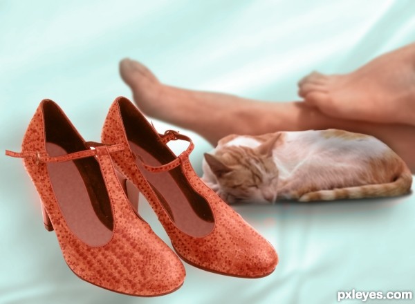
I had used the starfish skin to create the surface texture for stilleto. Searched for a nice satin white sheeted bed. Couldn't find one. So created a background. Hope you like it. (5 years and 3370 days ago)
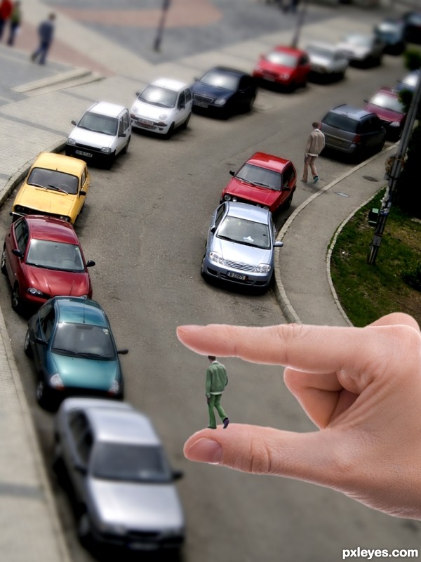
Building a city...
Thanks to:
- Olaru Radian-Alexandru and Bartlomiej Nowak @ Photoxpress. (5 years and 3371 days ago)
At least someone remembered it was a photoshop contest.  GL!
GL!

i think adding the hand to force an image to make it look miniture is over doing it and off of the rules. the tiltt shift video tutorial, to me; made it seem to take 1 image, and with simple adjustments. make it look as tho it were miniaturized. not by adding a giant hand and a person to look as tho it is a miniature set.
great great great idea author...best of luck
LOVE IT!
Howdie stranger!
If you want to rate this picture or participate in this contest, just:
LOGIN HERE or REGISTER FOR FREE
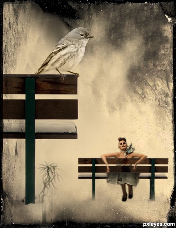
A tiny girl tired of her long journey rested at the bench beside a human-sized bench (5 years and 3375 days ago)
Try to say that 10 times fast - Bench by the bench, lol. Nice work = )
I decided to enlarge the girl a little bit... 
Bird seems to be the hero of creation. Perspective needs attention!!!
cool work author...nice usage of the texture...gl
Composition suffers since viewers 1st stop point is the shadow cast on the bench - which has no relevance imo.
A good idea is to Crop your image so that we can only see a part of the Big bench on which the bird is sitting, and the entire small one. Crop it from the right side of the pic to a few cm after the first bench leg.
You don't need 3 parts of your image  , and you'll transfor it to a portrait-mode, which is more dynamic than a landscape orientation.
@greymval... thanks for the suggestion... i will try to consider that...
I hope this gives justice to the tiny girl as the main subject...
Howdie stranger!
If you want to rate this picture or participate in this contest, just:
LOGIN HERE or REGISTER FOR FREE
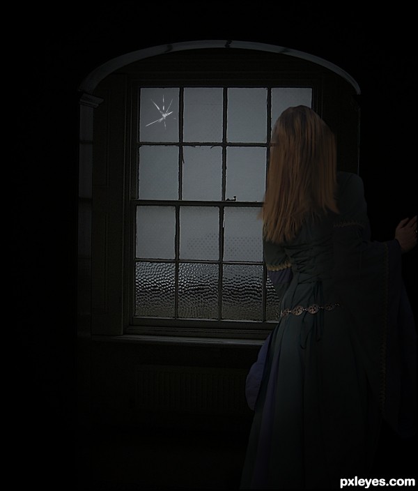
Thanks a lot to:
BROKEN GLASS BRUSH:
http://eebvoom.deviantart.com/
WINDOW:
http://tia-stock.deviantart.com/
MODEL:
http://liam-stock.deviantart.com/
(5 years and 3392 days ago)
ooh ! this is eerie in fantastic way, i love the subtle color!
Unless I'm seeing things, I thought the girl was a little brighter the last time I saw it. At that time I thought she was a little too bright, but Idon't think so now. Have I lost it? (probably)Anyway, I really like the combination of elements and the atmosphere. Nice job!
PINGENVY, you're right.
At the request of the moderators, I changed the bg.
After that, I changed the colors and brightness of the other sources, too.
Thanks for the comment.
It's a beautiful image! 
Mas, tio, o cabelo dela está meio apagado na lateral esquerda, e uma parte da esquadria está aparecendo através dele... 
ERIKURI,,, thanks for the coment,,, but,,, foi tarde d+... rs...
Too dark, and the bottom of the window is crooked.
Howdie stranger!
If you want to rate this picture or participate in this contest, just:
LOGIN HERE or REGISTER FOR FREE
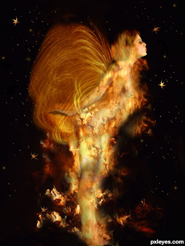
Image altered to include wings I created in Apophysis. Thanks to Deviantart for the source images:
Model from mjranum-stock
Flames provided by
Tortured-Raven-Stock
Star Brushes created by Reikavich. (5 years and 3392 days ago)
Wow...very nice.
amazing.............
Thank you
Really nice, but her legs look green with the shadows...If you can make all of her warm toned, it will be better.
Fantastic, great image well done 
Thanks, I'm glad it still looks good, I had to redo the wings.
Great imagination! Love the way this turned out 
Howdie stranger!
If you want to rate this picture or participate in this contest, just:
LOGIN HERE or REGISTER FOR FREE
The edges on the cat need to be softened so it will blend in better.
thanks itgik. I corrected it.
looks much better gl
Howdie stranger!
If you want to rate this picture or participate in this contest, just:
LOGIN HERE or REGISTER FOR FREE