(5 years and 1259 days ago)

(5 years and 2808 days ago)
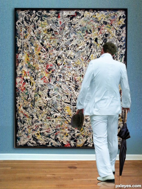
Im not sure if i agree with the use of Jackson Pollacks oil painting in your own image... this is a famous painting of its own and even though someone took a photo I still think its a tad wrong to use it in your own art... just saying!!!
It's not a Jackson Pollack piece, it's a Norman Rockwell, and since we weren't given the ability to draw our own piece I couldn't do that for the Pollack part of the image (IHOOQ is a more than a TAD wrong but it used the actual Mona Lisa in it's creation)
Museum of Modern Art, NYC
White light. Jackson Pollack. American. 1954. Oil, enamel and aluminum paint on canvas.
link 4.
What I CREATED ISN'T A POLLACK PIECE, sorry about the misunderstanding, Yes White Light is a Jackson Pollack image that I used, and some English or Italian Designer probably made the suit, I think the Umbrella was designed by Folsom and the Bowler Hat was probably created by a hatter, and all of them are offered in Creative Commons at flickr for fair use. The image I created was a mimicking of THE CONNOISSEUR by NORMAN ROCKWELL, a piece that created a very interesting argument between ARTIST and ILLUSTRATOR. Personally I think of it as Dada (The IHOOQ reference)
Right on theme, author. Good recreation of Rockwell's work. 
Congrats Ernie!
Congrats!!
Congrats my friend!
Howdie stranger!
If you want to rate this picture or participate in this contest, just:
LOGIN HERE or REGISTER FOR FREE

A concern on modern times, where business and personal interests steer us far away from helping and supporting necessitous people.
On regard to the entry, criticism on my entry is appreciated, it's always time to learn from others' suggestions!
An image including all the sources I used is within the SBS, in order to shorten the time to check them! (5 years and 2853 days ago)
for me. the beautiful goddess and is well made​​. a nice contrast. I also do not like the girl on her knees, just my opinion
Thanx Nator and lincemiope for your opinions. Unfortunately the kneeling kid had been the main concept of my creation, so everything turns around her (also all the masks and the light effects I used to create the atmosphere), I have no time to change the whole image again, but I admit that the kid fills too much space in the image, and decreases the sensation of movement of the people; but, on the other hand, I considered the importance of the glance between the characters, which is the title of the picture.
Congrats!!
Howdie stranger!
If you want to rate this picture or participate in this contest, just:
LOGIN HERE or REGISTER FOR FREE

see my own stock in the SBS... (5 years and 2982 days ago)
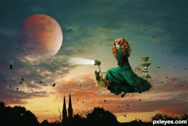
Very striking and creative. Good composition (Rule of Thirds). The headlight is too intense with too strong edges IMO. Also, the clouds should be in front of the top of the moon just like they are in front of the bottom of the moon as the moon is well outside our atmosphere. The upper-left lighting of the witch and her vehicle is inconsistent with the background's back light but is nevertheless dramatic. I do admit I wish the modern witch had a little more complex vehicle (contrary to the 'less is more' modern dictum).
hahahahahah...so cool...gl
Congrats, lovely work 
Congrats!
Howdie stranger!
If you want to rate this picture or participate in this contest, just:
LOGIN HERE or REGISTER FOR FREE

Modern art is: " I can do that myself! "
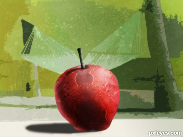
My objective was to create something simple and appealing. It wasn't that simple and you decide if it's appealing. (5 years and 3202 days ago)
It looks like more than "appealing," it looks like the whole apple... !
!
Nice job!
Much more appealing than the source pic. 
Very creative and imaginative! Good work author and good luck...
Very creative author, GL!
beautiful and very effective work author...GL
Howdie stranger!
If you want to rate this picture or participate in this contest, just:
LOGIN HERE or REGISTER FOR FREE
Haha, love it! Stop monkeying around with my iPad!
Thanks for comment... he will learn how to use it soon....
Learn how to use it... my 3 year old nephew had an iPad and he could get Mickey Mouse on that thing in less than an minute.. hehehe great job on this
  so much fun
Yeah, the new generation... they learn fast....it was fun yes!
Congrats George!!
Thanks Rein....
Congrats!
Hey, thanks my friend...
Congrats.
Thank you my friend.
congrats George55
Thanks Demi...
Congrats George!
Howdie stranger!
If you want to rate this picture or participate in this contest, just:
LOGIN HERE or REGISTER FOR FREE