(5 years and 3151 days ago)

(5 years and 3172 days ago)
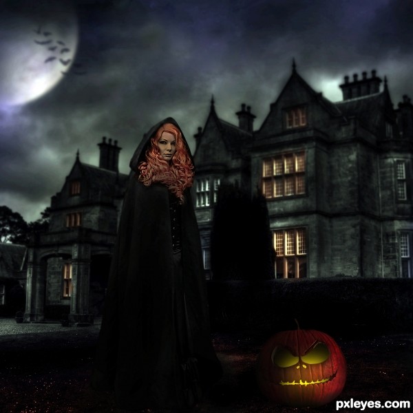
The lighting is too dark and inconsistent. What light source illuminates her hair and face so much, yet everything else she's wearing is matte black except for the tiny buttons? Moody is one thing, but the lighting needs to have some small modicum of realism...
Dear Mossy, i have followed your advices and hope the light is better now !
very nice love the scene just one thing.. the pumpkin has no back? its just a mask looks like it... because u see the background right thru it.. other then that very nice and high marks.
edit: thats better author 

Thanks Eladine, oups it's true i made a mistake !! I come back with a real big pumpkin !
nice work although I do find the shadows conflicting
Beautiful witch castle 
Howdie stranger!
If you want to rate this picture or participate in this contest, just:
LOGIN HERE or REGISTER FOR FREE

(5 years and 3672 days ago)
Fantastic expressions. Hehe, great entry. Good luck!
very cute!!
Oui, tres chic! 
Very romantic, author! GL... 
great work author ......... very beautiful entry ......... ............. but i feel that she is in a little insistence ..............
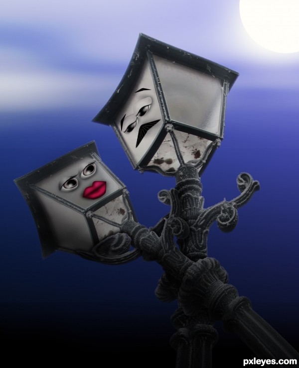
AAAH! The expressions are SPOT ON! The source is kind of sad for the details, and not your fault of course... but if you took the time to make them be more joined visually this would be even more lovely and fun.
Very funny and creative idea!
Kind of like Lady and the Tramp for Light Posts instead of dogs....gl
Great Expression and cute work. Another beautiful Love Story 
Agree with the expression, very nice job 
Romantic Entry......Good Luck Author.
How cool is that!
These lamps in love are so sweet 
Congrats! 
Howdie stranger!
If you want to rate this picture or participate in this contest, just:
LOGIN HERE or REGISTER FOR FREE
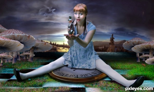
very well done -- clock looks a bit flat but still overall very nice
repeat the clock a few times and stack it tight and it will give it some height, FANTASTIC CHOP ALL ROUND.. a woo HOO!
EDIT: ZAPOW!!! great fix author,, much Much MUCH BETTER!!!
Dear Drivenlush and Alan2641, i have followed your good advice and made the change on the clock, hope it's better looking now
congrats on third.
Congrats!!
Thanks to all
Congrats !!!
How can I do to get this image in a high resolution? send me an email please jennyschorsch@gmail.com
Howdie stranger!
If you want to rate this picture or participate in this contest, just:
LOGIN HERE or REGISTER FOR FREE