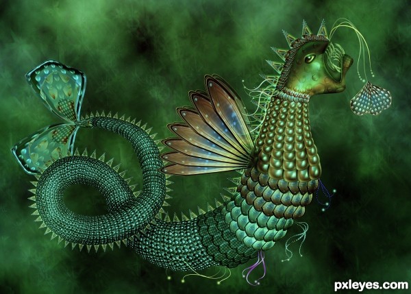
only photoshop is used (5 years and 3314 days ago)
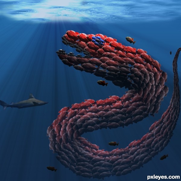
(5 years and 3315 days ago)
I saw this in the sidebar and thought it was so clever, I had to come in for a closer look. Your lighting is really very good and I like the way you made the fish twist in serpentine fashion. The addition of the extra fish was the perfect touch. The only critique I have of this is the masking. There's that line of light around the bottom of the fish. When I'm masking something, I use two backgrounds, black and white, to make sure I didn't miss anything. I still like it and everything else is great.
Great job, and very clever thinking .. good luck
ty both for your kind words
A major  !!
!!
Good idea! Good work! 
Howdie stranger!
If you want to rate this picture or participate in this contest, just:
LOGIN HERE or REGISTER FOR FREE
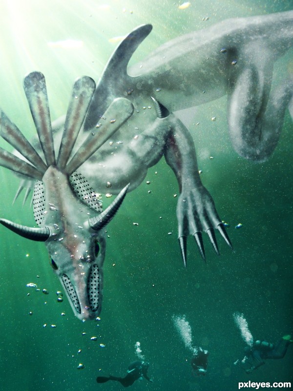
Protecting his submerged vestiges in the North Pacific Ocean, near the ancient city of Tehuantepec, he attacks clueless divers and treasure hunters.
(5 years and 3317 days ago)
I don't get it (good score).. just don't get it
I just made a description for fun it started like an Aztec submerged site hauted by a monster who's the reincarnation of an ancient leader - and from there it evolved.
nice nice
unless you were thinking Montezuma's Revenge? that would make a whole lot more sense
I don't know, I was never good at making titles. But of course I can change it if anyone gives me an original suggestion  . Montezuma's Revenge sounds good, but it's taken.
(montezuma's revenge is Diarrhea author.. ) oh lord.. why do I try
LOL, that too! Thanks for stopping by !
Edit: changed name to Diverhunter so it won't be associated with the crappy video game 
love the colors the lighting and the overall construction of the monster, good luck !!
Thanks nanaris & andi. It feels good to know, that there are people who get and like my entry and that my efforts are appreciated 
You've done a good job on this. I think it might look a little better if your creature were more the tone of the water like those divers are. Just my 2 cents...nice work.
Thanks for the comment, i'll give it a try, but i especially made the creature white so it stands out more, like a big shark.
Made a slight blend adjusment, you can see the before in the SBS. I can't guarantee you ll notice a difference since it might also dependsof your screen.
great work author!
I really like what you've done author! Good work!
This entry was dedicated to Drivenslush for helping me get through my laziness. I managed to instal Ps3 and create this entry using multiple psd files so that my laptop could handle the memory. It was fun, thanks again Drivenslush.
Howdie stranger!
If you want to rate this picture or participate in this contest, just:
LOGIN HERE or REGISTER FOR FREE
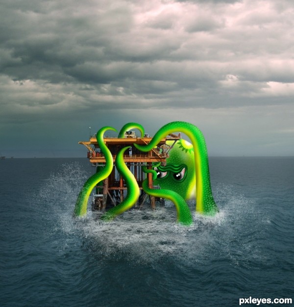
One year ago, the Gulf coast of the United States was devastated by an oil spill after an offshore rig exploded. After watching the oil spew for weeks from the hole deep in the ocean, this is my depiction of a real sea monster. (What appears to be the company's logo is actually a stylized design using a standard Photoshop shape.) Thank you to veetec and piuse for images. (5 years and 3318 days ago)
 South park reference?
You could find whatever texture and apply it on the monster to level the density of the image.
Overall it's a nice job.
BP is the real monster!! great comment on that situation, really did a number on our economy and I live on the EAST coast of Florida, and all the BP execs got all those bonuses for safety, what a croc!!
Great job!!!
We need oil, and to get it we drill or buy at some absurd rate set by other country"s we have plenty of oil here in the us but this administration bows to the activists who hate any type of intrusion on nature, unless it is another country drilling in our waters. So to make it look like they want oil they force company's to drill 3 miles off shore in water way to deep, STUPID !
Glockman, no, we do not need oil, a group of overly rich pieces of crap had a cute little meeting with Cheney in a private gathering to keep us dependent on oil ... end of story. 19 of the hijackers on 9/11 were Saudi Arabian.. think about it... or just continue to drink the Kool Aid LOLOLOLOL
(and this administration got Bin Laden, and didn't try to sleep with his relatives like the previous one)
Oh my.. update.. they just got the other guy too.. LOL.. wow..
Sorry drivenslush, you been ready to many liberal newspapers , we do need oil, you can't run a country like the USA on solar power and corn just won't cut it. Try to fly a airplane on solar power, and heat the homes with it , and those turbine's on those wind machines is nowhere big enough to supply us.
And as for this administration getting Bin Laden , -don't think so, he was taken by seal's who just happen to be under this administrations power. the real work came from Gitmo and interrogations, which by the way are STILL being carried out by --guess who .
BS
http://www.usgs.gov/newsroom/article.asp?ID=1911 Burried at sea...riiiiiiiiiiiiiiight. I hope OBAMA pays those Navy Seals the bounty that was on OSAMA's head
Nice sea monster BTW 
It is my opinion that this country has more than enough oil on its own lands and off its own coasts to take care of ourselves. We just don't drill for the greenies' hysterical and radical protection of popping plovers and caribou. WTF-ever. It's easier to get the oil from overseas from countries with unstable governments who hate us. OK. Too much is manufactured with oil / petroleum. Free energy was created decades ago by Tesla, et al., but the technology is bought up as fast as it's invented and shelved by the monopolies. And BP was a foreign country drilling off our coast, and the disaster - don't forget the tons of corexit sprayed and dumped into the ocean to "clean up" - has yet to be fully calculated. Obama bungled that disaster, like he's bungled almost everything else but put us on the fast track to marxism. He's the latest on a long line of globalist presidents; Bush was no better (hello, can you say PATRIOT ACT?). I don't know the answers, but I sure see the problems.  Thanks for your comments, all.
Nice take on a disastrous scene. Good to see you here again, author!
Thank you, pixelkid 
Yes it is good to see you back. Nice chop Author 
Thank you cabldawg
Howdie stranger!
If you want to rate this picture or participate in this contest, just:
LOGIN HERE or REGISTER FOR FREE
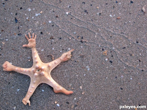
Nasty little buggar! Common in the South Pacific. (5 years and 3319 days ago)
Love it!
Nice idea, pretty funny result but 2 suggestions. First, imo the blending from the star fish to the hands and feet can be a bit more smoothly if you'd softly use some more of the star fish texture on the hands, etc. Second, the quality of the star fish image is soso around the edges (more blurry) that also affects the star fish itself. In case yu'd be able to find a sharper image, the added hands (which are all also sharp) ill fit better with the background (or if you want, make the hands as blurry as the background). Good luck!
Thanks for the advice Wazowski. I made the adjustments you recommended, i think it makes it look better.
LOL neat  love the idea
Thank you!
Nice idea! GL
 Great idea!
Howdie stranger!
If you want to rate this picture or participate in this contest, just:
LOGIN HERE or REGISTER FOR FREE
strange shape the tails looks like a butterfly and I think that is nothing left in that seas because his face looks a little bored )))
)))
I will dream green tonight
whhooaaa.......really, really total work here,.....very very great.....! fav....!
Intricate and time consuming are what I first thought! Then I thought...geeeez no wonder...it's beautifully done. Real eye candy, author!
Great!
Great entry.....GL!!
its so cute ,, it look not like a monster
beautiful entry with beautiful details
Beautiful as usual.........Best of Luck Author.
Congrats on placing !!!
Congrats
Congrats
Howdie stranger!
If you want to rate this picture or participate in this contest, just:
LOGIN HERE or REGISTER FOR FREE