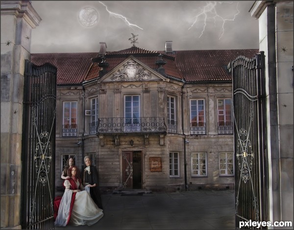
Betty's Brothel is in need of some repair and perhaps has a bit of eccentric clientele. (5 years and 3255 days ago)
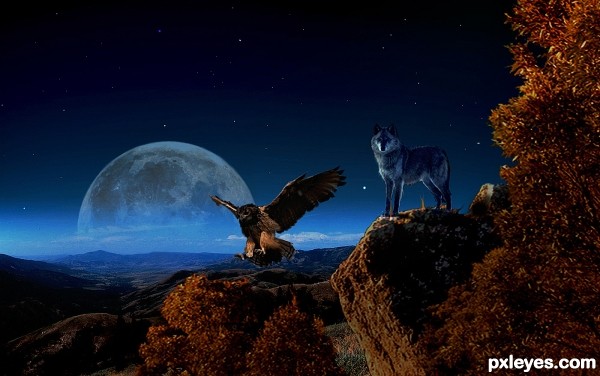
Thanks to night-fate stock for providing the landscape sources for the background here. The link back to the sources is not working I obtained the images used when I purchased a tutorial from DigitalHeavens.com (5 years and 3284 days ago)
Really nice!
I really like this, but it almost looks to be a bit too soft overall. Is that intentional?
This is fantastic job author., I like everything in it.., good luck to you
Wow, this has a really nice feel to it...almost surrealistic even. Top notch work and a good vote from me 
very cool moody work...they are the spirits of Indian warriors... ...GL
...GL
Very nice image, author, love the moon in there. Good montage of background elements. 
Howdie stranger!
If you want to rate this picture or participate in this contest, just:
LOGIN HERE or REGISTER FOR FREE
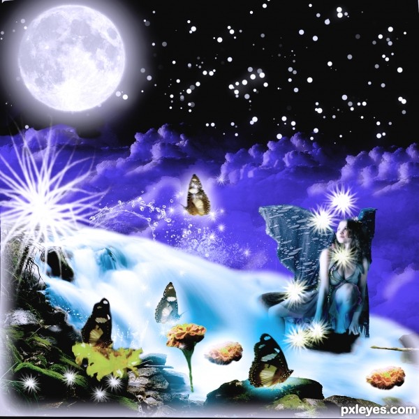
I would like to thank Mjranum of deviantart for providing this lovely girl. Then thanks to Falln-stock for those lovely Moon brushes. Thanks to redheadstock for those beautiful and impressive water and cloud brushes both provided by him. (5 years and 3307 days ago)
I am Back with a bang and brought this entry to life.......................I hope it stays till the end.
cool work...gl
Like the composition.... good luck
Thank you friends..........
Howdie stranger!
If you want to rate this picture or participate in this contest, just:
LOGIN HERE or REGISTER FOR FREE
Pretty song
So I decided to make a pretty picture to match it :) (5 years and 3336 days ago)
very very nice composition author...great colors too...u did fantastic work at start with good desaturation and good reflection...best of luck
3 Links set into place as per MOD request, link to artist's website... link to Wiki... link to his credit..hope that fixes the problem
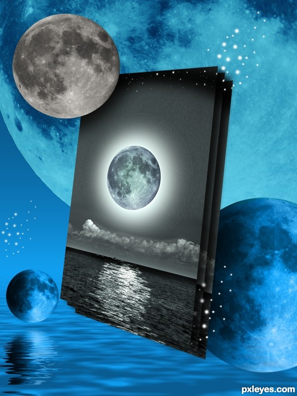
Only problem I see is the color from the moon in the background overlaps the moon which is in the foreground. Fix that and I see no problems. Good luck!
I think I got it Chalty... you have awesome eyes
author looks nice, but shouldnt the moon on the far right have a reflection just as the one on the left?
Very unusual and creative take on subject.
Howdie stranger!
If you want to rate this picture or participate in this contest, just:
LOGIN HERE or REGISTER FOR FREE
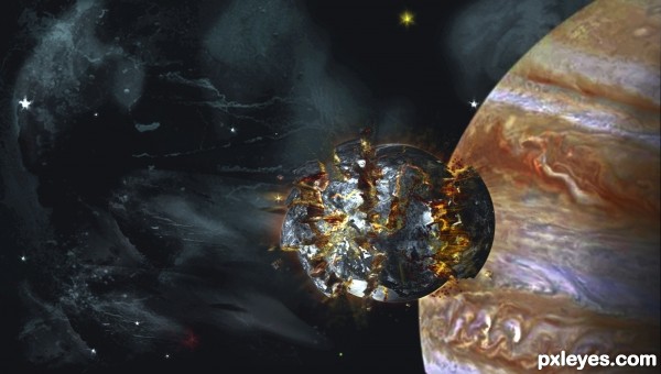
My version of this PSD Tutorial
http://psd.tutsplus.com/tutorials/painting/exploding-planet-photoshop/
This is a Premium membership tutorial: http://tutsplus.com/ (5 years and 3342 days ago)
hmmm, not sure if the photos from NASA are according to the rules. did you get permission from NASA? also, as far as i remember. unless rules were changed. no premium images and such, can be used. i could be wrong on that 2nd one.
NASA images are .gov, so they are considered public domain, I believe...
From the NASA website:
"NASA still images; audio files; video; and computer files used in the rendition of 3-dimensional models, such as texture maps and polygon data in any format, generally are not copyrighted. You may use NASA imagery, video, audio, and data files used for the rendition of 3-dimensional models for educational or informational purposes, including photo collections, textbooks, public exhibits, computer graphical simulations and Internet Web pages. This general permission extends to personal Web pages.
This general permission does not extend to use of the NASA insignia logo (the blue "meatball" insignia), the retired NASA logotype (the red "worm" logo) and the NASA seal. These images may not be used by persons who are not NASA employees or on products (including Web pages) that are not NASA-sponsored.
NASA should be acknowledged as the source of the material except in cases of advertising. See NASA Advertising Guidelines."
But I agree, that a "premier" tutorial that can't be publicly seen shouldn't be allowed...Just like tutorials in a book can't be used, because those without the book can't see the tutorial...
Without the tutorial to compare to, it looks like your exploding moon is wonky.
"Find any tutorial on the internet and follow it (and possibly give it your own interpretation). Don't forget to mention the tutorial you interpreted."
NASA has been credited. See my description I posted the link to the tutorial. You may not have total access to the detailed tutorial, however you can plainly see the jest of it. MossyB, you are certainly entitled to your opinion about my moon, mighty strange remark considering you also have an entry in this contest....
That Image of the Day on the NASA site has been a bookmark of mine for a long time, Dragoncide, those images ARE ok to use on this site, or for non-commercial purposes, as MossyB states. As far as this particular tut, yes, it's frustrating if you're not a member, but the images and video that they DO show should be enough for an artist to come up with something like they show. Author, you've done a very commendable job here, looks good to me! SBS is well done also.
nicely done 
i wasnt sure about the image being legal or not. thanks for the clarification everyone. it is a fantastic image. and still i must say is very unfair for everyone else who wish's to learn how to do such a thing. but as the rules do say yes your results are very on par.
Dragoncide, I do understand what you are saying. You too can become a premium member, there is lots of cool stuff there.
will you buy me a premium membership? =D
The tutorial had a highlighted simple planet to make contrast with the dark moon, and a saturated sky (meaning very blue, even if space is black) to make contrast with the gray exploding moon.
Even if this was not explained in the tutorial ( i can only guess, i don't know) - these tricks create the point of interest, the equilibrium of the image, so that the exploded moon really stands up.
In many tuts the authors don't explain this stuff, either cause they think it's obvious and well known, either cause it's in their blood and don't realize when they're doing it. But you should pay attention to these details - you can't really learn skills from others, but you can steal them  ..
..
whatever... 
Just trying to help, not to criticize or anything, it's a good attempt.
Howdie stranger!
If you want to rate this picture or participate in this contest, just:
LOGIN HERE or REGISTER FOR FREE
Sara Barth and Lies Meirlaen have both been notified of their image being used, by note thru Stock.xchng.
I like the overall colours of this image, it suits the elements in the image so well. Good work!
I like it overall however I think it could have been straightened up to make it look level.
I thought of straightening the right entry post, but decided it added to the state of decay. Therefore, I left it as it is, to be fitting of the theme.
This is nice entry author and with few tweaks this can be even better...Sky image and the overall mood don't go with each other...U have day light for the house and people but rainy dark sky...U have to made image darker or to find some other sky for this image...I think that some other sky would be better in this case...Also IMHO spiders are to big..For better blending u can use some color layers in different blend modes..There is slight difference in resolution of provided source image and images that u used so some color layers would fix that difference...sorry for this nit picks...
Erathion, all the changes you requested have been made, with the addition of a nicer weathervane and lightening.
Cool concept. The fairly uniform lighting makes it all rather blah, however. A lot more shadows would make it a lot more dramatic. Some green (for example) interior lights might convey both "open for business" and "eccentric."
it looks loke a painting, very nice good luck!
It's sort of scary, really like it!
Howdie stranger!
If you want to rate this picture or participate in this contest, just:
LOGIN HERE or REGISTER FOR FREE