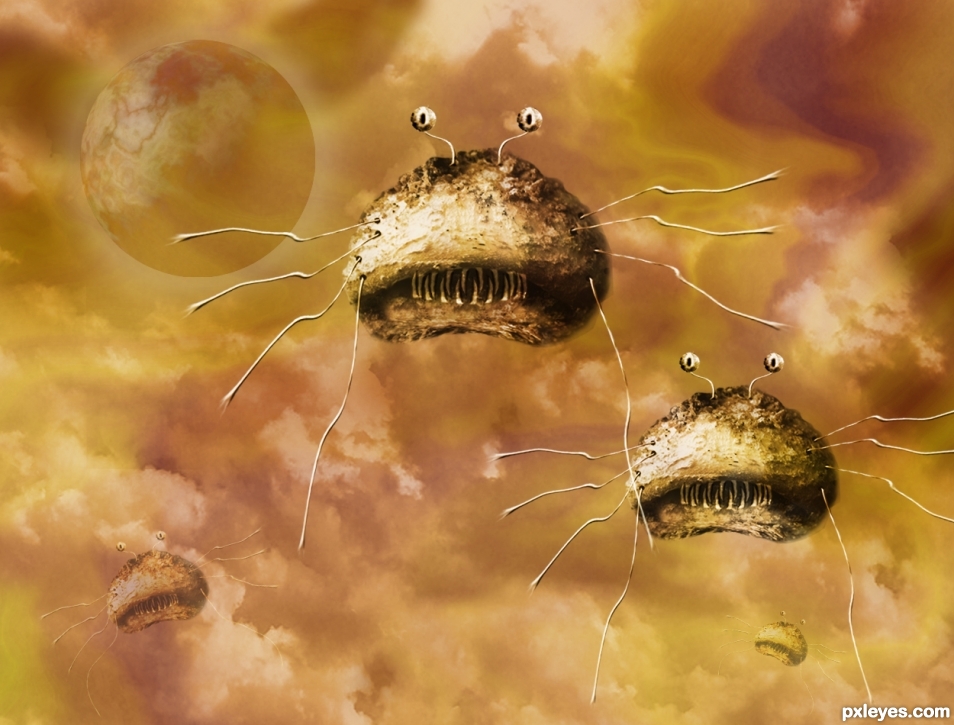
Thanks to Jacob Gube from flickr for the pic of the clouds.
Thanks to The Paessel Family from flickr for the pic of the mushroom.
The rest is just fun! Thanks Bob for suggesting the contest. (5 years and 2380 days ago)
(5 years and 2410 days ago)
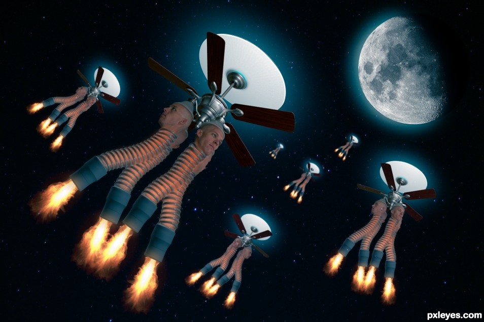
nice ...but there is a black squire around some flame.
You're right, I couldn't see it on my monitor. Fixed now.
A little inspired by the colors of Howard Johnsons I see. LOL, creme Aqua and red orange, can't go wrong with that LOL and getting a model to put their head in a ceiling fan light 4 TIMES!, BRAVO! good luck
nit pick.. the flame alignment on one of the engines is a bit off center, not important to the piece.. as I said, just a nit pick 
Thanks, appreciate the comment!
I absolutely love this  very creative thinking there!
Backstory: I was laying on the couch napping, woke up and saw the fan and thought, hmmmm, what if a head was in each of those light fixtures...thanks.
Howdie stranger!
If you want to rate this picture or participate in this contest, just:
LOGIN HERE or REGISTER FOR FREE
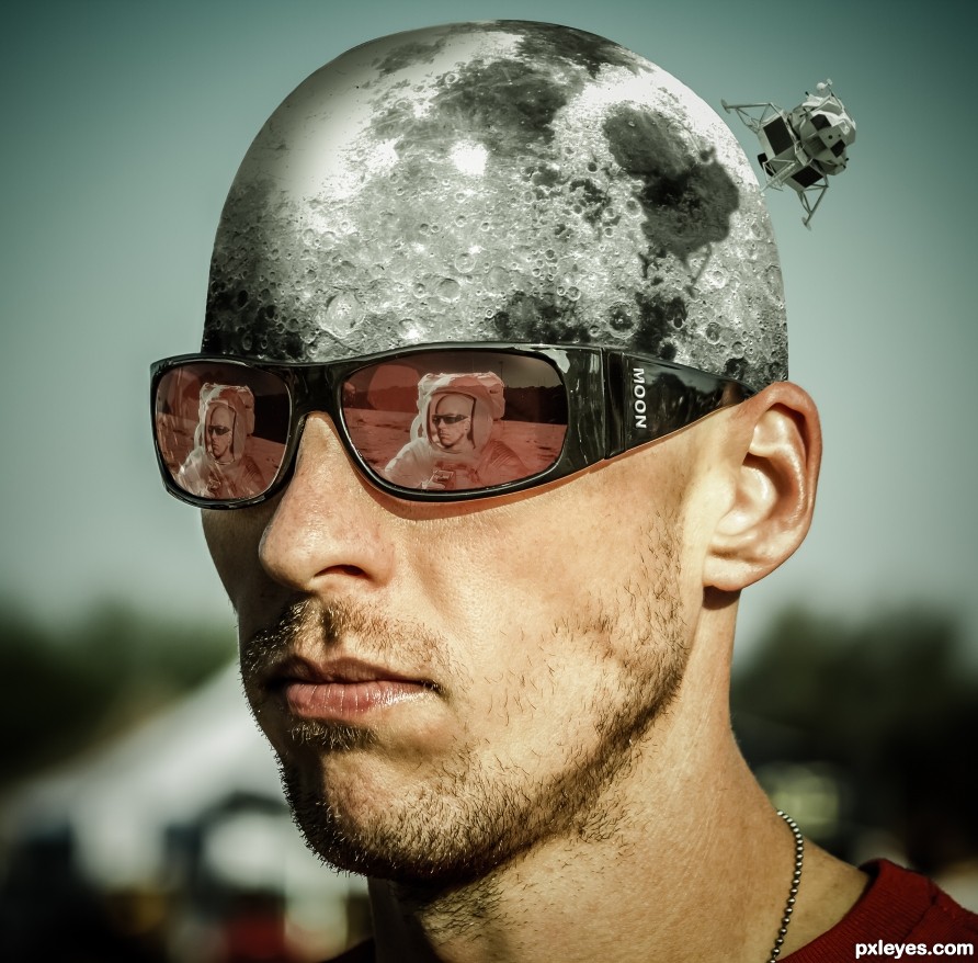
You can explore all you want but I won't let you in. (5 years and 2480 days ago)
This is so cool! Great concept. Well executed.
Thanks, appreciated!
Congrats once again Randy!
Thanks!
Howdie stranger!
If you want to rate this picture or participate in this contest, just:
LOGIN HERE or REGISTER FOR FREE
(5 years and 2518 days ago)
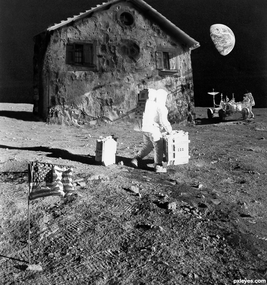
Shadows of craters on house don't match light source.
Thanks, fixed.
There should be more contrast between the light and dark areas on the house to match the other elements.
The house is made of moon substance and note that the moon doesn't reflect light the same way that man-made substance does, not as much contrast.
Congrats on this 3rd spot 
Thanks!
Congrats once again Randy!!
Thanks!
Congrats>
Thanks!
Congrats......!
Thanks!
Howdie stranger!
If you want to rate this picture or participate in this contest, just:
LOGIN HERE or REGISTER FOR FREE
(5 years and 2541 days ago)
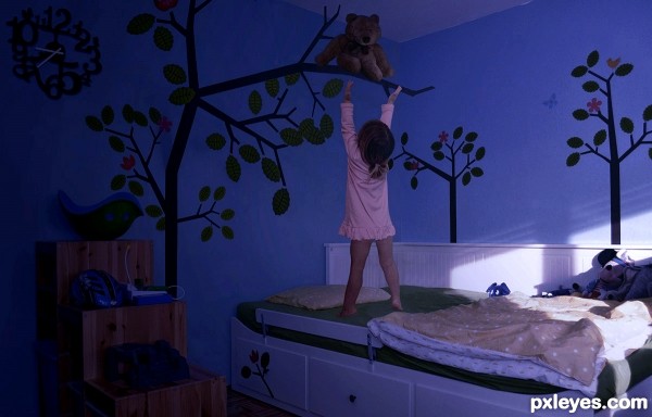
Well author, I'm not sure if my screen... but it appears very dark and hard to see...just check please...GL
Thankyou - I've checked it out on a different monitor and yes it was pretty dark! Updated.
And time to calibrate my monitor!
I think you may want to mess with the color balance here and give the overall image a more blue tone. I think that would really make this piece look like it was taken at night. Good luck author!
Howdie stranger!
If you want to rate this picture or participate in this contest, just:
LOGIN HERE or REGISTER FOR FREE
This is really good - the color scheme is excellent.
Thanks gibbsld.
cute little munchers
Thanks Driven.
Howdie stranger!
If you want to rate this picture or participate in this contest, just:
LOGIN HERE or REGISTER FOR FREE