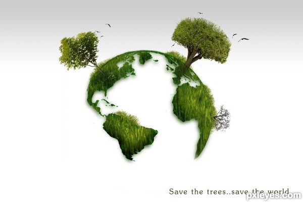
just used the source image and some masking techniques
see the sbs for details (5 years and 3567 days ago)
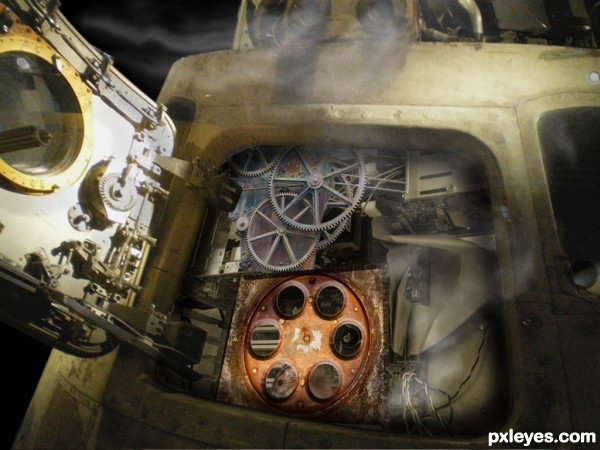
I've wanted to do a chop like this for a long time, just for fun. Sometimes when I give the computer a command, and put my ear to the tower, I imagine a little hamster running on a wheel in there, and hope his power doesn't run out! We may end up going back to steam power, it's much more eco-friendly. (5 years and 3602 days ago)
What can I say? Bingo, it's funny! 
awesome....
bizarre neat ness...hehehe
I see that hamster he looks like he's taking a break. This is a great job, quite a mechanical engineering feat not to mention a good Adobe engineering job. 
Very nice work author...gl
nice
How cool is this.......great job, gl
superb work............. all the best ..........  :
:

Howdie stranger!
If you want to rate this picture or participate in this contest, just:
LOGIN HERE or REGISTER FOR FREE
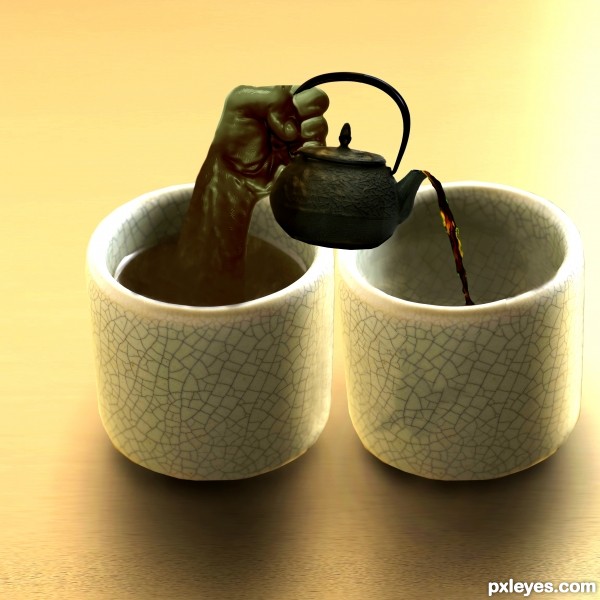
A mildly successful attempt at creating a liquid hand. :) (5 years and 3613 days ago)
haha..  great idea author! Best of luck
nice idea -- the liquid coming over the spout looks a bit off but a nice job otherwise
Cool idea, what alan says, good luck 
Creative idea. The liquid hand looks fairly good. Some brighter-white highlights (like at the left edge of the tea in the cup) might make it appear more convincing. The teapot doesn't seem tilted enough for tea to be able to escape. The perspective is also off; I would expect to see as much of the top of the teapot as I see of the top of the cups.
@dan: I agree with you, however, for the sake of argument, the teapot could be rotated along the x axis into the z plane, which would allow for the perspective to be correct and the tea would be able to flow from the pot
Looks realistic  Nicely done
Agree about the highlights, and since the hand is liquid it should be more translucent, but good idea.
I agree with CMYK about the transparency of tea hand; and for a green tea, the liquid that enter in the other cup is a bit dark, like black tea... But it's really a creative idea! 
The z-plane argument is technically correct and indeed explains the apparent lack of arc in the exiting tea (it's flowing away from the viewer). Maybe changing the title to "More sideways tea, sir?" would alert the viewer that a non-traditional interpretation is required. And I just realized that the teapot isn't casting any shadow (which might provide some insight into its orientation)!
A really creative effort. GL
Great idea, you did wonderful work with this. Good Luck to you!!
nice job
Howdie stranger!
If you want to rate this picture or participate in this contest, just:
LOGIN HERE or REGISTER FOR FREE
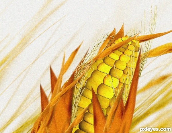
I made this corn only using source image, brushes, lightening effect, grain texture over the final image, curves, colorize, copy/paste. (5 years and 3615 days ago)
Nice  Good luck
Nice try, but try to improve color adjustment...
Color is matching with the theme...!
u can add narrow shades under the covering leaves of corn ... Good job i like it and good luck
i want corn..nice job..good luck
Howdie stranger!
If you want to rate this picture or participate in this contest, just:
LOGIN HERE or REGISTER FOR FREE
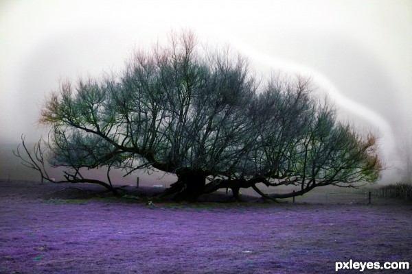
purple land (5 years and 3632 days ago)
nice color  i love purple
nice effect ,i am not sure for that white line around the tree,its a bit distracting...
Nice job =)
fantastic.....
Howdie stranger!
If you want to rate this picture or participate in this contest, just:
LOGIN HERE or REGISTER FOR FREE
Poor cheerleader,who will save her if we all start saving tree's...Great thinking author...well done
thanks Nebojsa for the comment
Its reaaally cute
I agree!
Great job!
Howdie stranger!
If you want to rate this picture or participate in this contest, just:
LOGIN HERE or REGISTER FOR FREE