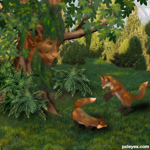
This was inspired by watching my cats play. (5 years and 3519 days ago)
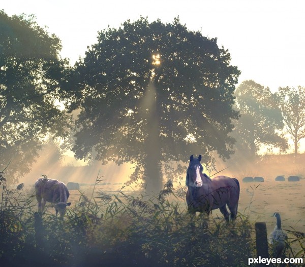
FLICKR advance search for the two words misty morning.
Credit goes to: OliBac,squacco, EssjayNZ, and carnagevisors (5 years and 3552 days ago)
Really really beautiful... it seems I'm there, breathing the morning air, fresh and a bit cold.
awesome!
this is really good
There are a few single grasses on the foreground bushes breaking up, looking like going behind the objects. As the light comes from behind, I would make the objects a tiny bit darker from the shadow side, but overall this is a very good blend. Looks very realistic and nice for the eye.
good luck .
Beautiful scene, author, looks quite realistic. 
Beautiful work and very nice blending. 
Fabulous serene scene author...good luck
very nice work, the duck looks mean , but I`m sure the horse will take him 
Howdie stranger!
If you want to rate this picture or participate in this contest, just:
LOGIN HERE or REGISTER FOR FREE
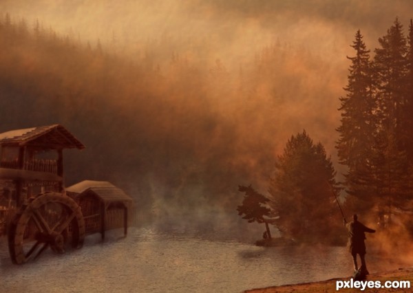
Thanks to Evgeni Dinev and Tom Curtis. (5 years and 3555 days ago)
Very nice! gl
nice color n mood, gud luck author
Very nice work author,great colors and fabulous mood.Only thing that bothers me,picture of the lake looks like pre manipulated image...I am not 100% sure but colors of the image,mist and some other details look like some other already worked on original photo...any how i like your entry very much and wish u best of luck...
nice
Well, it's quite difficult nowadays to affirm which photo is natural or premanipulated. And sometimes we can see really unbeliaveble colors in the sky with our own eyes... I hope this shot is ok (author, be aware that premanipulated images are not allowed, ok?) Otherwise, it's a beautiful blending of images. GL!... 
Great atmosphere and fantastic colours the only thing that is bothering me is the lighting on the fisherman i think if you flip him it will work better..... going by the tree shadows in the water
Water wheels don't sit in a lake, they are moved by running water.
I understand your concerns about the image but it was used in good faith. The photographer doesn't mention whether the image has been manipulated so I presume it's just a great shot.
Love the mood of this. A great piece of art. I can see it blown up and hung in someone's den!
Howdie stranger!
If you want to rate this picture or participate in this contest, just:
LOGIN HERE or REGISTER FOR FREE
(5 years and 3562 days ago)
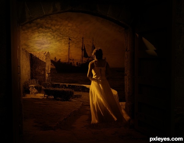
Nice sentimental scene, colours are good so is the composition my only suggestion would be to crop the image down, bit too much negative space.
thanks, warlock.....hope this one could be like the one you suggested....

Very well done author, I'm just curious about one thing, the door on the right seems to have a sort of a lighter colour at the top on it, it might be just me, but great image anyway. GL
wow this image has a very cool feel to it good luck!
Very nice improvements author! Its has even more interest now you can see the finer details…..still think you should crop it down (more a personal taste thing tho)
could add more lighting imo. nice composition though, gl 
Very nice composition author...lovely mood...best of luck
Beautiful! But is she happy because her captain is coming back early morning or is she sad because he is going out early morning?
I have a general suggestion to your works, you should make a bright scene, other than dark or dim scene, because as my experience in Pxleyes, the brighter entries are higher rated than the darker ones.
Howdie stranger!
If you want to rate this picture or participate in this contest, just:
LOGIN HERE or REGISTER FOR FREE
(5 years and 3573 days ago)
i like it, but i think the image is too saturated
EDIT: much better! good luck
thanks elficho i just fixed it. The reason why it looked so before is because it was CMYK
nice!
thanks
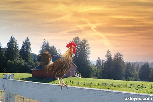
Very nice work author,only one nit pick,try to adjust color of the feathers to be similar, darker or lighter,i think its better to be darker,because of sharp line transition is visible...Any how i like this image,u choose good solution for bad source...Good luck
tahnk you erathion
I think if you turned the rooster the other way, it would have better matched the light source, but still one of the better entries so GL!
ok
Howdie stranger!
If you want to rate this picture or participate in this contest, just:
LOGIN HERE or REGISTER FOR FREE
The green beard is the same color as the background, and at first glance looks like part of it. Other than that, this is a great image and imaginative use of the source!

WEEEEEEEEEEEEEEEEEEEEEEEEEEEEEEEEEEEEEEEEEEEEEEEEEE
Very cute and creative! CMYK46 is right about the beard. The hair, too, blends in with its own leafy environment and thus looses its impact. From the SBS, the hirsuteness appears to be a Spanish-moss-like thing. Spanish moss always seems to have a silvery/grayish tinge to me. A tonal shift in that direction might make the hair more distinct. (Having the beard be in front/on top of the fronds of the far fern might help as well.)
Very well done author.
Great entry...well done author
Beautiful...
That was nice... congrats to be in among the best 7.
Howdie stranger!
If you want to rate this picture or participate in this contest, just:
LOGIN HERE or REGISTER FOR FREE