(5 years and 3878 days ago)
PLEASE READ:
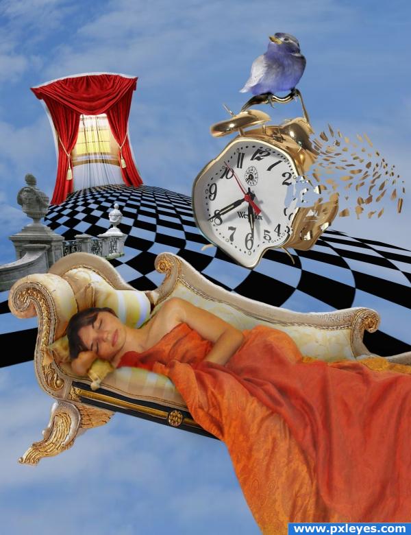
the theme said near or distant future. I have gone for near future.
A mother's dream of the future.
This depicts how a mother sees her future. ---- sleeping past the alarm.
I know this is very different to all other posters... FEEDBACK welcomed
THANKS TO THE FOLLOWING FOR STOCK:
http://lunanyxstock.deviantart.com/ for curtains
credit Jusben and MorgueFile for clouds
Created by mconnors
for alarm clock
http://sitara-leotastock.deviantart.com
for the lady
http://vacuumslayer.deviantart.com/ for the window
http://two-ladies-stocks.deviantart.com/gallery/ for the little bird and balustrade
http://tattoomaus78.deviantart.com/
for the Sofa
(5 years and 3892 days ago)
very alice in wonderland meets Salvadore Dali... good luck 
weird idea author... the bird and the girl are not very clear images compared to how sharp and clean cut the rest of the image is. I don't understand how this is what the future will look like... more of a dreamscape this resembles. goodluck anyway.
wow this is very cool!
OliviaArts.. my future.. to sleep past the alarm. hheee. and anyone else who says in the future i will sleep in , even if it is just once.
AWEE.. you tell me it is only a dream?? not the real future??? 
thanks for the comments and feedback everyone.
alarm... oh boy totally understand that.. dont have one, i just get up before the sun does, that way i know my 3 year old wont come in and rip the blankets off me lol
Great!!!
that's funny, i was thinking dali myself, but apparently i'm not the only one...if i could do this kind of work, i'd have passed 2D Art!
Very creative, great result.
I love your image, but it doesn't seem on theme to me...
i agree CNYK 46 that my interp of the text written for the theme is a different angle.
however, it is based on the future. For many a future they wish for and hopefully achieve later in life.
Thanks for your comment. 
the clock looks great! the room too  well, everything's fine!
I like the idea
Howdie stranger!
If you want to rate this picture or participate in this contest, just:
LOGIN HERE or REGISTER FOR FREE
ONLY SOURCE (5 years and 3939 days ago)
Cool very nice idea and well done !
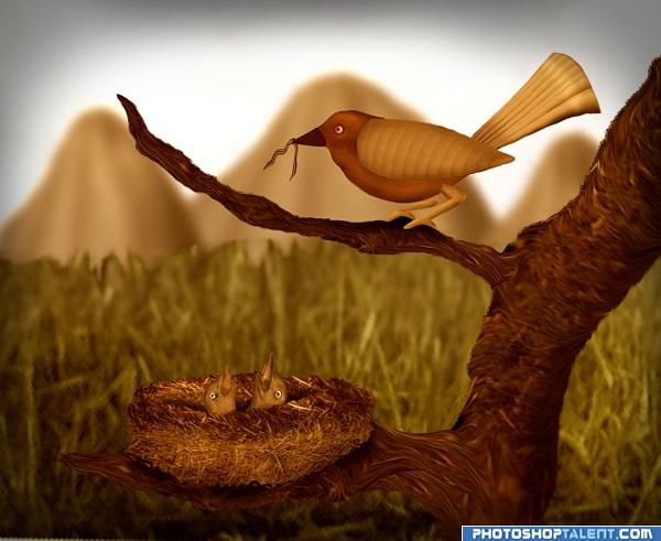
Edges of tree are too smooth, might be good to add some texture, too...the rest is good!  (On second look, do you think the background could be more interesting?)
You should add some background elements like clouds, flowers, birds dunno, it's kinda empty. Great work with the nest and the birds 
very pretty and awesome work.. a little lack of detail in the babies but nothing that takes from the work.. good lluck
HUGE improvement (glad I gave you high marks to begin with..hehehe... GREAT!!!
CMYK46 , Akassa and GolemAura thanks to all for yours suggesstion, I have added detail in the babies, changed background and made changes to edges of tree. 
very nice idea and good job.
cool
nice creation. only grass nearby is blur and in distance it's sharp. correct it
thanks gopankarichal, fixed 
Another great entry! (Maybe you could make the nest a bit darker...it looks a bit too bright right now.)
EDIT:Looks better!
Giggles thanks for suggestion, made nest a bit darker.
Nice Piece.
Nator thanks for nitpic, I have blurred the moutain
great job
Nicely done 
Nice work 
great 
Sweet.
Congrats! Very well done.
Congratulations for 2nd
congrats
Congrats! 
congrats!!
Congrats on 2nd!
Congrats!
Howdie stranger!
If you want to rate this picture or participate in this contest, just:
LOGIN HERE or REGISTER FOR FREE
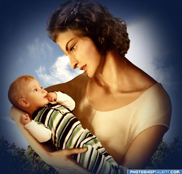
This is my old entry. I have deleted PSD and also SBS :-(.
Thanks to CynTurek, jazza and bergertv at sxc.hu for stock images. (5 years and 3940 days ago)
very nice
Very good one.
Nice job! Good blending! She looks a bit 'dazed'...
WOW
nice job
nice work!!
I remeber this great work.
very well done author! 

Congratulations for 3rd
congrats!
congrats
congrats
Howdie stranger!
If you want to rate this picture or participate in this contest, just:
LOGIN HERE or REGISTER FOR FREE
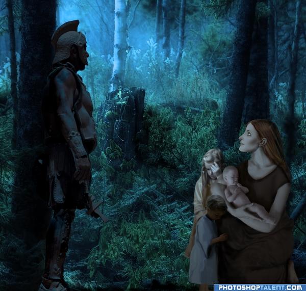
The unthinkable: to have to choose which of your children will live and which will die. (5 years and 3940 days ago)
that's a lot of sources and very good for covering your rump on any trouble with them.. horrific situation you have created.. just like sophie's choice.. good luck
very nice mood
nice mood. good work!! edges you can make more brighter(see the light source)
This is really nice, one thing, there seems to be a bit of a perspective problem with the guardian/ knight, i don't really think that really effects the overall mood (plus there's no easy way to fix it.) nice entry, good luck
awesome work
This looks pretty real, but I think it would be even better if the knight was holding a sword up in the air (pls don't shoot me)... also her arm on the left looks a bit thick, almost like a man's arm, I think. Overall mood is awesome and great use of source. Good luck with this. 
SUPER WOW
WOW!! Great!! very good job author!! i like this 
a lot of work and very well done  GL
GL 
Wow this huge! Nice work author! Good luck on this one!
nice job
Congrats, really lovely work 
Congratulations for 1st
congratulation 
Congrats on 1st place! Well deserved!
Congras!
congrats  glad that this one won
congrats
Congratulations.
Congratulations for 1st 
Howdie stranger!
If you want to rate this picture or participate in this contest, just:
LOGIN HERE or REGISTER FOR FREE
Really nice use of source. Beautiful job!
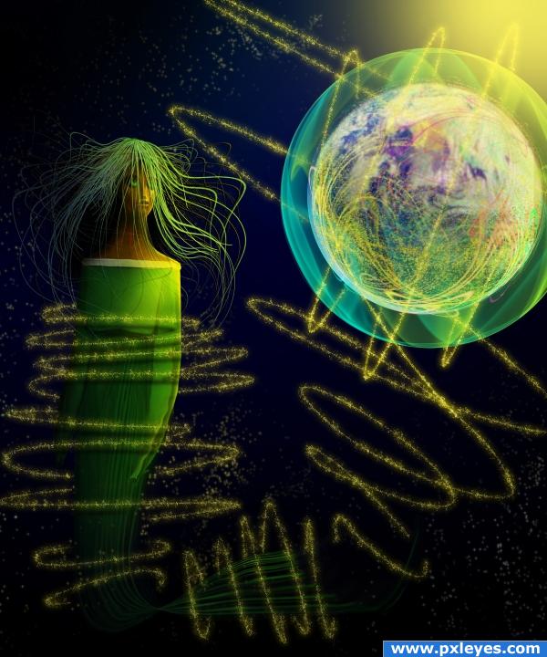
Nice light effects, but a bit chaotic...
...wow... Good luck!!!
thanks...the chaos was created to enhance her focal point
freaky ! i love iT.^
intresting, effect.
Love this!
This one is amazing and the colours are beautifully combined
Congrats for your third place!
Congratulations for 3rd
Congrats!
Excellent! Congrats!
Howdie stranger!
If you want to rate this picture or participate in this contest, just:
LOGIN HERE or REGISTER FOR FREE