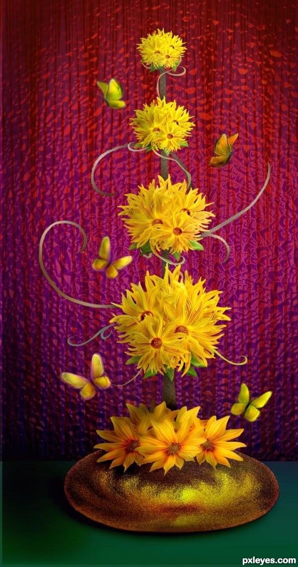
Pattern layer is from CGTextures.com, Rest of image is all from source and drawing with brush tools. (5 years and 3100 days ago)
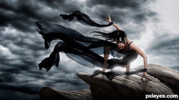
I loved how dynamic this pose was! So I figured some sort of super heroin (or perhaps villain) was in order :) (5 years and 3135 days ago)
The back light glow is a bit too intense around the butt and left leg, while non-existent anywhere else, which makes it somewhat distracting. The lighting on the top front of the face (see the reflection on the mask), and the top right of the arms is also inconsistent and confusing with such a strong back light...
Excellent Work..you're right, it was a dynamic pose, but u did an excellent job transforming her and placing her in a simple but very fitting background..GL 
Thanks for the feed back! and I appreciate the constructive criticism Mossy. I see now what you were saying. I finished it very late at night and after seeing it with fresh eyes in the morning you were right about the back light being over done. Also, I agree about the glare in the middle of the mask, but I removed it and it just seemed to take away from the image, so I just toned it down a bit.
I'm with Nator ...you should have kept the glare
I put the glare half way back  thanks for your input everyone!!!
very dramatic feel, good work.
awsm!!
If I were the model, I would have this hanging on my wall. This is terrific!

Thanks!!! I sent it to her maybe she will 
Congrats for 1st place, super pic
Congrats Robert  excellent work
Thank you thank you!
congrats!! cool n amazing 
Howdie stranger!
If you want to rate this picture or participate in this contest, just:
LOGIN HERE or REGISTER FOR FREE
(5 years and 3365 days ago)
Wonderful job ! GL ! 
I love the color and the mood ! Good luck author !
Wow, great job really!
Good luck
fantastic effects and great colors...well done author
Very Bird In Space meets Hideous Kinky  Good Abstract is very difficult to achieve to put it into a marketable state, this would look AWESOME in a Bank Entry Way as public art.. in an Airport? Not so much.. it would make the passengers nervous LOLOL.. good luck author.. Nice balance
I like the effect here, well done = )
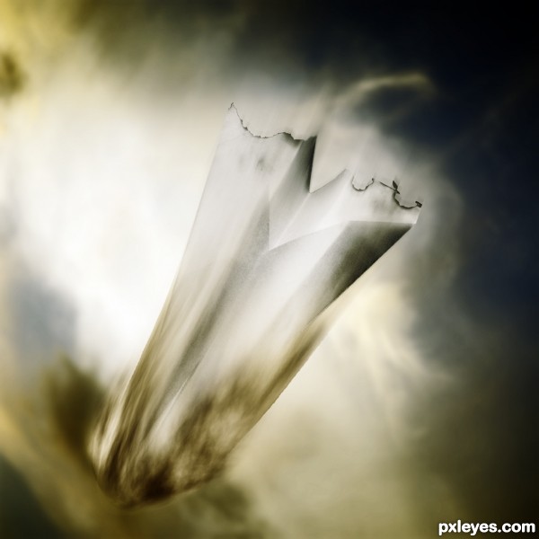
OMG! They must have lost their heat shield! Fantastic, well done author! 
Nice win congats
Congrats Ponti  nice work
congratulations...
Congrats!!
Howdie stranger!
If you want to rate this picture or participate in this contest, just:
LOGIN HERE or REGISTER FOR FREE
(5 years and 3464 days ago)
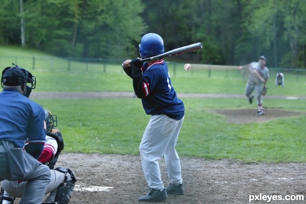
the mans arm would also be blurring as it would still be moving while the ball is travelling... also would the ball really be so perfectly round?
Good point on the arm, but the ball would not change shape. Maybe you've never seen a real baseball, but they are "so perfectly round," and do not change shape as they travel through the air ~ They're quite hard little things...
I'd lose the ball image at the pitcher's end, but good idea. 
Nice idea..good luck
can you refer me to a link to an actual shot of a baseball being thrown at highspeed with a trail... so that it can dis-prove my comment on that then?...
Very nice work author...Movement is well made...best of luck
I think the blur could benefit from a little curve. Right now it looks like their in space with no gravity. Good luck!
Howdie stranger!
If you want to rate this picture or participate in this contest, just:
LOGIN HERE or REGISTER FOR FREE
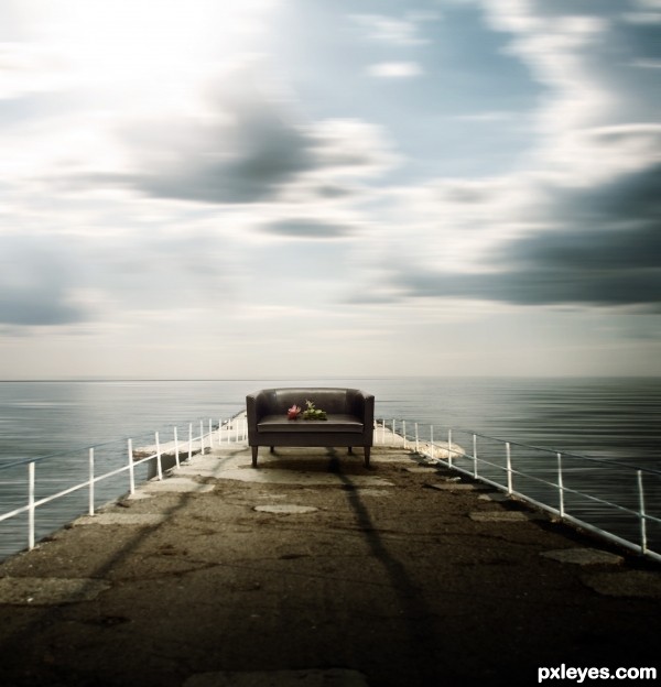
Be sure to look at the High Res :) (5 years and 3574 days ago)
Author, note the sunlight coming from upper right. I think sofa needs shadow... 
nice and smooth image 
Thought provoking, very nice work.
beautiful
very nice work author...gl
Actually erikuri, the sunlight is coming from the upper left and the sofa DOES have shadow, although the author didn't extend that shadow from the back legs and bring it forward, it comes from the middle of the sofa forward.
niiiiiiiiiiice!
Howdie stranger!
If you want to rate this picture or participate in this contest, just:
LOGIN HERE or REGISTER FOR FREE
Congrats
Howdie stranger!
If you want to rate this picture or participate in this contest, just:
LOGIN HERE or REGISTER FOR FREE