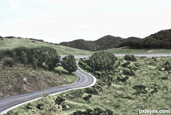
Thanks to dlockeretz
I change the image in HDR (5 years and 3047 days ago)
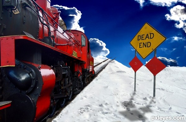
The engineer should have checked the map! (5 years and 3090 days ago)
cant check your first source.. link dont seem to work for me
Ok, should be good, thanks!
Pretty cool.
Link one doesn't lead to image used.
That is the train that was used. It is a working link.
It is from this set here: http://www.public-domain-image.com/transportation-vehicles-public-domain-images-pictures/trains-and-buses-public-domain-images-pictures/steam-locomotive-train.jpg.html
But putting this set link in doesn't seem to work for everyone so I've had to link directly to the image itself.
The image makes no sense, because you've put the "dead end' BEHIND the engine, not in front of it...Interesting idea, but it just misses the mark a bit...
The link you added works for the train. You've got 2 different light sources: Light on clouds from upper left, light on sign & train from upper right. Suggest flipping the sky background so they match up.
OH! Great catch CMYK46! I'll do just that! Thanks, you are very helpful!
Also, the sign is behind the engine because engines usually go fast and stop slow. Hes going to drive off the edge to his doom. Its showing that the driver did not see the sign in time and is still going. Poor guy :P
Only if he's backing up. Perhaps you are not familiar with older locomotives, but that engine is facing the viewer, not the broken track behind it...
Haha, I did not know! Oh well, I guess hes backing off the cliff. Anything possible with PS! 
Thank you for telling me, I will use this info for future reference.
thnx author for fixing the link and yeah lol thats exactly what I was tryign to see before i was going to comment on it.. hes goign the wrong way and can not possibly read that sign :P
its all good.. so much to think of when creating an image.. GL

Howdie stranger!
If you want to rate this picture or participate in this contest, just:
LOGIN HERE or REGISTER FOR FREE
(5 years and 3149 days ago)
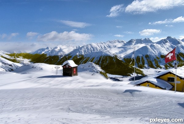
The gold on the LH side in the distance is too saturated. Colors fade with distance, and it's the same shade as up close, which looks odd.
Howdie stranger!
If you want to rate this picture or participate in this contest, just:
LOGIN HERE or REGISTER FOR FREE
(5 years and 3156 days ago)
Votes and Notes
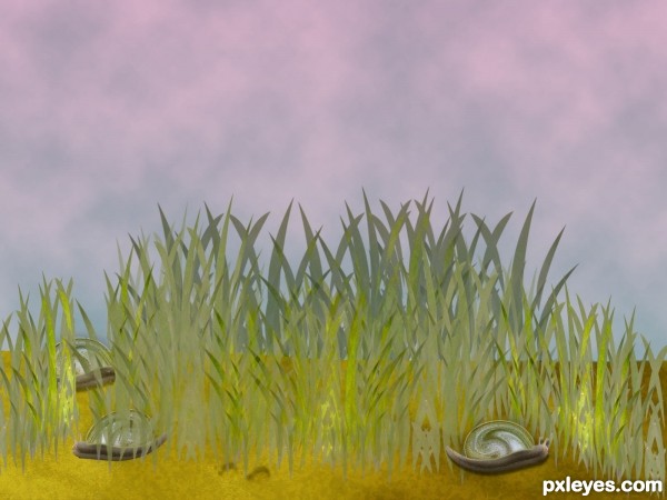
Looks like grass is growing out of the snail on the left, and the edge of the rock is too smooth for that texture.
EDIT: On second look, some of the grass is transparent.
The grass color is a bit bland, and the rock looks very flat and "cut and paste," but that may be the effect you were going for, rather than realistic...
ok thx guys , great notes :
- the mountain's gone
- grass's fixed : colours and position
Transparent grass removed ............. !
Howdie stranger!
If you want to rate this picture or participate in this contest, just:
LOGIN HERE or REGISTER FOR FREE
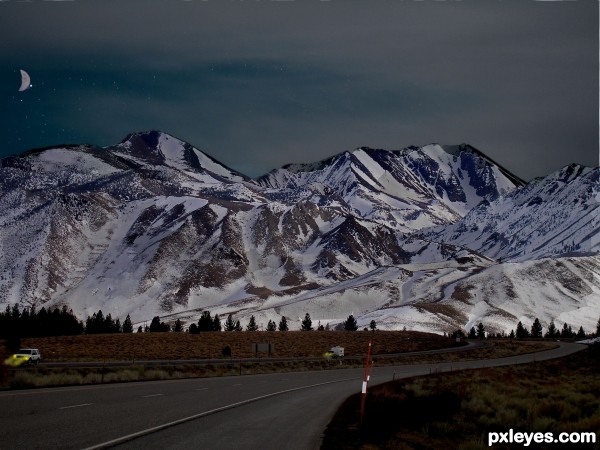
(all own images) (5 years and 3209 days ago)
The lights from the car is a nice detail, but something tells me that the sky can be way darker. Good luck!
I totally agree with wazowski. This looks like dusk at best. A snowy background is a good choice for maximum reflection of moonlight—except I see the (half) moon is in the background, so let me change my observation to 'mountains make for a dramatic silhouette with heightened star-light shadows thanks to the snow.' I think the rear vehicle's headlights could be stronger. And the angle on the front vehicle's headlights should be higher. More white in the headlight light would also be warranted IMO as would more feathering of the edge along the mountain ridge.
I think your source pic has a lot of potential and there's still lots of time to realize it. Note that the pole thing in the foreground needs to cast a shadow consistent with the primary light source.
thanks for your comments! I changed it up a bit. quick question though: what do IMO and feather mean? (sorry I'm a little new to this)
IMO - In My Opinion.
Feather - A technique to smooth the edges of an object.. or to reduce the hardness of the edges..
there we go. did some more editing. thanks for all the comments
This image reminds me of being up North in early September... it is quite light until very late ... this feels like it would be around 10-11PM!
Nice work ... it has improved from your first uploaded image... although it would be nice to have a Hi Res 
Howdie stranger!
If you want to rate this picture or participate in this contest, just:
LOGIN HERE or REGISTER FOR FREE
Tons of work to build this one, and pretty well done too. Except for that one clump of trees near the centre looks like the cloning is too regular, not much else wrong with this one.
Thanks for this comment .
Howdie stranger!
If you want to rate this picture or participate in this contest, just:
LOGIN HERE or REGISTER FOR FREE