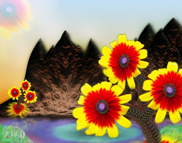
Only the source file and PS. (5 years and 3667 days ago)
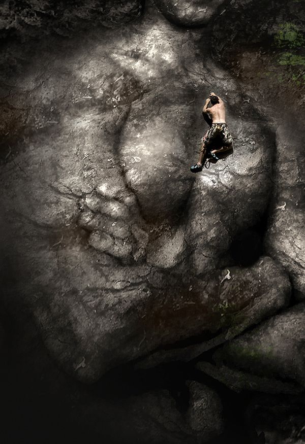
Used pieces of rock to cover the man with, used multiply for blend mode. Added more rocks behind him. Used clone stamp with background to blend. Masked rock climber. Copied onto rock image.
Credit goes to Ruslan for providing the muscle-man image. (5 years and 3678 days ago)
Nice idea....would look better with some color on the rocks
liitle more closup is best i think

edit: I gave it a little colour and brought it slightly closer. Thanks for the input!
Brilliant! Very creative, and highly resolved.
Not bad work but minimal use of "bad" source image...good luck author
congrats on 2nd place
congrats for the second place.. very well done
Howdie stranger!
If you want to rate this picture or participate in this contest, just:
LOGIN HERE or REGISTER FOR FREE
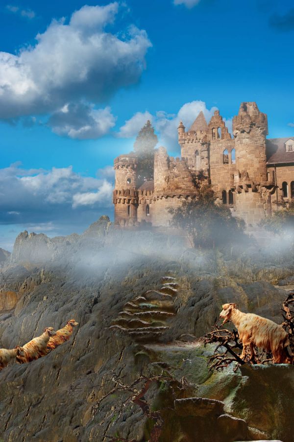
Thanks to hesselink at morguefile for the castle ruins photo; to clarita at morguefile for the mountain goat; to mqtrf for the stone stairs at pxleyes; and to xandert at morguefile for the dead tree photo; (5 years and 3685 days ago)
It's very nice, but, I don't know, the first goat on the left looks unnatural, maybe it's the feet, they aren't horizontally positioned.

nice idea, wd 
Congrats!! 
Howdie stranger!
If you want to rate this picture or participate in this contest, just:
LOGIN HERE or REGISTER FOR FREE
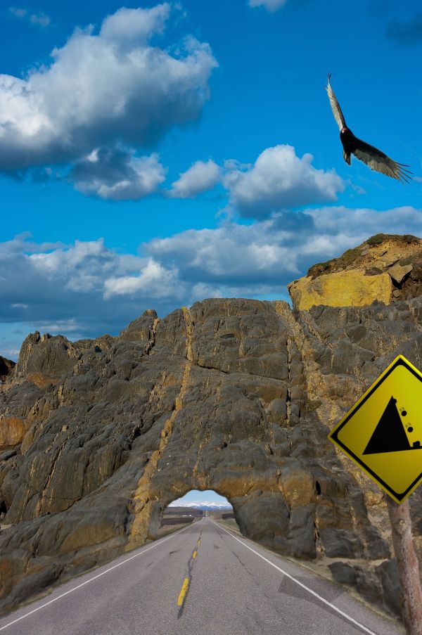
simple comp using 3 external sources and sign illustration (that I couldn't get to look any more realistic) (5 years and 3690 days ago)
Good! But I think underpass is a little low... 
Good idea but you need more depth and heigth on the tunnel. ; )
Thanks guys, quite right! I`ve changed the height to let those big trucks through 
fantastic work...good luck author
Look out for the boulders. Nice one
Nice idea ... like it... it reminds me of the old 'Road Runner' cartoons !! lol
Good Idea but could be made a lot better by making the tunnel look longer (looks a bit 2D)
Howdie stranger!
If you want to rate this picture or participate in this contest, just:
LOGIN HERE or REGISTER FOR FREE
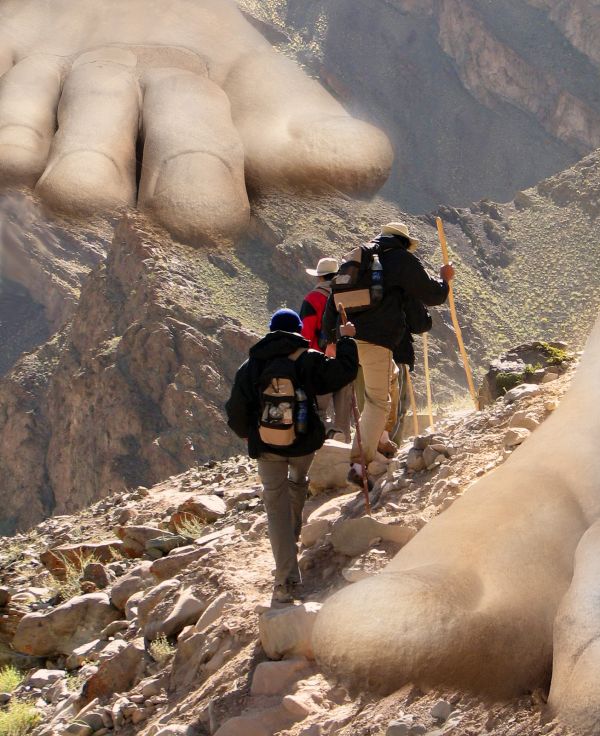
I used one external source
thanks to http://www.sxc.hu/photo/873518
Author: krayker (5 years and 3722 days ago)
Would be better to add some rock texture to the feet...
I agree with CMYK..overall, great idea..
Howdie stranger!
If you want to rate this picture or participate in this contest, just:
LOGIN HERE or REGISTER FOR FREE
like the stems, well done
Howdie stranger!
If you want to rate this picture or participate in this contest, just:
LOGIN HERE or REGISTER FOR FREE