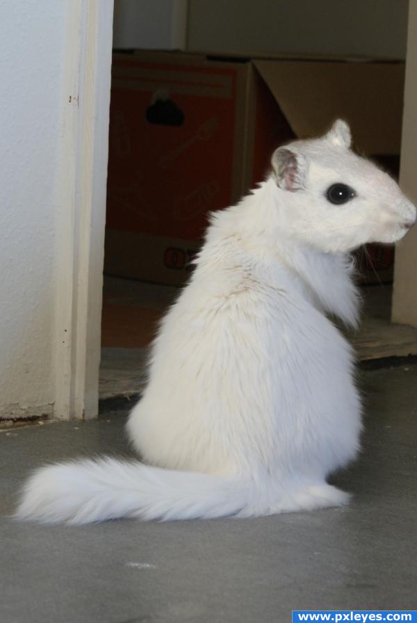
This is my resubmission to the mo(u)ose on the loose... It was removed from contest because i googled the image... it was my first entry... so this is the new one, or the same one, with legal source of the mouse that was created by carlohh... lol (5 years and 3917 days ago)
1 Source:


Looks great! This image looks better to me than your previous one. Extra marks for re-uploading, good luck!!
very much improved.. I agree with Ponti.. good job author.. extra points for correcting and learning.. excellent!!!!
Great idea, There is some tone difference between the head and body, for correcting it, add color adjustment layer with clipping above head and play with three slider ( try out on shadow, midtone and highlights) to match with cat body., color balance can also be used from image > adjustment menu but it will permanently change your layer, therefore using adjustment layer is safer .
.
Nice to see this back again...this version is even better. Good luck!

glad to see it back!!!!!!!!!!!! the image was awesome to begin with and i am so sorry it was removed great work here author this ones just about as good as the other one!
I'll have to ditto the sentiments above this one looks even better than 1st one!
I haven't seen the first version, but I really like this one! Very nice job with the blending!
Nice work on this.... thay say that you can never do it better the second time round. Well you just proved that it can be done better the second time round super stuff!!
lol! cool. nice blending.
this takes the cake! i mean cheese! lol great work, nice to see it re upped looks better than the first
very simple and very cool! the head is slightly brighter than the body, you might want to fix that
EDIT: curves should do the trick
it's like a bad joke to the cat! haha the mouse has taken over:d great idea
A funny idea, looks like a new species. One basic point about the composition, the nose gets cut off and makes for a weak layout. I know you ran out of image on the right but the animal itself looks good and would have been worth the trouble of putting him on a new background or cloning more image on the right.IMHO
Congrats for being top 7 with this mouat or couse or whatever it is
congratulations!!
Howdie stranger!
If you want to rate this picture or participate in this contest, just:
LOGIN HERE or REGISTER FOR FREE