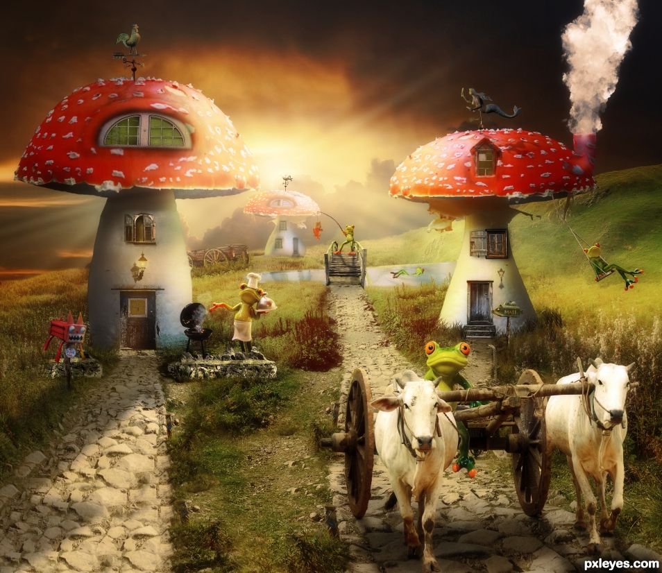
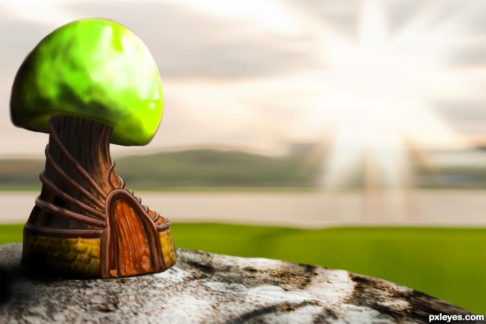
A heavy composite made from 32 source images. Please look at SBS. It's pretty cool. For some reason the image looks a bit fuzzy in this preview, so have a look at the Hi-res.
.
.
More Sources:
.
https://www.flickr.com/photos/afagen/12172162436/in/photostream/ (Grasshoper Weather Vane - Adam Fagen)
http://www.publicdomainpictures.net/view-image.php?image=174782&picture=old-wood-wall-and-door-background (Door 1 - Paul Brennan)
https://www.flickr.com/photos/domiriel/7431090190/ - (Door 2 - Domiriel)
https://www.flickr.com/photos/annegirl/3215280879/ (Door 3 - Lucian)
https://pixabay.com/en/frog-gesture-peace-funny-cute-1234514/ (Fishing Frog - Alexas_Fotos)
https://pxhere.com/en/photo/816102 (Swimming Frog - CC0 Public Domain)
https://pixabay.com/en/frog-cooking-grill-figure-funny-1708727/ (BBQ Frog - Alexas_Fotos)
http://maxpixel.freegreatpicture.com/Travel-Holdall-Luggage-Farewell-Frog-Go-Away-897418 (Frog in Cart - CC0 Public Domain)
https://pxhere.com/en/photo/1410360 (Swinging Frog - CC0 Public Domain)
http://maxpixel.freegreatpicture.com/Puppets-Toy-Play-Happy-Swing-390192 (Swing - CC0 Public Domain)
https://eirian-stock.deviantart.com/art/Angler-Little-Fisherman-135727125 (Fishing Pole - Eirian-stock)
https://www.flickr.com/photos/msakr/7145778381 (Fish Mailbox - ms.akr)\\nhttps://www.flickr.com/photos/newtown_grafitti/4403664634 (Cat Mailbox - Newtown grafitti)
https://commons.wikimedia.org/wiki/File:Mermaid_Weathervane.jpg (Mermaid Weather Vane - Wanderr Edwin B Waskiewicz)
http://www.geograph.org.uk/reuse.php?id=1807456 (Rooster Weather Vane - Maigheach-gheal)
https://www.flickr.com/photos/gravlax/4290627878/ (Lamp 1 - Paul)\\nhttps://www.flickr.com/photos/rover75/2223234917/ (Lamp 2 - Andy Leonard)
https://commons.wikimedia.org/wiki/File:Small_opportunistic_fly_checking_out_a_dead_blowfly_(5435632775).jpg (Dead Fly - James Niland)
https://nickistock.deviantart.com/art/Scary-Fish-176643480 (Fish - NickiStock)
https://www.flickr.com/photos/104284854@N07/10115182185 (Cart - KX Studio)
https://abluescarab.deviantart.com/art/PS-and-GIMP-Cloud-Brushes-247810856 (Cloud Brushes For Chimney Smoke - abluescarab)
https://www.brusheezy.com/brushes/50503-rays-of-light-brushes-2 (Rays of Light Brushes - Tijo)
(5 years and 981 days ago)





The bird weathervane, on the back hut is copyright all rights reserved and can not be used. https://www.flickr.com/photos/31124827@N06/37087184145/
Why do you hate me so?
Updated with a grasshopper weather vane. I put it on the top of the list in the comments to make it easier for you to find.
LOL... Now you know I don't hate you at all.... grrr apart from having to check 32 sources... it is up there with the most sources used. I must say I laughed when I found the fly, I checked the sources before looking at your sbs. Everything is AOK now.
I figure that checking sources can be a huge pain. Seemed like it took me half an hour just to post the image and sources. I bet it took you a while too, especially searching for that darn fly!! Haha . Whoever you are, I would like to thank you and all the mods for doing wonderful work here at PXLeyes. You have made my stay here most enjoyable.
Why are the previews that we see on this page sometimes fuzzy? Really, that preview does this chop no justice. They need to up the .jpg settings a bit IMO.
I downloaded the preview and it is 153KB at 954X826 px. As a test, I went to save my .psd at the same size using "Save for Web". To make it 153KB, I had to set it at 50% quality!! That's pretty horrible. Is there anything they can do about this? I doubt many people really look at the Hi-res and all they will see are these low quality previews. Maybe I should make a forum thread about this?
Thanks. I don't know why, the preview always looks a bit soft, I always check the high res.
Great job with many sources but...but you give us a clue to your identity because when we look at the weathercocks on the mushrooms your sun is pointing North so we can conclude that you live ...in the southern hemisphere ! Elementary my dear Watson
Nothing gets passed you does it? haha
Love what you did here, but there's some sources which (color / saturation wise) jump out (like the stone where the BBQ is standing on). There's a plugin set by Nik software (owned by Google) which is free.

https://www.google.com/nikcollection/ The 'Color FX pro' is a great help to set mood to your image AND it helps blending those sources which stand out a bit.
When you download this plugin do download everything, because it is (still) free. This plugin has been sold to a French company last week and no clue if it stays free or not.
A request to help the mods:
if you make changes please use the red flag option to tell the mods what you changed so they do not have to recheck all the sources.
Rob. Whatever it is you are seeing, I can't tell. I spent a ton of time on this and lost 4 days of my life haha. I just messed around with the Nik Fitler for another hour and can't seem to make it better. I'm gonna go blind if I mes with this anymore.
I did run one of the Nik Filters called "Glamor Glow" which softened it up some. It looked good so I tried an old editor called "OnOne Perfect Suite 7" (OnOne perfect Effects4) and used a Diffuse Glow filter that was nearly the same, along with a Red Enhancer that mainly affected the mushroom caps.
Here is the image straight out of PS and before the OnOne Perfect Effects. Maybe you can mess with it and tell me what's wrong?
https://i.imgur.com/L06XYAr.jpg
Don't get me wrong, I do love your entry. Think it is really well made!
Personally, I always use this plugin to make some all over color changes which, IMHO in the process also, help blending the sources together.
Excellent work. You certainly set a high standard for us to try to follow.
I think its hilarious that you made the source police check all those sources and especially funny that one went searching for the fly before checking the SBS. I agree with you about it being a pain to list all the sources but it must be worse for the people who need to check all sources on all entries and see how they were used in the work. It's not something I would volunteer to do unless I had nothing better to do.
I think there would be more entries in these contests if people didn't need to list sources. It takes a lot of time to make large lists like yours as well as a detailed SBS and not everyone has that much spare time. That is most likely why we get very few entries which are so detailed with so many sources.
By the way, I looked at the high res version regarding the stones which the BBQ and letterbox are standing on and I personally don't think it is the color which is making them stand out more. I think it is the sharpness of the stones. Try softening them down a bit to match the sharpness of the grass. A slight surface blur should do it if you want to perfect it more. Otherwise it's perfectly fine just as it is.
I'll get back to your other post, but I need to go play some video games to relax my mind. I totally agree with you about the wall being too sharp. It had like a lot of "chunks" in it or w/e they are called. I tried Blur and it took out the sharpening but made it look blurry even with a .4px. Blur. Then I remembered that PS had a denoise filter so I used that and it made it better. Don't know if you can tell the difference but I can upload the previous version if you would like to compare. Thanks for your suggestions SA. I think you were right on the button.
Looks great.
Congrats BWR, I love this
Thanks MM. It was a challenge.
Congrats brah!
Congratulations. Superb work.
Howdie stranger!
If you want to rate this picture or participate in this contest, just:
LOGIN HERE or REGISTER FOR FREE