Other source:
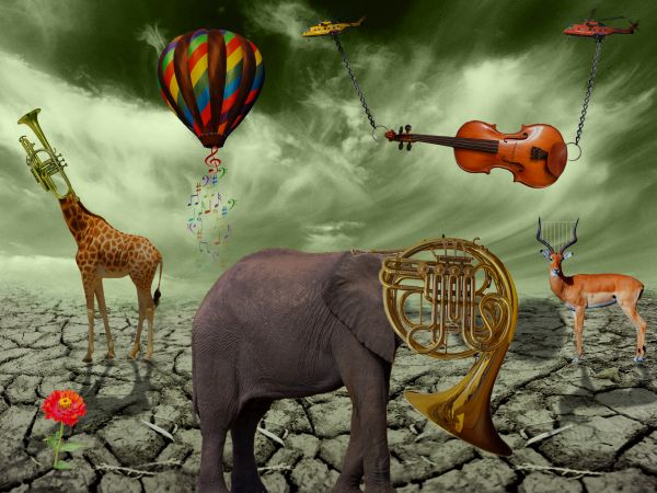
http://www.flickr.com/photos/8078381@N03/3855667484/-Giraffe
http://www.sxc.hu/photo/880227 -Big chain
Updated :with shadow :) (5 years and 3709 days ago)

(5 years and 3742 days ago)
Nice!
Nice...could use a SBS...
56
nice!
very nice 
Howdie stranger!
If you want to rate this picture or participate in this contest, just:
LOGIN HERE or REGISTER FOR FREE

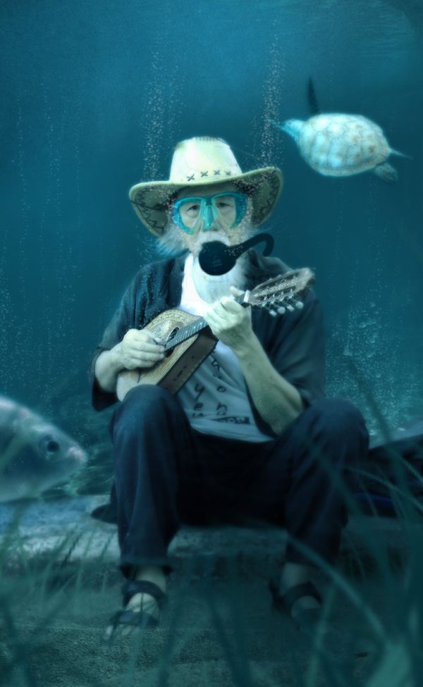
Here is a revised version for the people that said I was out of guidelines. I liked the original better and yes I know it's not likely for a human to adapt to breathe under water. I also know that if the earth was covered completely by water all the existing structures would be useless and we would most likely have new floating cities, like in the movie water world. There is a reason we don't live underwater now, we would all need submarines so we wouldn't get crushed by the water pressure. (5 years and 3743 days ago)
Really funny! Also really stupid...which way to vote...?
This is quoted directly from the contest guidelines: "Assuming the world is 100% covered with water and every city is fully covered with water, show how humans would survive at the bottom of the ocean."
You really think humans will learn how to breathe underwater? It's a unique idea and well chopped but not realistic...
realy nice....but.....?!
Maybe a scuba mask and lung tank ?? You still have time.
 OK, better. Not too sure how he's going to play the mandolin under water, but at least he won't drown.
Excellent pic, really well done.
Fantastic! Great blend of sources, very nice colour matching, very realistic!! Great great job...definitely one of the best.
beautiful 
cute
Dont know how it look in first version but now look awesome. Nostalgically, I can hear old man singing about green fields of his youth. 
Howdie stranger!
If you want to rate this picture or participate in this contest, just:
LOGIN HERE or REGISTER FOR FREE

I own the image. (5 years and 3814 days ago)
hmmmmmmm.........viewed 106 times and has 116 votes! Is that possible?
It is normal for a lot of entries but once the view number goes up farther, the vote number will start to slow down.
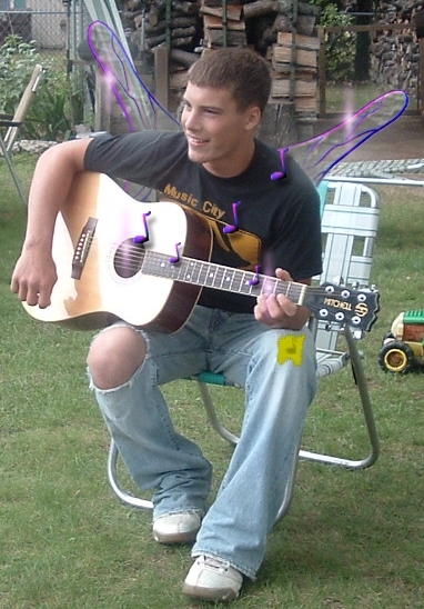
I love the notes!
nice
Howdie stranger!
If you want to rate this picture or participate in this contest, just:
LOGIN HERE or REGISTER FOR FREE

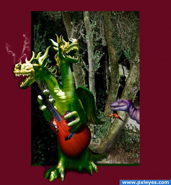
A swingin' dragon has just stepped out of the woods. Thanks to spygirl1978 for the photo of the dragon toy. It has been changed substantially from the original (see SBS). The background photos are my own. Smoke tools are by Photoshop Tutorials at Brusheezy.com. Thanks to all. (5 years and 3819 days ago)
Pterodactyl is too small...funny pic, though! 
Pterodactyl is too small...funny pic, though! 
Wow! Two heads are better than one....lol
That's just a baby dino and pterodactyl!!! thanks CMYK46
great 
Howdie stranger!
If you want to rate this picture or participate in this contest, just:
LOGIN HERE or REGISTER FOR FREE
Shadows will make this entry soooo much better.
nice but shadow
I agree with Ponti.And maybe to add some blending layers.Dark blue overlay layer and maybe dark brown color layer.Just an idea...gl
Agree with ponti55...shadows would make this really good.
Love it
Fantastic entry, best of luck.
the chains would get smaller towards the 'copters. where did the musical notations and 'harp' in the antelope's horns come from? overall, a very cool chop!
And where did the giraffe come from?
Fantastic!
thank you everybody for your comment. For pearlie : "harp" is made with a basic brush (diameter 4px) white...music notes are standard shape ,change color after each note............For CMYK46: because I didn't have only 10 link spaces and I used 12 picture I put other 2 sources in description (Giraffe is one of it )
Nice try....and a nice work....
Nice...
awesome, you have shadow!
I'm liking the colors here, good work
looks very familiar to a famous art peice hmmmmmm
http://media.photobucket.com/image/surrealism/Peyton1007/surrealism.jpg
So funny animals, especially the elephant in front
I really like your ideas. Higher score if hi res edges were chopped better. GL
Good one.
they look copy pasted u need to work on blending and lightning and shadows besides colors dont really fit
Howdie stranger!
If you want to rate this picture or participate in this contest, just:
LOGIN HERE or REGISTER FOR FREE