(5 years and 3242 days ago)

. (5 years and 3246 days ago)
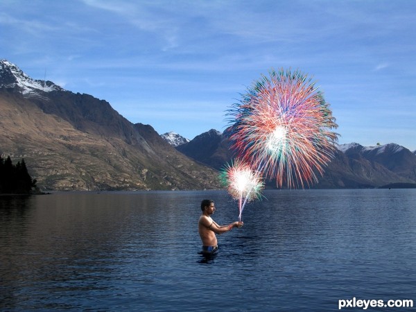
There is a reflection of the man in the water, but nothing at all of the fireworks... Also, the black along the outer edges hurts the illusion. If you go to Image>Adjustments>Selective Color and choose "Blacks" from the drop down box, you can lighten those and make them better blend into the sky.
If you showed the third degree burns and sizzling flesh on his hands, this would be very realistic and way cool! 
(Not to mention the missing reflection).
Howdie stranger!
If you want to rate this picture or participate in this contest, just:
LOGIN HERE or REGISTER FOR FREE

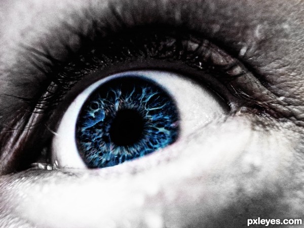
Hopefully this is on theme, I see this as a "selective coloring" even though I had to re-create the eye since there was a lot of reflection I didn't like. (5 years and 3249 days ago)
Looks like a real photo to me.
There's a horizontal line at the bottom of the eye (focus blur that ended up colorized) that you might want to clone out, but otherwise, I think this came out well!
Thanks for the kind comment and suggestion Mossy, I will work on it today.
If the eye is colored, I don't get why the face is grayscale...?
I don't understand what it is that you don't get ?
Cool! I would believe that the starting point for this image was an actual photo, so this seems to be right on theme to me.
Wonderful image to start with, then by reducing the colour around the eye and the work done on the iris itself the image really pops. I would try to get rid of the line at the bottom of the iris though, it is a bit distracting and takes away from the overall enhancement (I know it is in the original but that is what enhancing is all about  )
)
MUCH BETTER!!!
Cheers guys, I have made some adjustments!
nice work gl author..!!
really nice author like it
Thanks for the favs!
Howdie stranger!
If you want to rate this picture or participate in this contest, just:
LOGIN HERE or REGISTER FOR FREE

(5 years and 3269 days ago)
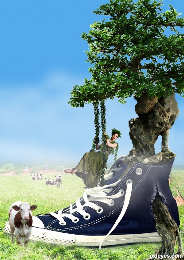
That mjrananum green girl on the vine swing is becoming her own meme...Interesting image, but the lighting of the shoe (LH top) does not match the tree (RH side), nor the cow (RH top)...It does match the green foliage on top of the tree, which is also reversed, though...
You may want to try adding some highlights with the Dodge tool at low opacity on the RH side, or flip the shoe. If you reverse the tree and the shoe foliage, the image will look more consistent than at present...
Light source direction is an important consideration.
Very interesting entry, GL!
I would suggest for future work that you spend a bit more time on your masking. It will help refine and enhance your work. It is a pain to get it right but worth the effort.
It all starts there, no matter how good everything else is, if you have left-over pixels, smudgy bits and outlines it can ruin a great image. You idea is very good, your masking needs some more work. To get you going try checking out this tutorial on how to mask trees ... hope it helps  http://www.pxleyes.com/tutorial/photoshop/1272/How-To-Mask-A-Tree-In-3-Minutes.html
Howdie stranger!
If you want to rate this picture or participate in this contest, just:
LOGIN HERE or REGISTER FOR FREE
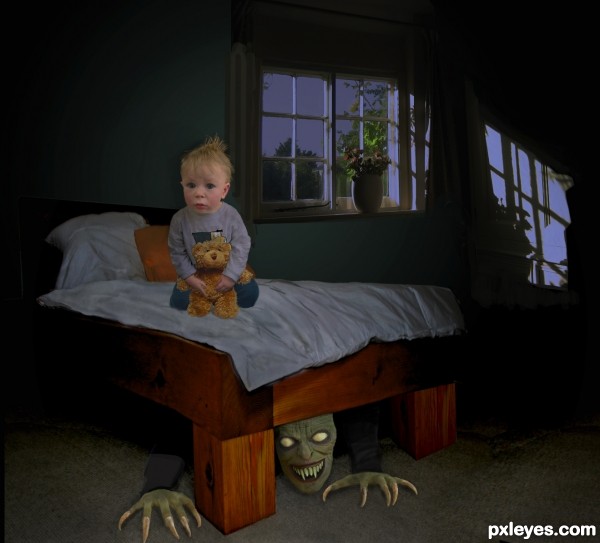
make the drop-shadow fall on the bed (not on the wall or side of kid)


add left-to-right, darken the kid's left side using "burn" or other method... you have to look at what direction the light source is....
the monster should only have the claws and portion of his chin in the light, the rest should be darker since under the bed
idea is great
well............... i won't be sleeping tonight lol
good work gl author..!!
There is no "drop shadow to fall onto the bed, since the light from the window is on the side, not above.
I did use the burn tool to darken the left side, but if I darkened it too realistically, you wouldn't really see anything of the image, it would be too dark...So I darkened the left side of the kid, and "globally" darkened the monster under the bed.
Thanks for your comments.
Good and scary! GL author.
Howdie stranger!
If you want to rate this picture or participate in this contest, just:
LOGIN HERE or REGISTER FOR FREE