(5 years and 3654 days ago)
1 Source:
- 1: source1
thanks to OeilDenNuit for the image HARNESS (5 years and 3657 days ago)
hehehe.. very twisted author.. I LOVE IT!!!
Super !
Howdie stranger!
If you want to rate this picture or participate in this contest, just:
LOGIN HERE or REGISTER FOR FREE
(5 years and 3658 days ago)
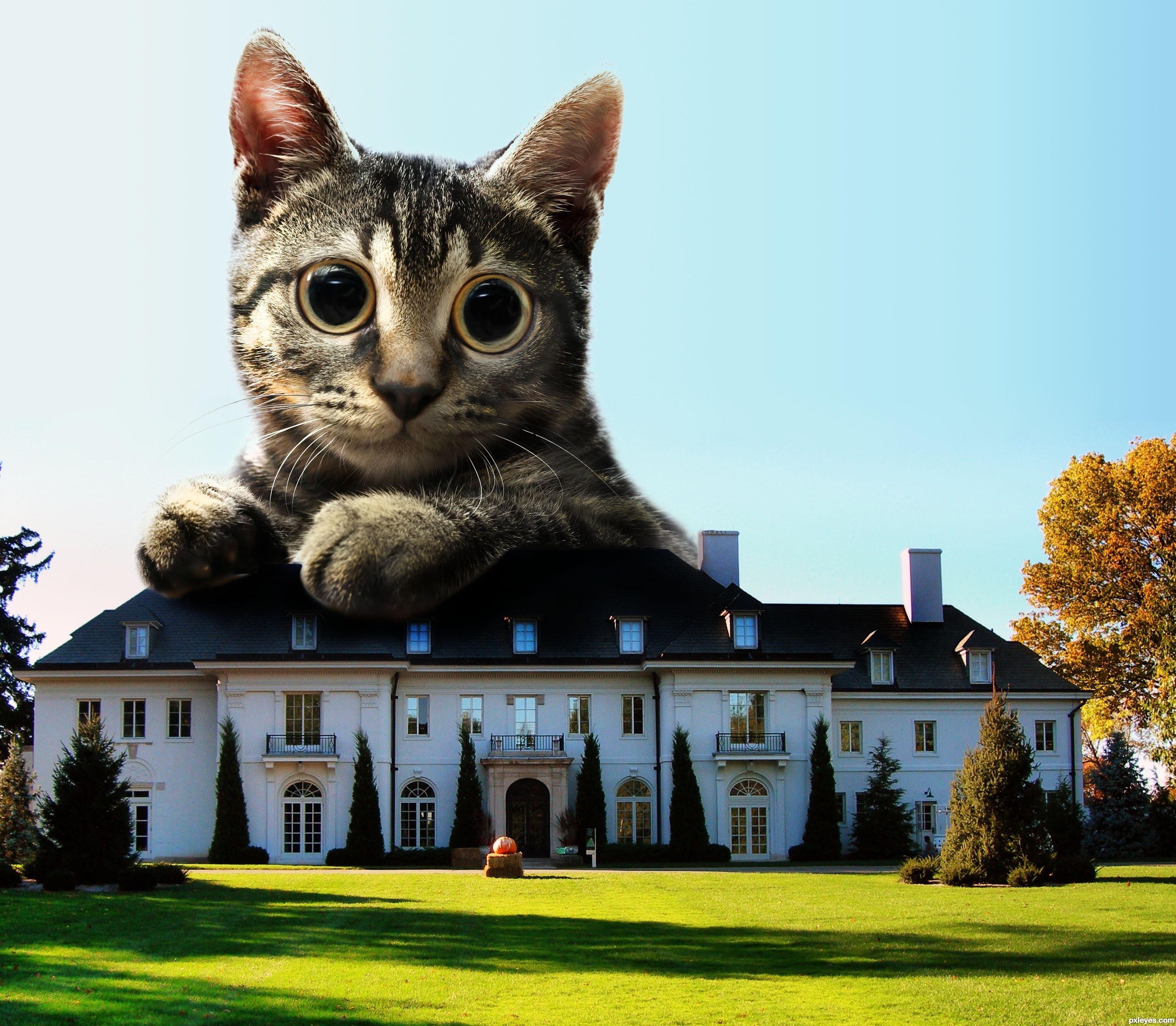
Nice idea, shadow is missing tho, if you take a look at the foreground the trees a creating very long dark shadows so
the cat should be too. I may be wrong tho.......
better hope that kitty never gets and eye infection.. LOL.. excellent work author!!
Nice lighting on the cat...but I think Warlock may be right about a long shadow just a bit from behind because the front of the house isin shade. Nit picky because I am a cat owner...the pupils would probably be smaller being outside however, he may be shocked sitting on a house. The lighting really keeps the cat from being flat. Nice job again.
I gave the cat a longer shadow, I think it's better now, thanks for the advice!
Howdie stranger!
If you want to rate this picture or participate in this contest, just:
LOGIN HERE or REGISTER FOR FREE
(5 years and 3660 days ago)
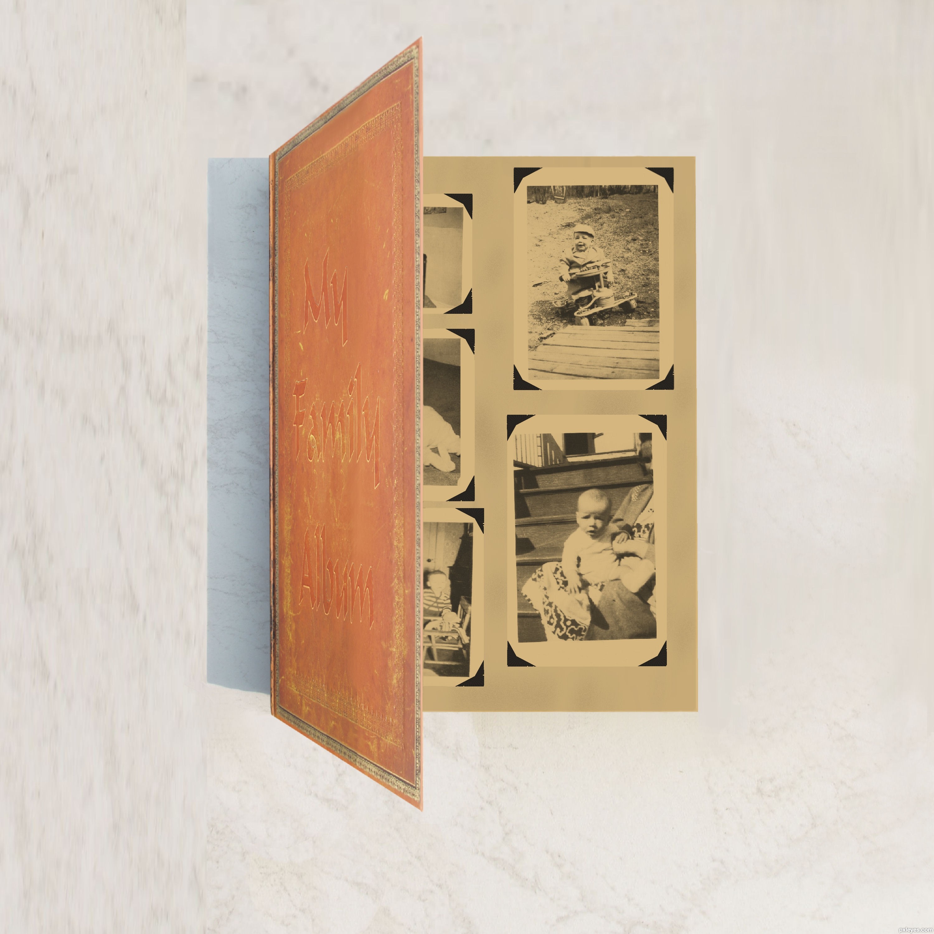
The cover is too garish, and the ribbon just stops abruptly. Try to make this more realistic, keeping in mind the cover could be more subtle. It also would have a light source, and hence a shadow. GL.
Thanks CMYK46 I hope this is what you ment. I did a little retouch far as the ribbon its just a marker and I didn't do anything with it. Its the same as original was same spot. I could have cut it out maybe?
Do you see how you made some parts a bit dark just on the edge of the binding of the book (to the left)? Trying doing that to the whole front of the book to give it an older look. Try giving it an overlay tone that makes it look older.
Thanks k5683 I did some changes to age it I think that was what CMYK46 was trying to tell me I added three colors to add some age to it does it look any better?
author... it's gud but cover is very bright.. and inner part is luk like old so give original book color to color than look like nice.. and your inner color(gray) that's need some grunge background than luk older book
i think you understand wat iam say
Ok Thanks all I have scrapped album and redid it I hope this looks better.I used original with adjustments.
ya.. it's seems gud but gray paper seems it creating paper so remove gray color and add old paper to your album
Ok Thanks here is change removing gray.
Howdie stranger!
If you want to rate this picture or participate in this contest, just:
LOGIN HERE or REGISTER FOR FREE
(5 years and 3661 days ago)
very good chop
It's a matter of balance! 

Howdie stranger!
If you want to rate this picture or participate in this contest, just:
LOGIN HERE or REGISTER FOR FREE
Photography and photoshop contests
We are a community of people with
a passion for photography, graphics and art in general.
Every day new photoshop
and photography contests are posted to compete in. We also have one weekly drawing contest
and one weekly 3D contest!
Participation is 100% free!
Just
register and get
started!
Good luck!
© 2015 Pxleyes.com. All rights reserved.


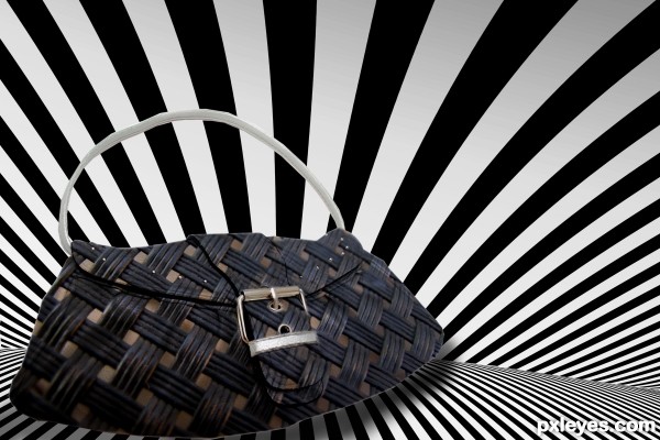
A very clever design. You should get rid of the light seal edge showing through, especially on the left edge of the bag. Left side/front is also quite blurry, it's like a picture taken with a camera that is out of focus. It could use a background also, white is always so.. boring.. Anyways, love your idea..
Gucci would be impressed
Very well executed!
Good idea...SBS would make it even better.
Creative. The far side of the clasp tongue needs an edge (looks like it melts right into the body of the bag now). I have to agree with Widiar that the white background is not very interesting.
Thank you all for your helpful comments.Changes are made.
wow...fantastic job...gl
Howdie stranger!
If you want to rate this picture or participate in this contest, just:
LOGIN HERE or REGISTER FOR FREE