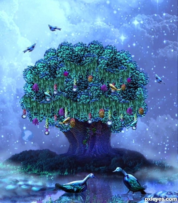
Thanks to the badastronomer and gustavo campos, both at flickr.com, for the eagle nebula and clouds sources. And to Martin Sojka (island) and floato (tree) at flickr.com (5 years and 3231 days ago)
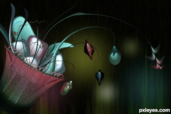
This was inspired by the flower based at the lobby.
Everything is manipulated from the roof of the gazebo.
Hope you like it. (5 years and 3240 days ago)
Superb work author...best of luck
Thanks a lot.
Really nice image, very creative textures.
thanks pearlie...
very nice compose of the background - and the rest is very good as well
Howdie stranger!
If you want to rate this picture or participate in this contest, just:
LOGIN HERE or REGISTER FOR FREE
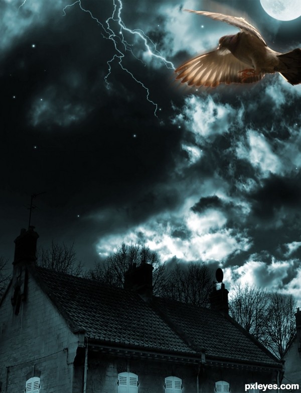
http://madyiordache.com/blog/2010/01/moon-flight-create-a-ghostly-effect-in-photoshop/
thanks to this tutorial
i had added the bird also from the tutorial link... (5 years and 3366 days ago)
wow cool
In her tutorial, madalina had some compositional tricks that she did not explain:
- those branches, create some sort of dynamic frame;
-the moon covered by the wing is the first checkpoint- it's not random that you find it in the lower 3rd of the image.
-pigeon has orange, to make a chromatic contrast, etc,etc.
The right half of your image is unatractive- compositionaly speaking, therefor i think that if you would crop it in half and keep only the left side, i would look so much cool.
Rotate that lightning strike 45 degrees.
You could also add a bit of orange on the pigeon.
Try it, and if it doesn't look better, never listen to me again 
agrees with grey
thank you Greymval....made changes...thank you 
It looks beautiful.
The image looks badly composed, although it has improved by adding color to the bird.
When you adapted the tutorial to include the house, you changed the overall composition.
The branches in the tutorial "framed" the focal point (the colored bird). Your house, with parts of another house on the side, throw the focus off the bird, and visually "weigh down" the image at the bottom. I would suggest eliminating the house(s) entirely.
thanks Mossy...this is my very old work done in 2009 ... thanks for ur comments..  i have the other version too with the same background also...i thought it would be too similar....i will add it in my sbs..
I have made changes again....thanks for the suggestions all...and thanks to locale for his suggestions on my entry.. 
very nice
Ooooo, great improvement  The bird resembles a little bad angel
Very nice piece author...gl
Howdie stranger!
If you want to rate this picture or participate in this contest, just:
LOGIN HERE or REGISTER FOR FREE
(5 years and 3387 days ago)
boy, that island sure looks mysterious....nice job, good luck!
fun fun fun
Pretty composition with a nice color palette.
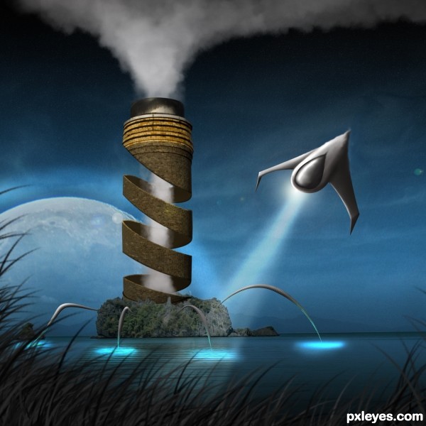
1. For some reason the shape of the spaceship ended bumped in the final result with masking probs., you could retrace it with pen tool and make it right.
2. The design of the ship is a bit confusing since the orientation of the wings points that it's front is in the upper side, while the cockpit and it's searching light, points the opposite.
3. Some description would really help since the design is not explaining : is the ship searching something or is it taking off ( in the 1st case wings are wierd, in the last case there should be some reactors or stuff, and the cockpit shouldn't be at the bottom).
If you have time, improve it, if not, it's one of the best around anyways. Good luck.
that is it ,it is amzing ,good luck
Thanks everyone for the comments! Greymval thanks for taking the extra time to explain your point. The waviness off the rear of the ship wasn't a mistake, I was trying to create the effect which heat creates near objects. 2. I could see how it would look weird, I was trying to create something non existent in terms of todays aircraft. I have added another step with a sketch of the side profile of the aircraft, hopefully you'll see what I was trying to achieve. 3. I'm not going to tell, I would much rather the viewer complete the story with their imagination. Thats why it's a mystery.
Fantastic piece author...well done
beautiful work author.......... all the best ..... 
I like this except for the wings on the spacecraft not being symmetrical.
The ship is better 
This is an excellent entry, but I think I'd take Pingenvy's advice and re-do the ship. GL author! 
Redone the ship, hope everyone likes the revision!
Revised ship is much better, but the light beam is misaligned.
Very nice, good luck author!
Congrats !!!
Congrats for 1st
Congrats man...well deserved 1st...
Congratulations on 1st place!
Howdie stranger!
If you want to rate this picture or participate in this contest, just:
LOGIN HERE or REGISTER FOR FREE
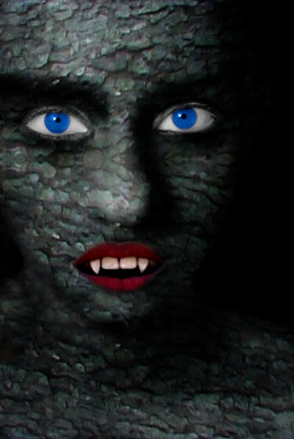
if you are wondering where is the source image,i used the tree texture and blended on women. i am wainting for suggestions.thx... (5 years and 3737 days ago)
The eye colour is a bit unnatural, try playing around with blend modes and lowering the saturation. As for the lips, try to use a soft brush to create more of a blend between the two. The mouth also looks slightly big. Good luck.
thank you ponti55. i have made some changes on mouth...
Good work.....I actually got scared looking at the pic...Though the mouth has still a little problem with the shape...But you have done a good job....Nice work....
Good pic!
Still not quite perfect on the mouth, but the eyes look great.
Howdie stranger!
If you want to rate this picture or participate in this contest, just:
LOGIN HERE or REGISTER FOR FREE
Where is this place..? Very dreamlike... I like it! GL
super fun!!!
very pretty and well done.
Love the birds and ducks! and what a magical place indeed.
Good one!
Howdie stranger!
If you want to rate this picture or participate in this contest, just:
LOGIN HERE or REGISTER FOR FREE