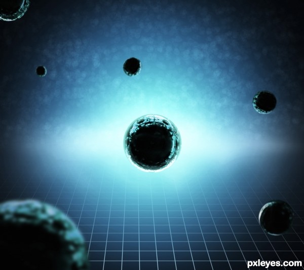
I use stock of the contest: http://www.pxleyes.com/photoshop-contest/19665/red-balls.html (5 years and 2914 days ago)
- 1: Red balls
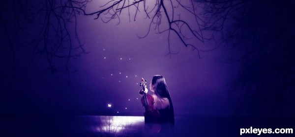
Mystic girl manipulation.
Special thanks to - "b-e-c-k-y-stock" for Girl With Violin stock.
For butterfly use Photoshop default brush! (5 years and 2954 days ago)
Howdie stranger!
If you want to rate this picture or participate in this contest, just:
LOGIN HERE or REGISTER FOR FREE
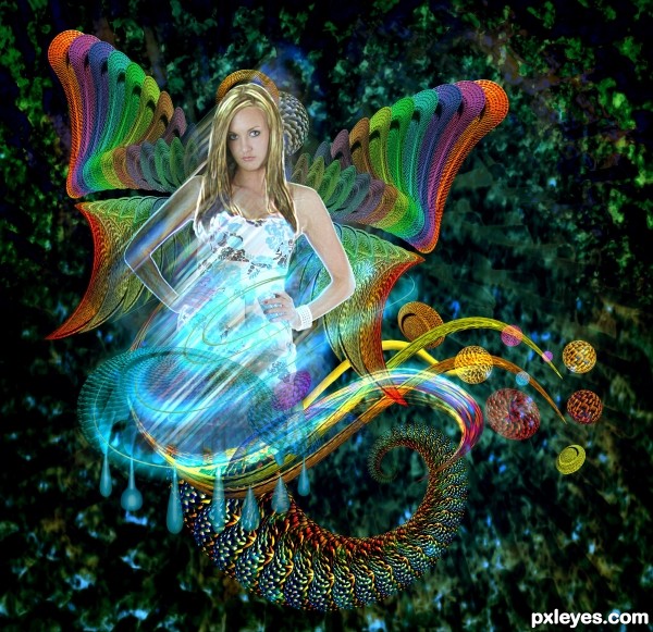
Use photoshop and illustrator to create this image. Many thanks to Avieth for the gorgeous lady model. (5 years and 3041 days ago)
So much fun  very hard work
Colorful and lots of layers...... GL.... nice to see you!
Yep...! Again....really nice work, author! Nice to see another entry from you. I like how you branch classic style and modernism here. Beautiful color too!
Nicely done.......Good Luck Author.
Well, a 4th place, still deserves a congrats, as a matter of fact, it is all the work you put into it! (Congratulations!)
Howdie stranger!
If you want to rate this picture or participate in this contest, just:
LOGIN HERE or REGISTER FOR FREE
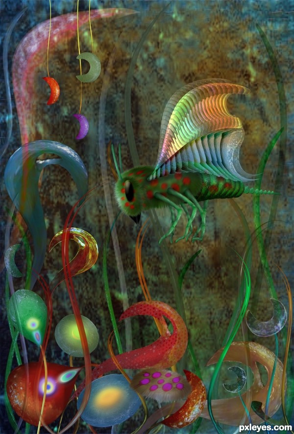
The source image processed in Photoshop (5 years and 3068 days ago)
Your work is unmistakable. You have a personal style all your own. Another creative and wonderfully executed image.
The taste of honey depends on the kind of flowers bees visits, but what how will it taste in this case?
Well constructed, i like the richness in shapes. It looks very good.
Now dats a choppity chop chop chop.. WONDERFUL!!!!

The wings are just  , oh shoot man I'm gonna cry...
Good work again..... nice colors. Good luck author.
Beautiful construction! 
Many thanks to all for the support 
Congrats!!
Nice Congrats
Howdie stranger!
If you want to rate this picture or participate in this contest, just:
LOGIN HERE or REGISTER FOR FREE
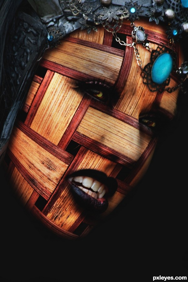
(5 years and 3150 days ago)
Great concept, the eyes look a bit like shadows to me, is it supposed to be that way?
Try using a displacement map:
http://www.photoshopessentials.com/photo-effects/texture-map/
@ Akassa, I wanted to create some depth and 'mystery' maybe a bit too much then?
@CMYK46, Yes i know about displacement maps. The face i felt was to 'white' and i didn't want to mess aropund trying to get a good enough contrast. Then i thought i may as well try it this way just to show you can still get results if people find displacement maps complicated.
Thanks for your comments guys....vote would have been nice too 
Cool!
OK then, if you don't wanna use a displacement map (which would have made the weave conform to the curves on the face) then use the highlights on the source face to guide your dodging. The head needs more highlights.
The nose area looks odd, somewhat blurry and indistinct. I think the right eye is too shadowy - not mysterious, so much as too dark. Perhaps lighten the eye white VERY slightly for better contrast. Then it'll just look super smudgy... 
I love it! So realistic! Very well done author!
Howdie stranger!
If you want to rate this picture or participate in this contest, just:
LOGIN HERE or REGISTER FOR FREE
Very clean effort, but a bit bland overall. Also, the grid squares are a bit too distorted near the center bottom, looking more like rectangles.
it's like enigma's face in dota... @@ bu it's nice n cool..
Howdie stranger!
If you want to rate this picture or participate in this contest, just:
LOGIN HERE or REGISTER FOR FREE