The image tells it all. (5 years and 3308 days ago)

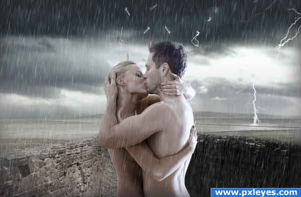
pretty much the image represents this
on shaky ground- the canyon- the ground splitting,
where we collide- holding the one you love
rusty nails- falling from the sky to the feet that they walk on
so we will try, or ill touch the sky- the intense sky in the background, lightning, and the rain unites them as one.
we'll stay alone, just passin' by- they will stay by each others side no matter how tough the times are. the storm as a metaphor of the triumph in the relationship that they live. the sunshine behind them is the hope that things will be better.
the lyrics as i heard them (there are no lyrics online):
like a broken speech
you took me on shaky ground
and don't tell me
and it feels like were walking on rusty nails
but the pain is not well
where we collide
and down is the only way out
cause how to ???
i tried to refocus on anything
but the strain inside
so we'll try, or ill touch the sky
we'll stay alone, just passin' by
but you took it away
you took it away
check out the music video at: http://www.youtube.com/watch?v=DoxUiqUpkw4
ENJOY! (5 years and 4015 days ago)
good work. may be some copyright issues. Check it.
no, there isnt any copywrite issues... i use high quality stock. just cause it looks good doesnt make it illegal. if your referring to www.123rf.com i have an account with them and i paid for the canyon and the models stock... as for the stuff i need to notify if i use, i have done that already.
good. I just have a doubt, now convinced. GL author
nice work author  i love the photo of the couple
  nice find there
Havent heard the song but I like the image. Well done....
nice job!
wow
I love this!
This picture tells a thousand stories. Well done! I'd add a few more falling nails/bolts, though.
Howdie stranger!
If you want to rate this picture or participate in this contest, just:
LOGIN HERE or REGISTER FOR FREE
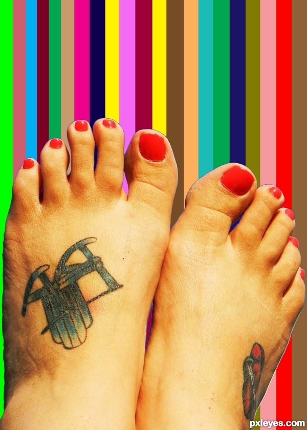
There's a slight outline where you've cut the feet from the background. The rainbow background you've added also looks very flat, with no shading or depth to match the feet so obviously pasted on top. Perhaps a very slight bit of shadow to correspond with the feet will help.
The thought was to have the background as a color chart from a distance, on a wall to see what color you want the nails done in. With a choice one can see better than looking at the small dot on the lid.
GL
Interesting explanation, author. I'm glad to have it, since my initial answer to your description ("The image tells it all" was "Ummm... no, it doesn't." Maybe it's because I do my own nails.
  Good luck. MossyB makes a good point about the masking. Expanding your selection by 1 or 2 more pixels would remedy that next time.
**CORRECTION: CONTRACTING your selection (make the selection smaller than the outside edge of the object you want to keep) by 1 or 2 pixels. Sorry! Another way to smooth the edge is to feather it by 0.5 pixels before the chop.
Thank you for all the input. Everyone
I try to use all the helpful information that I can.
Being new to PhotoshoP and finding it a fun way to express ones views and imagination by simply looking at something, than trying to apply that to the project, makes for a fun way to learn through trial and error to refine the art.
Howdie stranger!
If you want to rate this picture or participate in this contest, just:
LOGIN HERE or REGISTER FOR FREE