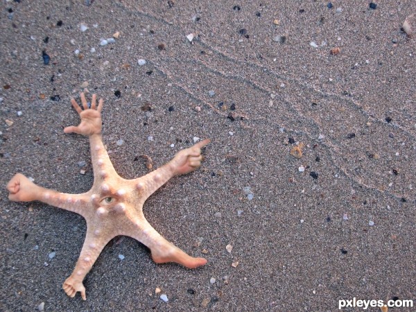
Nasty little buggar! Common in the South Pacific. (5 years and 3328 days ago)
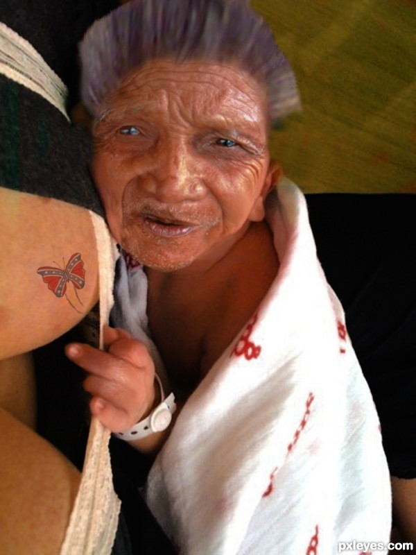
This was done using masking, paint and pen tool. warp tool was used as was the burn tool. butterfly drawn and set to multiply blend with a layer of her breast are over it set to darken. (5 years and 3426 days ago)
The face is too blurry, while the tattoo is razor sharp. Also, the chin area looks weird, like it has a triangular coffee stain on it.
Thanks Mossy, made an edit.
You made it, and that' s for sure !!! 
author you 


Tit for tat! He's having so much fun, his eyes are glazed over! Nice work author, on the butterfly and the finger. 

hahahahahahahaha...lucky bustard...well done author
Howdie stranger!
If you want to rate this picture or participate in this contest, just:
LOGIN HERE or REGISTER FOR FREE

(5 years and 3487 days ago)
Wow! Fantastic creation and good imagination  Only thing IMO looks not great is the hand which is suppose to be in the water... I would just take it out of the water and leave a slight reflection instead.. But if you think it looks fine don't listen to me everyone has different views
  Or just wait what others say
  Good Luck.. Still Fab entry!
You're right Toothpick134, I made some changes to the picture. I hope it is better now. Thanks for the advice
Yep!  Great stuff
  Try adding maybe a Gaussian blur to the reflection and see how that makes it look.. Just experiment to get it spot on!
  GL!
GL! 
Cool work author...love the mood on your creation....small advice, use smudge tool to make edges of the side lava a bit softer...best of luck
WOW.. huge Improvements... GOOD LUCK author!!!
thank you all for your advice and compliments.
I 'm still learning step by step, so I welcome any advice. Thanks once again !
Howdie stranger!
If you want to rate this picture or participate in this contest, just:
LOGIN HERE or REGISTER FOR FREE

MMMMmmmm Tasty !! (5 years and 3754 days ago)
Well done but...  ...
...
sorry ... fixed source link now !!
no way to eat that... (excelent....)
Reminds me of the water bug
Anthony Bourdane at in Viet Nam.
What erikuri said...
Howdie stranger!
If you want to rate this picture or participate in this contest, just:
LOGIN HERE or REGISTER FOR FREE
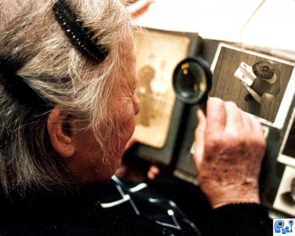
Your Momma is so nasty that she magnifies a young man's picture in your photo album.
Credits to:
Bjarte Kvinge Tvedt
for my Man Image.
Wojciech Wolak
for my Momma image.
(5 years and 3892 days ago)
I don't get the joke, sorry.
I have no idea why that's a yo mamma joke?!?! Are we missing something in translation?
Please read between the lines jawshoewhah & RayTedwell... Heheh! 
I don't understand either, sorry author.
???????????
I'm glad I'm not the only one who doesn't get it.
???
Howdie stranger!
If you want to rate this picture or participate in this contest, just:
LOGIN HERE or REGISTER FOR FREE
Love it!
Nice idea, pretty funny result but 2 suggestions. First, imo the blending from the star fish to the hands and feet can be a bit more smoothly if you'd softly use some more of the star fish texture on the hands, etc. Second, the quality of the star fish image is soso around the edges (more blurry) that also affects the star fish itself. In case yu'd be able to find a sharper image, the added hands (which are all also sharp) ill fit better with the background (or if you want, make the hands as blurry as the background). Good luck!
Thanks for the advice Wazowski. I made the adjustments you recommended, i think it makes it look better.
LOL neat love the idea
Thank you!
Nice idea! GL
Howdie stranger!
If you want to rate this picture or participate in this contest, just:
LOGIN HERE or REGISTER FOR FREE