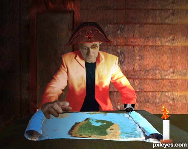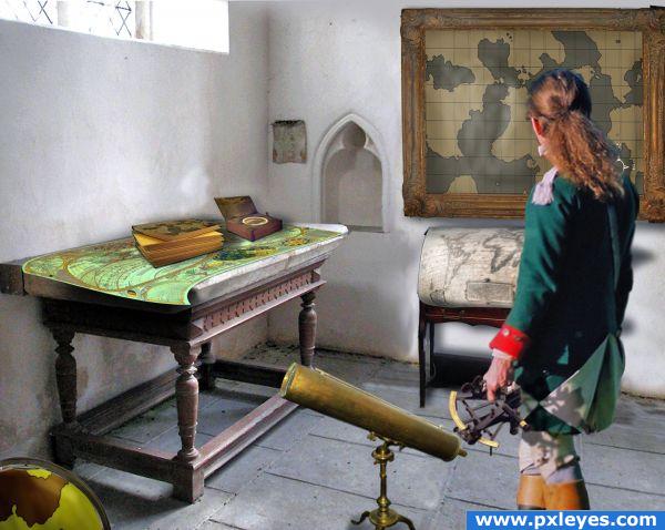
Source and my own photos seen in step 2.
Map was made by taking the blue part of the stand and cloning until i had a full map.
(5 years and 3349 days ago)

http://commons.wikimedia.org/wiki/File:WrightMolyneux-ChartoftheWorld-c1599.jpg
http://commons.wikimedia.org/wiki/File:Old_little_telescope_in_ VULibrary02.JPG
http://www.davidrumsey.com/
(5 years and 3919 days ago)
This is a nice combination of objects. IMO, some light sources/shadows need tweaking. If there is light casting a downward shadow on the framed piece, there should be no shadow on top. Also, the spotting scope would share some of that bright light hitting the instrument in the man's hand. I think if the light sources (I realize they are complex) all jive, this could be great .
Where is the map you created as in the contest goal?
This really doesn't fit the theme, sorry. You were supposed to make an old map, not put a map in a room with a 1600's explorer. I see three maps but that wasn't the theme.
Contest Goal: " CREATE" an old map, like the ones used in the old days.
The entire point of the contest is the map, nothing else should be added. Your presentation hides the map from the viewer, there is no clear view of it, how can that be on theme?
My homemade map is in the frame, the globe, and on the book cover. Jeez Tappy, look at the hires but be carefull that Sea Serpent might jump out and get ya. 

very good
nice entry, looks like it could be a winner 

Then what you should of done was concentrate on those three maps you made and uploaded them as separate entries.
Love the image.....who cares about maps.........where's the horse the girl rode in on???  Seriously, I DO like the image.
*
i think some people need to remember that with art, and themes, we should use the theme as a starting point, not a finishing point, what i mean is this author has followed the theme very well by creating "old maps" beyond that, this author has also taken the time to place those "old maps" into an everyday "real" scene, it is my opinion  , that this type entry is far better than an entry that only makes the "old map" and displays it as a flat image
  ,
,


Nice entry but the mans shadows are on the wrong side compared to the table and room.
Yes freejay the shadows are a mystery...thank you very much and razor yes sir I am always open minded when it comes to "Theme Interpretation "
This is not on theme, is three time on theme. Good job, author, GL.
Congrats for your second place, Loyd!
Congrats Loyd!
congrats!
Congrats 
Congrats!!
Congratulations for 2nd
Howdie stranger!
If you want to rate this picture or participate in this contest, just:
LOGIN HERE or REGISTER FOR FREE
His right hand looks painfully swollen and out of proportion to the rest of the image (a bit too blurry), but a very nice composition!
Thank you I'm not much of a artist and i butchered the right hand. I do wish i would have noticed the ridges on the right side of the map before i submitted.
Nice, GL!
Howdie stranger!
If you want to rate this picture or participate in this contest, just:
LOGIN HERE or REGISTER FOR FREE