(5 years and 3535 days ago)
- 1: By quatre mains
- 2: By megadem

(5 years and 3820 days ago)
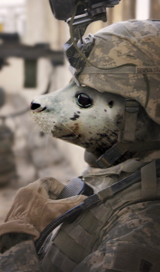
Good concept...making him stand out from the background would be better IMHO.
thanks! i've applied some lens blur to the background and increased the contrast, but all in a very subtle manner. i hope this looks better
Ive seen this pun used before, but a fun idea and well chopped. The blur on the background is nice
very good
the seal you used is perfect for this image. i like the way you can tell he is looking at the camera out of the corner of his eye. The level of blur and film grain between the two images match perfectly as well. nice job, i like it.
love it, gl
Sweetie!
Very cute........ Nice job Author......G/L.
very nice 
congrats! 
Congrats for your third place, Elficho!
Congrats
Congratulations for 3rd
looks like the uniform was made for him..........congrats on your third..........well done.
Howdie stranger!
If you want to rate this picture or participate in this contest, just:
LOGIN HERE or REGISTER FOR FREE
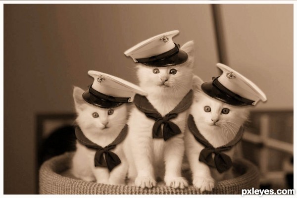
Quite cute, but I wouldnt point the hats all in the same direction. Also, I'd remove the dropshadow and instead only some shadow from the hat on their heads. Good luck!
Yep, I agree with Waz; changing the directions you make them more natural looking, and the kitty on the left is OOF, so hat also has to be a bit OOF. GL!
I totally agree with the others. Use your edit/transform/flip horiz. tool to turn at least one of the hats the other direction. Rotate will also help give a different angle to one of them. Will make a world of difference in a really cute entry. GL
thanks all for comments I have changed it
hmm you should flip the hats on the first two cats. and make them slightly bigger
Cute little kitty kitties, I like the way you did the scarf's around their necks. Nice idea.
Very nice and cute work...blur the hats just a bit to match with the cats...best of luck author
AWWWWWWWWWWWWW!
Howdie stranger!
If you want to rate this picture or participate in this contest, just:
LOGIN HERE or REGISTER FOR FREE