BabySitter Needed! $50 an hour... please respond?
Thanks:
mokra, nem youth, and mazwebs (5 years and 3259 days ago)

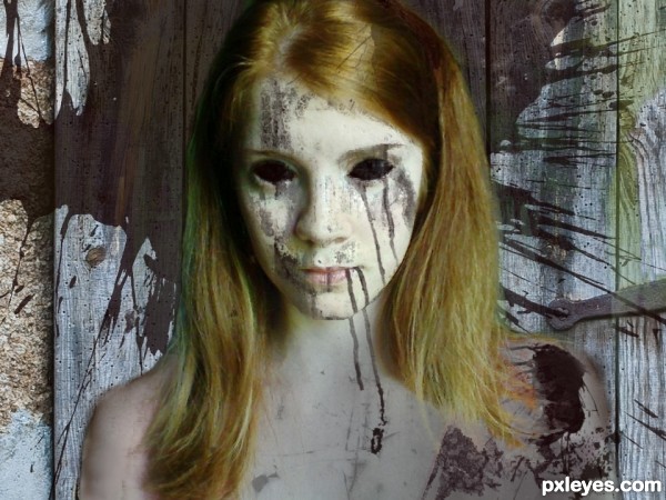
My humble attempt at creating the walking dead. Hope you guys like it!
The sources I used are linked to, other than those it was all brush-work, blending, and color manipulation. (5 years and 3513 days ago)
i love the vibe i get from this picture very creepy :P
Has potential, but it looks more like someone wearing a mask to me because the body doesn't match the face. Hair and shoulder edges lack the crispness of the 'mask' which emphasizes the maskiness of the face.
I see, I see. There were pink sleeves in the original image that I had a lot of trouble covering up. I'm not good at some things in photoshop yet.  If anyone has tips on how to cover things like that up more efficiently, I'd love to hear them!!
Why the need to remove the pink sleeves? If you thought they were too cheery for the walking dead, you could select them and change their hue to something more somber. But I think the contrast between frilly and dead would actually enhance the creepiness.
nice work...gl
I thought about leaving them in, but somewhere along the lines of making it I had the idea that bare shoulders would just be creepier. The problem I ran into with them was making the edges I had to erase (that were sticking out past where the natural arm was) look natural and not blurry. Which as you've noted I never did quite accomplish, haha.
I do like the occasional mixing of creepy with "cheery" though, it just wasn't working for me in this one.
I like your work! GL author.
Howdie stranger!
If you want to rate this picture or participate in this contest, just:
LOGIN HERE or REGISTER FOR FREE

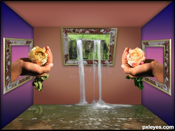
made the room with the polygonal tool, filled it with a gradient, added some shadow, added the frames free transformed them and added some shadow too.
more tools i used: clone tool, eraser photofilter, ocean ripple, levels, brightness/ contrast (5 years and 3645 days ago)
Check your masking on the waterfalls, you can see straight lines of the background on each side over the frame. 
hope its ok now 
Well done ! 
I can't tell, I think you forgot to upload the high res when you fixed it. I'll check back later. 
done;p
all better! 
i like the idea
nie idea 
nice entry! gl
Good work
cool
Howdie stranger!
If you want to rate this picture or participate in this contest, just:
LOGIN HERE or REGISTER FOR FREE
Nice blend! Maybe give the boat a bit more hull where the open side is.
Thanks CMYK46... I didn't even notice I masked the beam out... I put more of the hull back in... I hope it looks better...thanks again!
 .. I don't know...

Trully appreciated.
Edit: Where the ship opens/plank drops to the left.... there was no green beam/support before on left... I added it... and thought that was what you meant... well heck...
Anyway... I still hope it is fun and scary at the same time!
I don't see any difference. Maybe you could show what you meant in a SBS?
awesome humor author.. good luck
very nice , good luck!
Looks good! GL
Howdie stranger!
If you want to rate this picture or participate in this contest, just:
LOGIN HERE or REGISTER FOR FREE