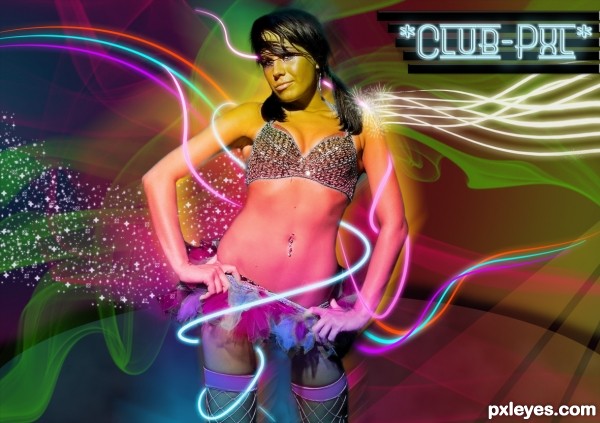
(5 years and 3329 days ago)
- 1: Eric Hamilton
- 2: Obsidian dawn
- 3: QBrush
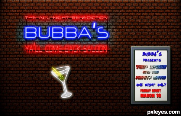
all Photoshop (5 years and 3330 days ago)
the margarita neon is divine!!
Nice...but it's Saloon not Salloon.
Nice fix!
Thanks rbsgrl, Bubba fired his other sign maker. Thats as bad as a misspelled tattoo.
Nice effect, best of luck 
Great work author...superb lighting effects...gl
Nice work, Bubba! 
Howdie stranger!
If you want to rate this picture or participate in this contest, just:
LOGIN HERE or REGISTER FOR FREE
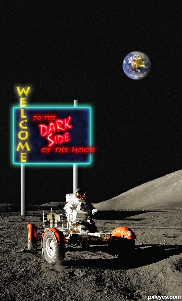
Sign drawn with Photoshop. (5 years and 3332 days ago)
Either this astronaut built and put the sign here...or he has some unexpected company...either way...
Good job but I think the Earth would be bigger and maybe not as blurred.
Very good.............Good Luck..
Great thinking author...well done
Fun concept!
Congrats...
Congratulations!!
Congrats Ichappel!!
Congrats!!
Congrats man 
Howdie stranger!
If you want to rate this picture or participate in this contest, just:
LOGIN HERE or REGISTER FOR FREE
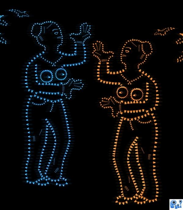
only source image used. Used Feuillu's image from flickr.com for reference. (5 years and 3800 days ago)
Nice!
nice idea! and....what boobs XD
Wow, very interesting neon tribal art 

very nice work
Thank you all for your commets, downoffthedragon, TemporaNigra, corneliaMladenova and nishagandhi
Howdie stranger!
If you want to rate this picture or participate in this contest, just:
LOGIN HERE or REGISTER FOR FREE
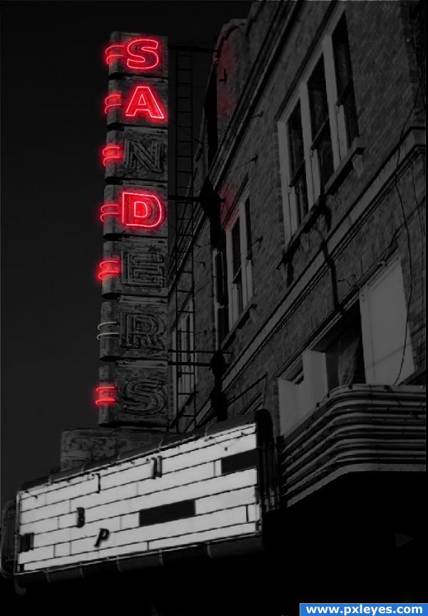
This poor theater has seen better days. It's fighting hard to retain dignity. This is an example of when letters burn out and they spell something unplanned...See SBS. Thanks. (5 years and 3857 days ago)
Nice idea, I'd make the high resolution version somewhat smaller (back to the original image's size), right now it's quite pixelated, which is a pity. Good luck!
Oops thanks for the tip wazowski...an oversight on my part. Image has been fixed...used at correct size now. Looks better...thanks. 
nicely done author.
did you forget the reflection on the building or purposely leave it there?
@k5683...not sure what your question is...but the reflection of only the three letters illuminated is intentional. The outer neon elements furthest from the building purposefully did not get put onto the building, because I felt they were too far from the building to cast color there. Does that make sense? Thanks for inquiring...I appreciate it. 
Oh great!  Especially in combination with the title! Very good work with the letters and the glow. And I'm pretty sure, that the theater will see better times some day. Nobody can be sad forever, right? Good luck!
Howdie stranger!
If you want to rate this picture or participate in this contest, just:
LOGIN HERE or REGISTER FOR FREE
cool work...great effects on her left shoulder... GL author
Fun!!!
This has a cool 'grunge'....but almost too colorful for grunge look. Hard to describe...but really cool stuff, author!
Howdie stranger!
If you want to rate this picture or participate in this contest, just:
LOGIN HERE or REGISTER FOR FREE