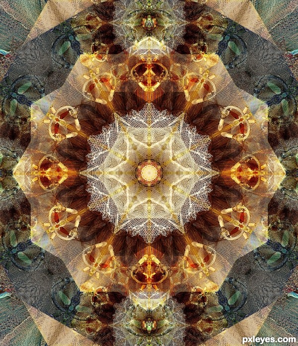
Used one of PxlEyes sources. Thank you very much, Aurash for the beautiful photo: http://www.pxleyes.com/images/users/a/aurash/3323/fullsize/4e0dff76b0163.jpg (5 years and 3139 days ago)
- 1: source1
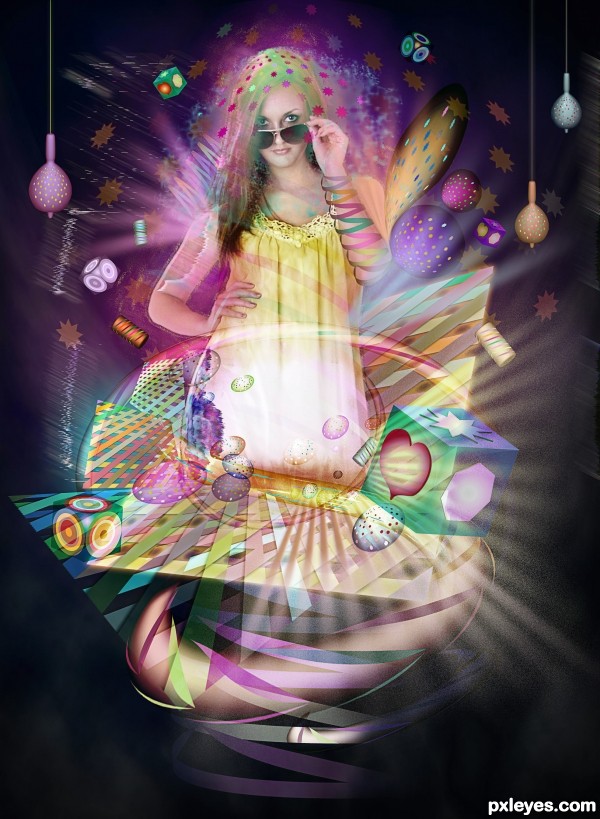
Used photoshop, illustrator and PxlEyes source thanks to Avieth. (5 years and 3233 days ago)
I like this one, cool illustrator pieces and interesting effects to her arms. 
Very lively.... One of my faves.... GL
Many thanks for the nice comments and support 
whole lot of fun!!!
Howdie stranger!
If you want to rate this picture or participate in this contest, just:
LOGIN HERE or REGISTER FOR FREE
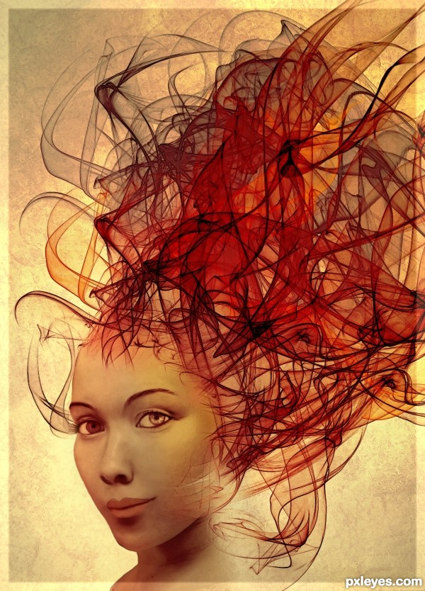
When I started this, I had something totally else in mind, but my skills still have to catch up to my imagination, lol.
All SBS coming tomorrow night. (5 years and 3441 days ago)
Very nice looking image, great job with the eyes 
Beautiful entry, vry nice colors. 
Thank you both. It's not quite what I had in mind, but I have already spend 3 days on it, and I didn't want to wait till the last day to enter knowing my busy schedule, so I was happy with this, for my level of knowledge of photoshop.
Very cool  ! although it would be even better if you blend the lines as tattoo or something.. anyway gl
  !
!
I like it! 
very cool image...gl
Howdie stranger!
If you want to rate this picture or participate in this contest, just:
LOGIN HERE or REGISTER FOR FREE
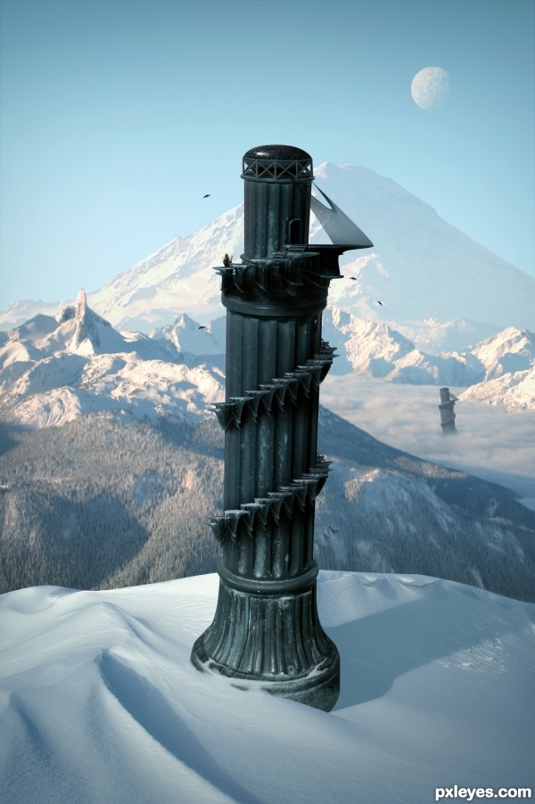
Edit:
- Fixed some masking problems.
- Decided to go with a colder climate than the last image. (5 years and 3633 days ago)
Beautiful work... 
great great work 
Pretty fast submitted entry! I like the idea, you may want to mask the top of the pawn a bit better (some white edges here and there). Good luck!
Pretty good, but room for improvement!
Im not entirely certain, but wouldn't the shadow be bent outwards over the slope rather than inwards? - the shadow from the furthest tower is too dark in relation to the closest - and - maybe a little addition to some shadows from the terrain would help place everything better - especially from the mound covering the foreground tower as it's casting nothing...
Oh and the glare fom the bottom of the 'tower' it's not true to where you're placing your shadows from, so maybe get rid of it and add some highlights to the relevant side
Thanks for the comments.
Cool over all. I personally don't think the duplicate background towers add anything, however. Also, the palm trees look fake. And the hi-res version highlights the white edge around the tower's top and the fakiness of the tower-bottom and sand-dune edges.
The top of the tower still remains sharp and white spots are there . but this is a good image... you have to make some touches there... good luck...
Great but as above you could just try the matting controls, use the "layer" / "matting" from the top drop down menus and remove white matt or defringe to get rid of them, Then quick select and feather those edages slightly.
nice creation ................ i like it ........ Gl to u ..........
Thanks for the helpful feedback. Image is now complete.
Very nice, like the Pizatower, but in the mountains 
I like it! GL!
yeah a much better image!?!... GL 

i like the colder climate version!! great job!
This is why I don't participate in this contest 
Nice work, and well done, gl
Very nice, good luck 
Fantastic work author...IMHO u don't need other tower...any how this is great,high marks from me...best of luck
nice
Good.
GL
Thank you.
Super! It looks like the tower will fall out of the image at any moment 
Howdie stranger!
If you want to rate this picture or participate in this contest, just:
LOGIN HERE or REGISTER FOR FREE
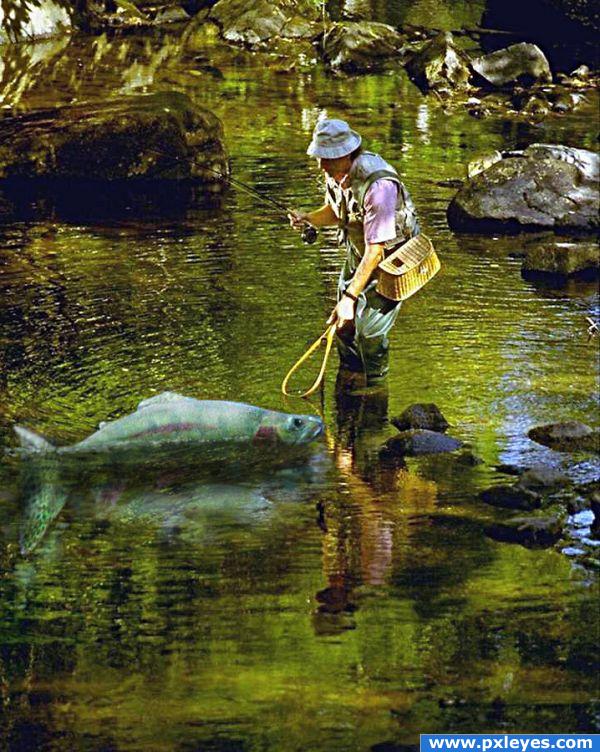
I was wondering how to net the darn thing... (5 years and 3880 days ago)
This made me laugh. I like the reflections too...but the reflection has more detail showing in its tailfin than the actual fish. What happened to the top of the tailfin?
EDIT: Understood author! Makes sense...really funny image!
Happy you got a giggle out of this. The full length of the fish is half out of the water. That was my intent to make it look like a tall tale. About the clearer details of the tail under water, well... there are less ripples on the water.
Howdie stranger!
If you want to rate this picture or participate in this contest, just:
LOGIN HERE or REGISTER FOR FREE
Stunning result, beautiful entry!
Lovely image...GL author!
I knew it was yours..... You are so talented. The result is so beautiful and delicate. Good luck....!
Fabulous pattern, great work.
Awesome, gook luck!
I love it author. Fav here!
Many thanks to all for the nice comments and favs
Congratulations on your well deserved win!
~M
Congratulations for your first place on a lovely entry my friend.
I knew that this was gonna be the winning entry!! Great job! Congratulations!
Such a beautiful image! Congratulations!!
Howdie stranger!
If you want to rate this picture or participate in this contest, just:
LOGIN HERE or REGISTER FOR FREE