(5 years and 3421 days ago)
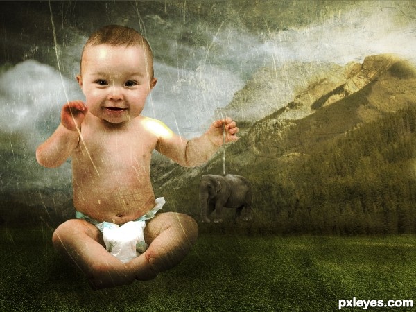
Credits to Adam Borkowski , Darren Nickerson , ~matrija-stock , =SalsolaStock and Sergey Tokarev and =night-fate-stock.
Updated. (5 years and 3441 days ago)
Great illustration of the size concept, but the lighting needs a lot of work. The planet is not lit so poorly that the baby's feet would be almost invisible in shadow, unless it was night. By contrast, there is a glaring white spot on the baby's shoulder that is very distracting, and is matched by the overly bright spot on the diaper.
The elephant "toy" (EXCELLENT size emphasis for the image) should have some sort of harness, instead of the cable just coming out of his back, and shows a rough extraction edge and some white pixels ~ Try using the Extraction Tool or the Pen Tool for better edges.
Consistency and edges are the key to good Photo-chopping, and you cannot "cover up" inconsistencies by simply making everything dark.
Well said MossyB. I think you said enough for everyone. But it is a cute idea 
Howdie stranger!
If you want to rate this picture or participate in this contest, just:
LOGIN HERE or REGISTER FOR FREE
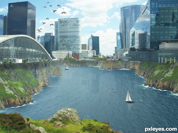
New city concept.
Thanks to http://www.imageafter.com/ and http://www.photos8.com/ for providing stock images. (5 years and 3441 days ago)
very nice idea..... looks good. Good luck author.
Thank you George55!
Beautiful picturesque cityscape 
Thank you CorneliaMladenova!
Howdie stranger!
If you want to rate this picture or participate in this contest, just:
LOGIN HERE or REGISTER FOR FREE
(5 years and 3443 days ago)
Great work, nice colours. GL !
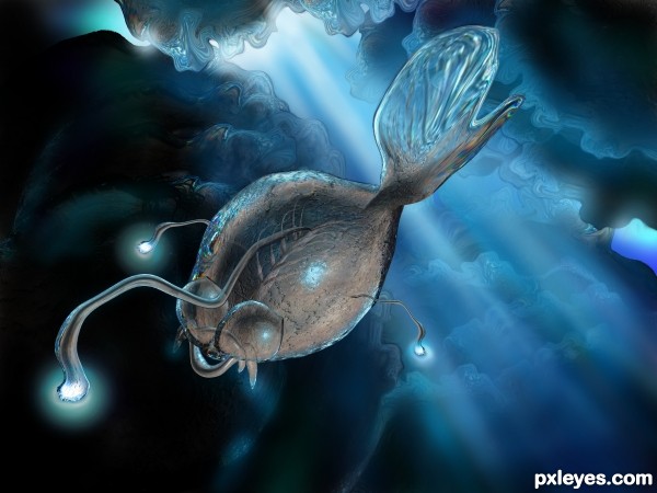
construction of both the creature and the background is very well done -- lighting is nice as well
I really like the tail, well done!
Great job! So awesome how ya'll can turn one thing into so many!! 
Very interesting. Reminds me of a picture of an article that they just had on Yahoo about a new creature. Great use of the source, author!
Thank you all for your comments!
JPDesigns: I will have to look for that article! It must be interesting. When I did the creature I had in mind something like those living in the abyss.
Beautiful creature 
nice work 
Definitely a creature from the deep ... great work. Love the fluidity you have captured!
Very nice piece author...best of luck
Yea, it also looks like that creature from on Finding Nemo when they are down at the bottom of the ocean. I think that maybe what what kind of creature you are talking about, right? 
Congratulations! 
Congrats for your second place, Marina!
Congrats!
Thank you all!
Congrats...
Congrats!!
Howdie stranger!
If you want to rate this picture or participate in this contest, just:
LOGIN HERE or REGISTER FOR FREE
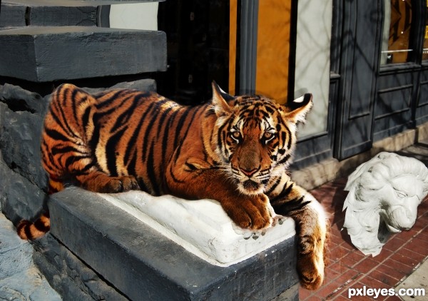
Removed the statue, fixed the background (added some height to make better perspective so that the tiger and statue appear larger). Added a tale for the tiger from another source (hard work with the colours). The rest is handwork and HDR toning/color adjustment. (5 years and 3484 days ago)
Nice job, my only criticism is that the lion head looks like its balancing on its point on the ground and isn't too realistic. If you lay it flat on the ground and adjust the shadow accordingly it will look better. A few other fragments of broken plaster would also look good but that's a fair bit of work :P
too much distortion on rear part of tiger.....otherwise brilliant idea.
GO TIGER GO!!!! 
Howdie stranger!
If you want to rate this picture or participate in this contest, just:
LOGIN HERE or REGISTER FOR FREE
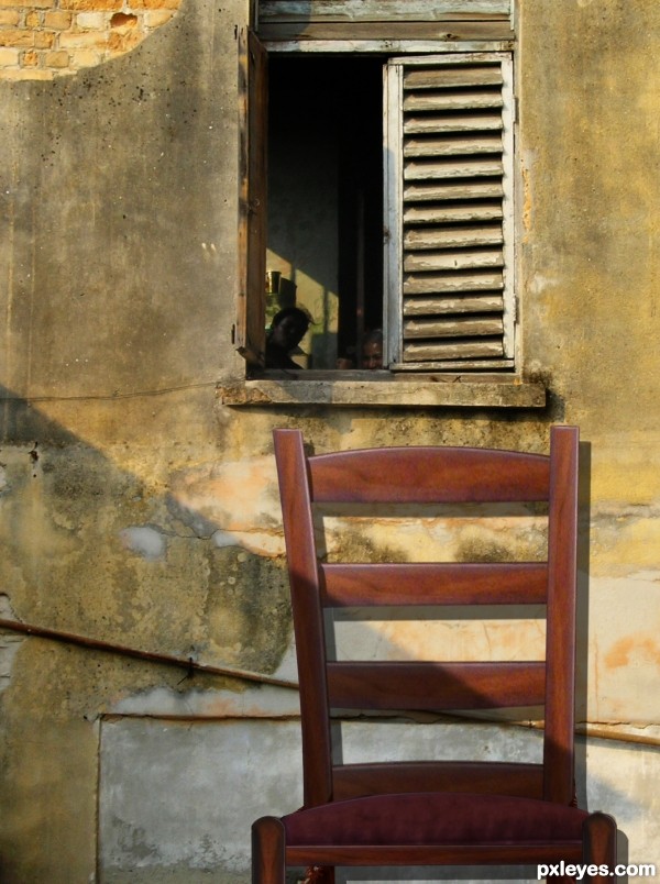
Don't see how you have used source 1 here, but not a bad image.
nice clean chop...u could use author some color layers to achieve oldish look...For example, dark brown layer, blend mode set to color with opacity somewhere between 20 to 40%, and maybe dark green, blend mode set to soft light with very low opacity 10%,and finally goldish/orange layer, blend mode set to color with opacity between 10-30%. Just an idea author...GL
I like the way you cleaned the chair... looks nice at it is now... good luck author.
Howdie stranger!
If you want to rate this picture or participate in this contest, just:
LOGIN HERE or REGISTER FOR FREE