(5 years and 3694 days ago)
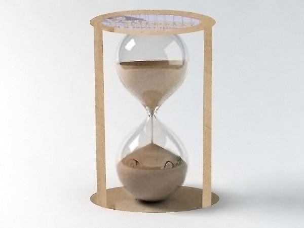
1) Import Source 1
2) Cut car out and place in hour glass. Erase top half..so it looks like the sand is gradually forming a sand car (Dealt with blending modes).
3) I made an hour glass frame out of the sand that was from the original picture. (5 years and 3709 days ago)
very nice, 
thank you 
It's too pixelated.. The Source is awesome and clear.. What did you do with it?!
agree with li3N....its too pixelated....but a great idea and nice work...
Howdie stranger!
If you want to rate this picture or participate in this contest, just:
LOGIN HERE or REGISTER FOR FREE
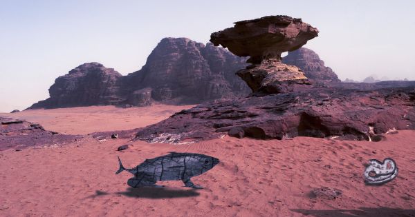
new species (5 years and 3712 days ago)
i'd remove the cracks from the fish.. and whats that white thing in the right ? anyway good luck
great job with the fish...needs high resolution
Nice....
Howdie stranger!
If you want to rate this picture or participate in this contest, just:
LOGIN HERE or REGISTER FOR FREE
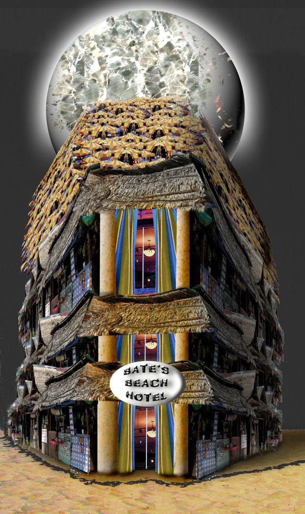
source and my photo
Texture is in basic version of PS 7 under PATTERNS (5 years and 3716 days ago)
What's the source for the smashed effect on the globe?
Coooool image this 
Looks like a place I know of up around Panama City  ...I like the globe explosion
Nice title 
nice!
Howdie stranger!
If you want to rate this picture or participate in this contest, just:
LOGIN HERE or REGISTER FOR FREE
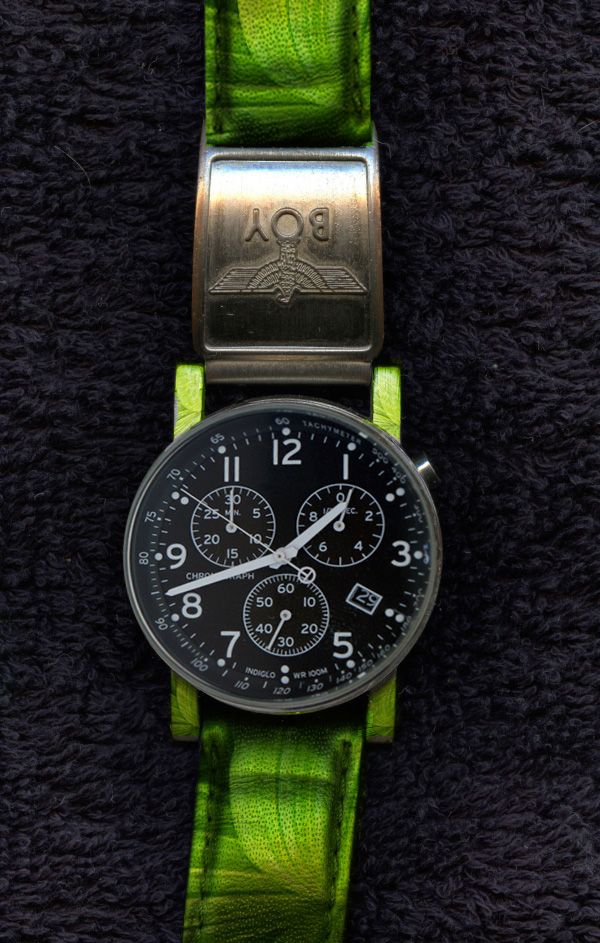
(5 years and 3716 days ago)
Simple but unique idea. Well chopped 
Thank you jawshoewah 
good effort. but the dial is warped, and is not sitting square in the case. the original shot of the dial was shot at an angle, rather than straight on...
is it better now adeincyprus ?
I don't see any difference.......look at the numbers on the outside edge of the dial on the left, then look at the numbers on the right.you cannot see them at all. the twelve and the six should be perfectly central to the strap tangs
and now ?
I see what ade means. It's real subtle so that's probably why I missed it the first time. You could liquefy the wider edge side (northwest side) to match the edge of the southeast side if you did it right.
Could've been more creative I think..
Howdie stranger!
If you want to rate this picture or participate in this contest, just:
LOGIN HERE or REGISTER FOR FREE
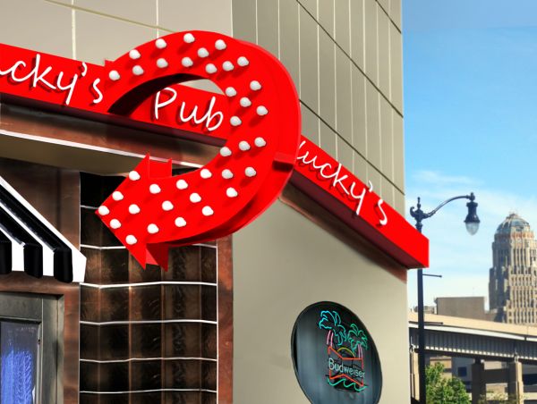
Outside edge should be lighter, beer sign rotated a bit counterclockwise...the rest is good.

great job... not sure if you have used a web safe color as there seem to be quite a bit of pixelation even in the high res... may want to try and tone down the red a bit too... GL!!
Yeah it does loose something, especially where the shadows of the light bulbs are. A lot of "pixelation" between my work here at home and the uploaded version...I kind of want the red bright though.
Under new direction... new decoration... nice!
looking good i like the red Author. Good luck
Thanks Nator and cbldawg71 for the 2nd opinions much appreciated, thanks.
nice job! i like the change of background too!
Just a nit-pick. The angle of the first 'k' is almost verticle, where the second 'k' is slated more forward. A littl backward skew would fix that. That being said, nice restoration work
Wow you really cleaned it up. It's probably wee bit too red but that's just IMO. GL!
Nice work...good luck
Nice resto.
very good
congrats
Howdie stranger!
If you want to rate this picture or participate in this contest, just:
LOGIN HERE or REGISTER FOR FREE