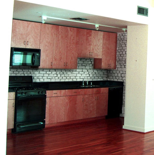
(5 years and 3774 days ago)
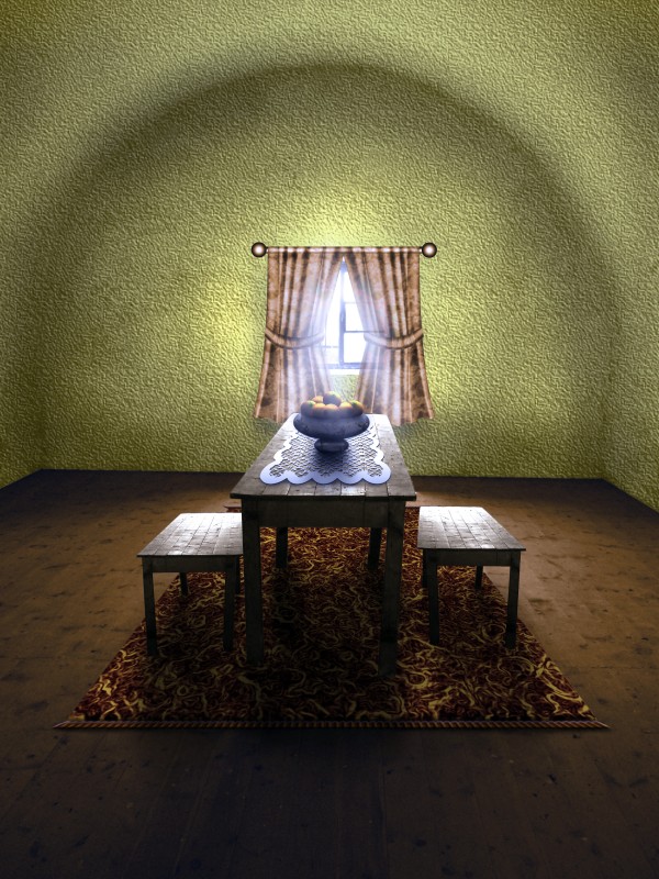
no outside sources (5 years and 3776 days ago)
That is a nice change to the empty room, and also a nice entry....gl author.
Good work, I was thinking of doing something like this my self.
Great idea, and a wonderful change!
Wonderful room,nice chop Author

Furniture looks good, curtains not so good, wall texture, color & lighting not good...
The vanishing point on the benches is much lower than the vanishing point on the table. nice job on the floors and the rug
well done author... just a small nitpicking... there should be a smooth merging of light b/w wall and floor... presently wall is bright even where it touches the dark floor....
Great sbs, love the making of the carpet, the best use of glowing edges I've ever seen 
Looks like Martha Stewart chopped it  I agree with pingenvy's comment. The perspective looks off because the benches don't match the table. I would try to line up one of them .
thank you all for your kind comments and suggestions! i agree with all of them but, unfortunately i can't make any changes right now.
thats cute but if the wall was further back the room would look bigger
Nice work author. Texture wall did'nt work for me. Also shadow of windows curtain and rod is missing. Overall nice image 
Howdie stranger!
If you want to rate this picture or participate in this contest, just:
LOGIN HERE or REGISTER FOR FREE
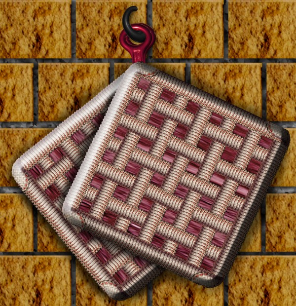
source only (a little texture for the grouting) (5 years and 3777 days ago)
Clever idea! Very neatly chopped, especially in high res. Well done.
Howdie stranger!
If you want to rate this picture or participate in this contest, just:
LOGIN HERE or REGISTER FOR FREE

“Men are only as loyal as their options.†Bill Maher
Credits to:
http://fetishfaerie-stock.deviantart.com
http://lilnymph.deviantart.com (5 years and 3796 days ago)
?.......................Take a DA pic and paste stuff onto it...uh-huh. 
thats fire exxtra flames.. good job.. even in the eye lashes
Interesting use of source. What is there below her lips? 
beautiful colors and image
ok, an interesting take on the source. However, it is still artistic outcome. GL
Howdie stranger!
If you want to rate this picture or participate in this contest, just:
LOGIN HERE or REGISTER FOR FREE

i didnt have time to finish my idea.. (5 years and 3805 days ago)
so cute would be great with a background
Very nice,eyebrows are fabulous.Its to bad why u dont have background for this little guy....
cute mouse. nice scarf. I just hate when time is not your friend when creating works. Looks great to the point you were able to finish too. GL
Howdie stranger!
If you want to rate this picture or participate in this contest, just:
LOGIN HERE or REGISTER FOR FREE
wrong perspective
NIce use of source, but I kinda agree with maXed. Before putting the pavin on the wall, make it straight first, then duplicate it a couple of times so you have enough to cover a whole wall (and try to avoid repetitive patterns) and then use the transform tool (perspective, for example). Good luck!
the kitchen feels too modern for the paving
why is the kitchen on an angle?
Howdie stranger!
If you want to rate this picture or participate in this contest, just:
LOGIN HERE or REGISTER FOR FREE