only source used (5 years and 4037 days ago)

VERY IMPORTANT: BEFORE WATCHING HI RES COPY FOLLOWING LINK TO THE NEW TAB IN YOUR BROWSER:
http://www.televisiontunes.com/Indiana_Jones.html
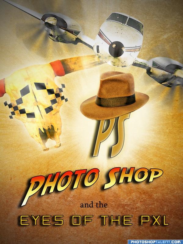
Well... there was A LOT of work! It was SO fun to do it)) Please view hi-res, comment and vote for my entry.
Thanks to the guys from flickr and stock.xchng for the photos. Sbs will be a bit later - I'm too exhausted at the time... (5 years and 4037 days ago)
OKAY AUTHOR I WILL DO THAT JUST FOR YOU COULD STOP SHOUTING NOW...giggle snort.. JUST KIDDING..love your enthusiasm..and yes .. this is a lot of work.. I'll have to say your comment at the bottom really makes this piece.. you can look at the piece and say nice.. then look at the comment and say GREAT..you really helped propel me to look at it more.. good luck and good work
I'm even going to stop back to see your SBS Now GET SOME SLEEP YOU NUT
The effects you used here is good, I think composition(placement of objects and text) need to improve
nice!
nice!!
SBS added... finally! Enjoy guys)
creative idea...I love the pixelated x's over the skull eyes. Nice job!
Excellent concept and design
eheh funny 
you did very well
Howdie stranger!
If you want to rate this picture or participate in this contest, just:
LOGIN HERE or REGISTER FOR FREE

just using variation (5 years and 4040 days ago)
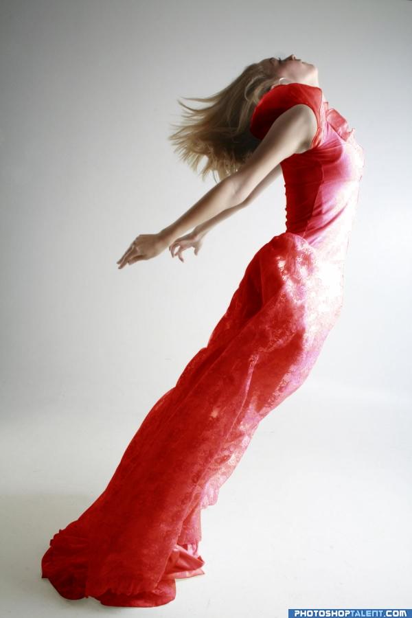
Are you kidding me? I was making this right now, I mean I was going to change the color to red.  ... It looks the same! Anyway, good job!
Lady in REEEEEEED... good luck
Very cleanly done, nice work 
i like it
simple yet very nice  goodluck.
one of the simple and best work keep it up
good coloring
thank you all for comment, n burtz: sorry, maybe i can read ur mind 
Nice color change. Simple and clean... matches her complexion better
Nice....
finally!! a different color!!
Howdie stranger!
If you want to rate this picture or participate in this contest, just:
LOGIN HERE or REGISTER FOR FREE

I reduced the truck and made a new trailer by copies of the usable parts; wheels, wall and floor made also by copying. The company got a name with layer-styles drop shadow, color overlay, satin, bevel and emboss
The bolts were taken from the truck; one of them is defect, therefore one letter fall over.
No other sources used.
(5 years and 4043 days ago)
good job! 
 too many wheels!
  good luck!
Good job with it you should have made the trailer longer imo, they must not have 18 wheelers where fille comes from. Author did you mean to have the "t" upside down?
good work
thank you, filles, I counted again and I saw that I have forgotten one wheel on the right side of the trailer. Please make a visit on "Gary Morton Truck Collection", there are even trucks with more than 20 wheels... 
Ichappell, thanks a lot. You're right, the letter can only fall a few centimeters, because the distance is not big enough for a rotation.  I changed it.
nice work, like it a lot, gl
nice job 
ahhh gee..I liked the upside down T... hehehe. but now I suppose it makes more sense.. don't mind me author..I'm always a little upside down 
Good job!  !!
!!
Howdie stranger!
If you want to rate this picture or participate in this contest, just:
LOGIN HERE or REGISTER FOR FREE

(5 years and 4048 days ago)
yep.. definate YEP.. love the long L
Thank you kindly, Mr. Golem! 
Nice idea good luck!
Good luck 
Nice!! I'd remove the shadow and reduce the opacity of the blak emboss 

I think you need to move away from the blue/orange and bevel/emboss (dated)...but I like the graphic of this.
nice
Not bad, but the color combination makes my eye tear a bit. And yes, watch out with layer styles, you almost kill the com with it. Good luck!
Nice one...dnt lik th bg though.. Good Luck!!
GL!
Howdie stranger!
If you want to rate this picture or participate in this contest, just:
LOGIN HERE or REGISTER FOR FREE
nice one....very imaginative.,...
Creative use of the source nice work!
very nice use of source!
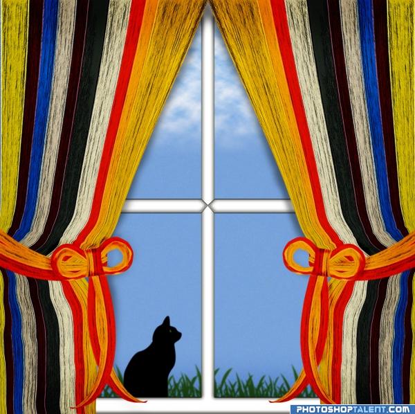
kitty bigger Kitty Bigger KITTY BIGGER.. unless it's a kitten, then it's okay.. if that's a real cat that window would be HUGE.. it is a very Nice image.. but who does the lawn care.. the grass is SUPER high .. just putting the piece into perspective. it's just fine the way it is but an can be tweaked.. gook luck
SBS is very good
nice work......the window and the kitty cud hav been more realistic.....GL author
good work
nice... but could someone please let the kitty in....smiles
some statements/explanations:the cat is a LITTLE cat, a kitten. not only the curtains are new, the window also is new: until now clean and without any traces or signs (but if you could look outside, there are a lot of signs of the cat/kitten) the grass is in a flowerpot on the windowsill outside, there were also flowers in the pot, but the cat/kitten ripped them off. when the kitten/cat is grown up, the grass will be high and then it can be used for fill the holes in the garden… And the most important: thanks a lot for all your advices and comments
Nope. Kittens are small cats with big heads. This one doesn't work. Even if the scale were correct, it would be fuzzy...
clever use of source
Howdie stranger!
If you want to rate this picture or participate in this contest, just:
LOGIN HERE or REGISTER FOR FREE