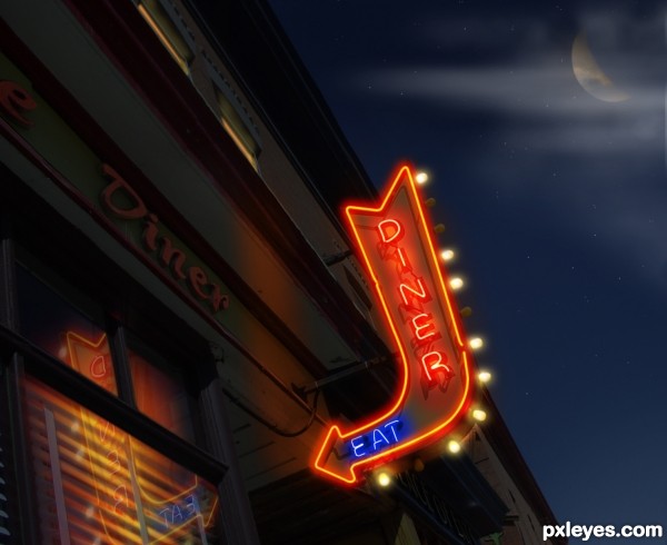
Made edits to moon as many have suggested. (5 years and 3219 days ago)
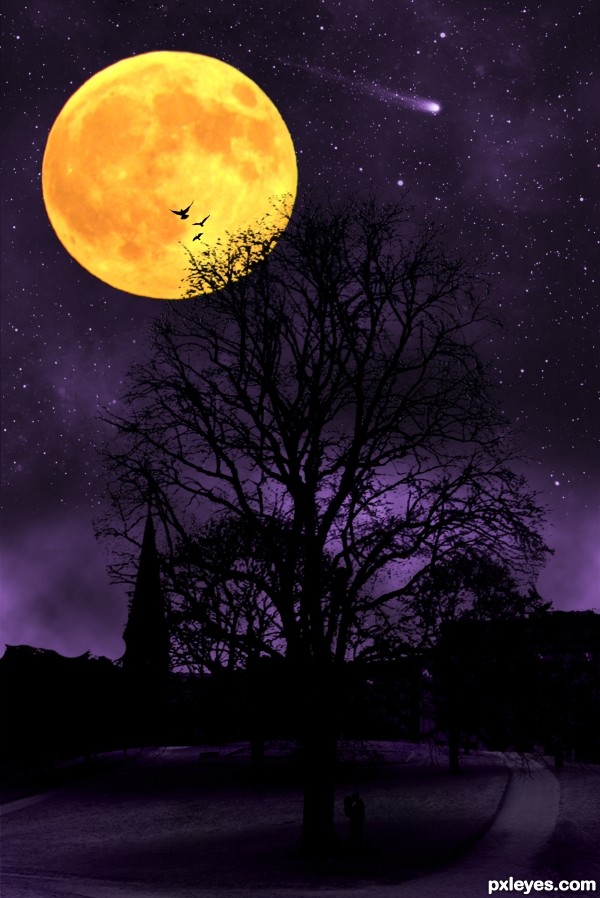
I love to take a walk in the park and look this tree and observe how it changes during the four seasons. Old trees still grow new leafes.
The photo of the tree is my own. (5 years and 3219 days ago)
Very arresting but this does strike me more as using a daytime pic to create a dramatic, fantastic night scene rather than transforming the day scene to a night version.
Hmm. I guess you got a point there. I forgot to view the tutorial after i opened Photoshop. I got stuck in my chair with my eyes focusing only at my conest entry the following hours.
Thank you for commenting Dan 
You should blur the moon's edges a little so it doesn't look so sharp.
very cool image author, but with the moon this big and placed there, tree would be covered with the moonlight...GL
Howdie stranger!
If you want to rate this picture or participate in this contest, just:
LOGIN HERE or REGISTER FOR FREE
(5 years and 3220 days ago)
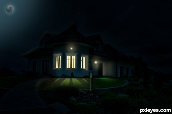
Needs to be seen in hi-res to be fully appreciated. This is a very good start, but the spread of the various lights needs work. The left and right windows should allow a lot more light on to the left and right sides of the lawn. The right exterior porch light doesn't seem to provide much illumination on the lawn at all. The very bright and very white foreground post lamp is illuminating very little.
I suspect the post lamp has a solid top and bottom so it can only spew light out its sides. Ergo, it can't illuminate the post it sits atop. (I recommend a nighttime stroll around your neighborhood to see how different lighting-fixture configurations cast light.)
Some sort of over-exposed interior inside the windows would be more realistic as well. And why not throw in some stars to make the sky more interesting?
hi-res is uploaded! and i made some changes and i think now it's better!
Beautiful work author...gl
Howdie stranger!
If you want to rate this picture or participate in this contest, just:
LOGIN HERE or REGISTER FOR FREE
(5 years and 3220 days ago)
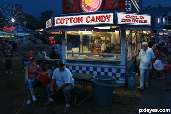
Details are great here!
Convincing work.
Great lighting and (as elemare said) your attention to detail is super!
Nicely done!
Very nice. I do feel the stand's light might extend out a bit farther, however. The background picnic table seems to be brighter lit than than the foreground table. The back of the foreground guy's T-shirt seems rather brightly lit yet there's not even a hint of a shadow on the ground. The right-side guy could also cast more of a shadow. (Might the Ferris wheel have more lights on it?)
Excellent work from a brilliant author!  I really love the subtleties of this image.
looks so real
that's a lot of work! best luck! 
grea tdetails
great work author...best of luck
Superb entry author ....GL!!
Congratulations!
Congrats!
Congrats!!
congrats
Howdie stranger!
If you want to rate this picture or participate in this contest, just:
LOGIN HERE or REGISTER FOR FREE
Primary source is my own photo (step 1)
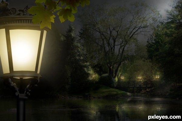
Update: Front lantern was brightened. (Thanks, Androla!) (5 years and 3221 days ago)
what a peaceful nite.......!
wonderful picture! the only suggestion is that you should make the front lantern brighter! much brighter! good luck!
Thank you both. I was afraid that would over-dominate the entire scene, Androla. But I will give it a try. Thank you so much!
Beautiful work ... lovely source image and wonderful conversion to night. Your lighting is perfect!
looks really much better!!!!!! awesome entry!!!
Lovely up through about Step 15, but the introduction of the foreground lamp with a vanishing point much lower than that of the background makes it look simply like a lamp in front of a painted backdrop.
OK, Dan, light lifted. Better? Thank you!
Yes, it is better (although I would eliminate the foreground lamp's underside glow and raise the underside's far edge).
The foreground lamp and leaves are a good way to add depth to the image. The brightness of the foreground lamp makes it the focus, however. I would move it to the left so only half of it at best is visible in the frame.
Thank you, Dan, I appreciate your advice. I moved the lamp off some, but think its lines and curves make it quite a beautiful piece by itself, worthy of discovery.
beautiful scene author...very well done
Great job, GL!
Beautiful work...best of luck!!
Congratulations on a lovely entry!
Howdie stranger!
If you want to rate this picture or participate in this contest, just:
LOGIN HERE or REGISTER FOR FREE
I like neon signs. GL.
Great work ... reflection is perfect and the lighting excellent ... not sure if I like the moon but that may just be a personal preference ... definite fav for me!
LOL! Thought so.... I've said it before. I really like your style author. If I could be anyone else in pxleyes world it would be you. Good luck!
very well done!
Absolutely well done, I do agree with arca on this one though, I'd dull the moon just a little.
I thought it was you...great job!!
This is terrific! And the SBS is wonderful. Not keen on the moon either, but I like the clouds.
Edit: Moon is much better - great job!
Terrific indeed. The burnt-out bulbs are a nice touch.
I'm afraid I have to give my allegiance to the 'less moon' crowd, however. The moon distracts rather than adds IMO. A just-out-of-frame moon could still illuminate the clouds elemare likes (although I would soften them a tad).
The reflection of the sign in the window is nice except a reflection needs to be the same distance from the reflective surface as the original is — so the reflection is much too close to the window pane. A little bit of the arrowhead would be reflected at best.
great job and exelent SBS!
Thanks for the suggestions everyone...made edits. I think it looks better too. @DanLundberg... I literally placed the new reflection right on top of the one that was originally there. Thanks for your input though...
Perfectly done and very convincing work!
Yep, like the edits... looking awesome!
Was great before ...now it is even better (if that is possible)!
Good work, author!
Top entry...and u become master in this day to night, lightening things author...well done
Excellent work!!
Great work author author ...best of luck!!!
Congratulations ... well deserved!
Congrats Kiddo, fabulous work, looks very realistic
Congratulation on your 1st place!
Congratulation Great work
Congrats!!
congrats
Howdie stranger!
If you want to rate this picture or participate in this contest, just:
LOGIN HERE or REGISTER FOR FREE