Starry night, a good light, what more can you ask for? (Maybe a good book, or Photoshop CS4.... ;) ) (5 years and 3929 days ago)
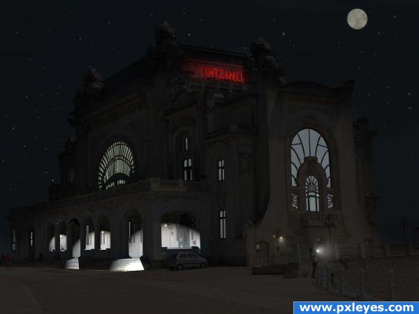
First I cropped the image, then cut out all the windows - that took longer than expected!
I added spotlight effects to building, modified lightsource for whole image.
Then added lights for street lantern, flash bulb and cazino sign, added moon & stars, darkened the sky a little more and added some highlights to the top of the building and a couple of the people. Then voila!
I am still playing with PS4 (have had it about two weeks now), so any constructive critisism or thougths are more than welcome! Thanks. (5 years and 3935 days ago)
i wanted to make this but u were faster, try to add some beam lights to light to the sky , maybe add some colour lights for the windows , the casinos is all about fun so make it more happy more fun , i would keep the lights on the road too, but that is what i was going to do anyway good luck
Nice image, but I think the light from the building would be warmer (more yellow)...other than that, good work.
Howdie stranger!
If you want to rate this picture or participate in this contest, just:
LOGIN HERE or REGISTER FOR FREE
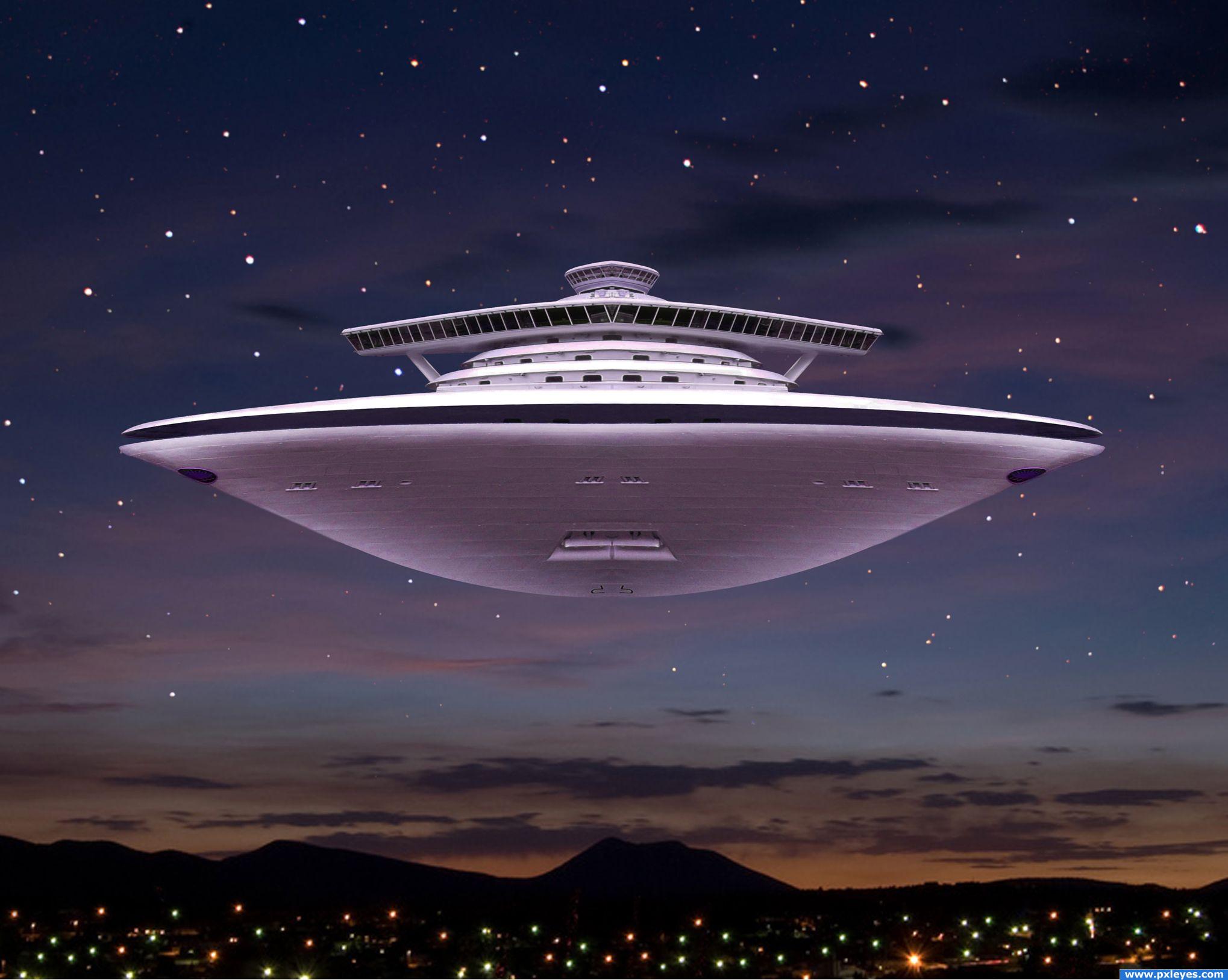
Oh yes this is a Tourist Ship as well but they collect unique souvenirs, the bi-pedal hominid kind...and of course the occasional cow. (5 years and 3940 days ago)
rock on! This is an awesome image.bravo!
nicely done
Great spaceship!
very nice
Nice job...maybe the ship should have some lights...?
cool!
Thanks for the comments! I felt adding lights would be too cliche' CMYK46, There are lights on the ground and in the sky, more would just get too busy. Besides we never...I mean THEY never run with lights when collecting specimens.
Ahhh...of course!
nice work!
love your entry author. the balance of colours and the use of source is great.
That is diferent concept!! now the ship can fly!! good idea author!! GL
nice job! the lights on the ground seem a bit big but it looks great overall
And also congrats for your third place!
Congratulations for 3rd too
Nice show this week congrats!
Congrats!!!
Congrats!, creative
congrats
Thank you all! Much appreciated!
congrats
Howdie stranger!
If you want to rate this picture or participate in this contest, just:
LOGIN HERE or REGISTER FOR FREE
Thanks xentory,mzacha (5 years and 3943 days ago)
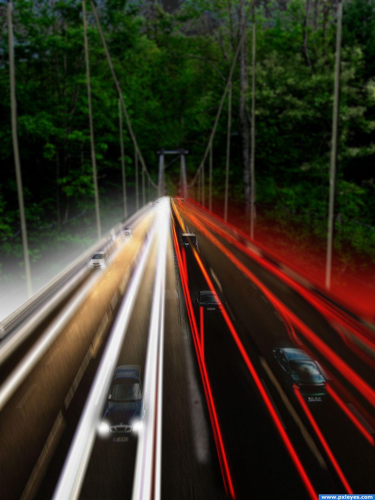
This is fun...but the surrounding scene isn't dark enough to warrant the tail light stream. Not to be too nitpicky, but usually the headlights give off more of yellowish hue...if you take it off of the neutral cool white look, it might help. Just try darkening the rest of the image and possibly give the tail light trails varying opacity and intensity. Sorry for so much critique...just like your image and thought of these things that might help. Good job, author!
The bacground loks a bit weird to me but realyl nice idea, love the light effects.
A little bit blurry ...sharpen up the background a bit methinks
neat
Howdie stranger!
If you want to rate this picture or participate in this contest, just:
LOGIN HERE or REGISTER FOR FREE
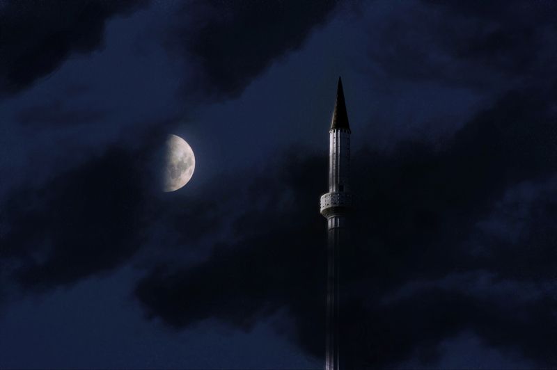
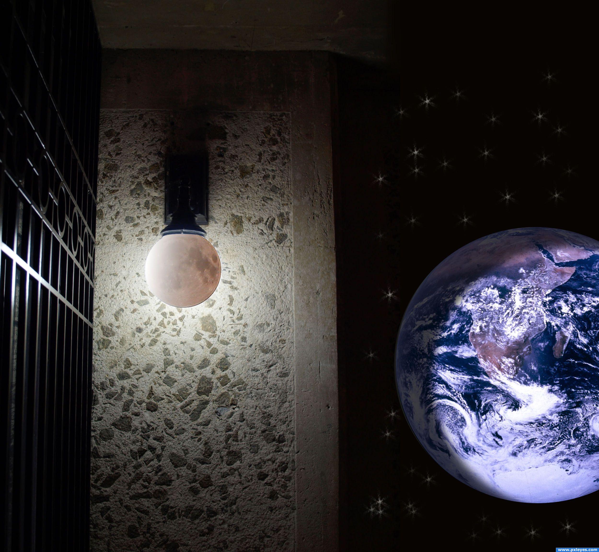
I'm not really happy about how this got but in factg I wasn't very inspired for this picture. (5 years and 3948 days ago)
Interesting image, i like it, it looks peaceful, but it's a bit on the darks side. Just try pushing the brightness up slightly.. the rest is great!
In fact I put the wrong picture and I saw it was too dark. Do you know how I can modify the picture and if I can?
Yes you can - got to My Stuff - My Contests then find the right image and click 'Edit Entry'
That's what I just did but it doesn't change the picture. I will let it like that then :/.
your image has changed, it's a lot easier to see now. My suggestion now would be to use a full moon, because it doesn;t look like half of the moon is hidden. Anyway, good luck!
It's pretty good, but the perspective is skewed as either the moon should be higher or the tower should be from the standpoint of someone on the ground.. Also you shouldn't make images just for the sake of entering a contest.
Wow... Creepy, that's great! GL
@visba: I haven't say that I did the image just for the sake of entering the contest, it is just that I wanted to do something original with the spire but it didn't come out as desired because I wasn't in an "inspiration mood". And moreover I don't understand what you were saying about the perspective for the tower ?! But I can tell you that it was intended to have both the tower and the moon at the same height. Thanks for the comment anyway.
Oh well if it was intended to have the tower and moon at the same height that's fine, it just makes it look like the tower is unbelievably tall. If the middle of the moon was parallel to the tippy top of the tower it would look right. Sorry for misinterpreting your lack of inspiration.
well.........you chopped and thats whats important
Howdie stranger!
If you want to rate this picture or participate in this contest, just:
LOGIN HERE or REGISTER FOR FREE
Photography and photoshop contests
We are a community of people with
a passion for photography, graphics and art in general.
Every day new photoshop
and photography contests are posted to compete in. We also have one weekly drawing contest
and one weekly 3D contest!
Participation is 100% free!
Just
register and get
started!
Good luck!
© 2015 Pxleyes.com. All rights reserved.


Good thinking!

good use of texture.
Very creative. Simple but yet unique.
Thanks!
Howdie stranger!
If you want to rate this picture or participate in this contest, just:
LOGIN HERE or REGISTER FOR FREE