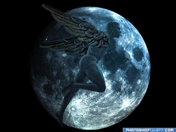
I am new to the site and this is my first entry please comment, enjoy. (5 years and 4035 days ago)
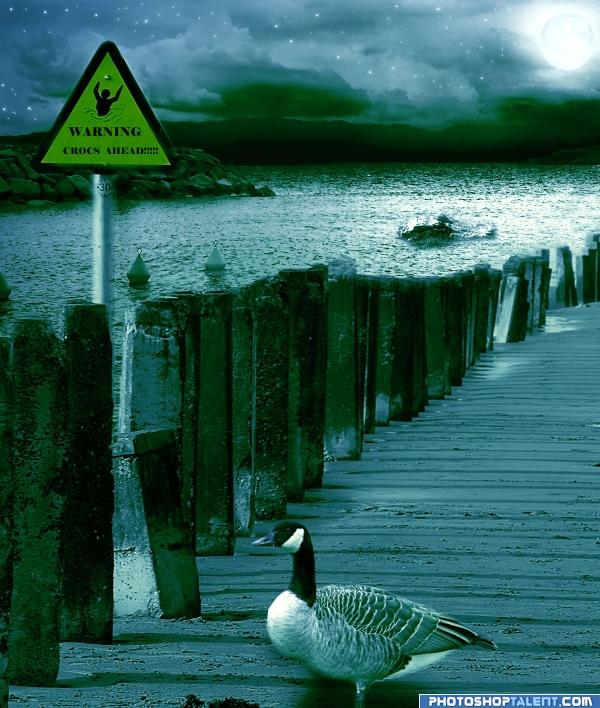
this is NOT an old entry...
made this entry this week: )
(5 years and 4035 days ago)
I'm liking the mood but I think you need work on the goose.. his feet are kinda wounded and he's looking a bit floaty.. you have a good composition going though. now just make it work for you more
(I can't really see the croc either.. and I really am trying.. good luck author)
Much BETTER!!!. those feet were driving me crazy.. which isn't very far for me to drive LOL
(I can see the croc now.. I didn't realize he was swimming sideways, so I couldn't build his shape.. much better now)
golem thanx for the comments u can see the croc in the water only head is visible (as in the source link)
edit:have moved the goose down  hope its ok now golem
very nice. good job author 
Love the feel of this image...Croc is a little sharp compared to the surrounding area and the goose edges need to be sharpened...Good Luck
nice colors, shadow of bird is not ok
thanx all for the nice comments: ) Nator: have darkened the sky..christy: and gopankarichal :have made changes as u said
you need to work on the birds shadow i like it though
good idea  love the colors
  GL
GL 
nice work and good color 
Fantastic!
Giid entry, i think maybe the shadow on the goose should be a bit more subtle, and maybe try giving a harsher edge to your alligator or crocodile. Otherwise it's a very nice mood and good luck!
Croc is way out of scale...unless you're going for Hollywood monster flick....shadow on goose is opposite light source.
As CMYK says, the light is from the moon, there would not be the shadows from the posts across the sand, they would come forward.
i have readjusted the shadow..hope its ok now
Hmmm.. Not sure what you have done - but your pole and sign are now semi transparent! So are some of the pillars at the top.
beautiful colors
hey animmax i have not done anything to the pole and the sign  ....i had just readjusted the shadow of the duck as mentioned before in my previous comment

anyway thanx a lot everyone for the nice comments 
i love the mood, great job author

Beautiful work author, this is truly beautiful and calming like.
Howdie stranger!
If you want to rate this picture or participate in this contest, just:
LOGIN HERE or REGISTER FOR FREE
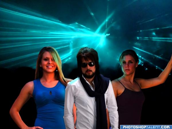
i will spend my money on night clubs and girls ;)
and thats not all my BMW M6 is out side the night club :) (5 years and 4039 days ago)
good work. You added the reflection on people, but if you give more highlighted edges will be better, and reduce the reddish tone of people
but I see you spent nothing on the hair cut LOLOLOLOL.. get some style... LOL. looks like Adam Sandler after a rough week end LOL.. good luck author.. very cute concept 
I may be wrong but I believe men are, on average, a bit taller than women. So I think the perspective is off a bit with all three of them being the same height. Plus with the women behind "Mr. Sunglasses Indoors" either he has little man complex or they are from Amazonia (is that a place?). Also, if you'll soften the edges of his arms he won't look so cut out.
The man seems very small compared to the women, even the width of the man seems small, work on perspective and color correcting the red out of the photo to a more cool color and you should have a pretty good piece. Good luck!
the girls don't exactly look as though they are in the same picture:l
The flesh tones would appear more cool than red if actually in this room. Try toning the red down a bit. 
Howdie stranger!
If you want to rate this picture or participate in this contest, just:
LOGIN HERE or REGISTER FOR FREE
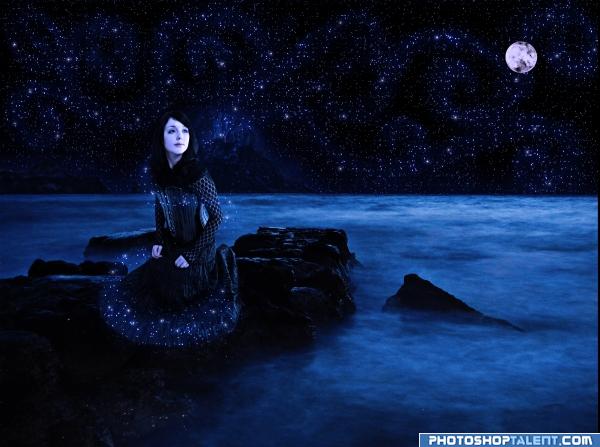
Nyx was the primordial goddess of the night. A shadowy figure, Nyx stood at or near the beginning of creation, and was the mother of personified gods such as Hypnos (sleep) and Thánatos (death). Her appearances in mythology are sparse, but reveal her as a figure of exceptional power and beauty. She was the only god or goddess which Zeus feared.
Please view high res.
Special thanks to antihumanstock for the exceptional photography. (5 years and 4042 days ago)
Wow! It looks beautiful  ! Great job!!!
Suggestion for background: Bigger moon, a lot less loopy stars....
Okay, I toned down the star swirls, but didn't eliminate them completely. As far as the moon, I'd rather it not overshadow Nyx. As unrealistic as much of the image is, I don't think that you would see the moon in the sky larger than the size it is in my entry. Thank you for the suggestions, CMYK46.
Perhaps yu could tone down some of the stars and add a constellation or two.
good work
nice idea!! G/L
nice! gl
Very beautiful image of one of my favorite Goddesses!
Howdie stranger!
If you want to rate this picture or participate in this contest, just:
LOGIN HERE or REGISTER FOR FREE
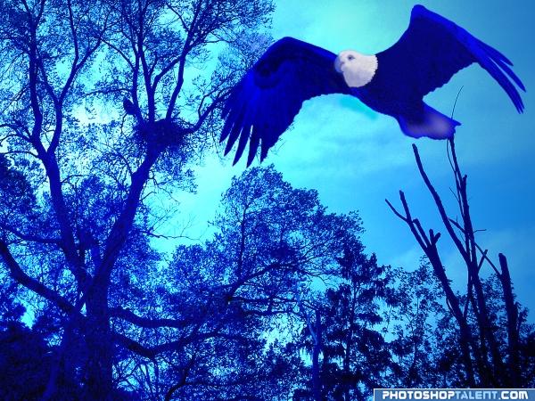
Thanks to carlchapman for the beautiful eagle in flight. Background is an eagle nest in trees which I took recently here in Ohio. Daddy eagle never appeared down where we could photograph him, but a couple eaglets were in the nest with mother perched nearby.
Adjust/color and balance/changes of hues, saturation were used along with airbrush, paintbrush, and dodge tools. (5 years and 4046 days ago)
Looks like day...title change recommended...
a liitle darker shade of trees will add glory
aw very pretty, nice work, the bird is a little more drawn than the rest of the picture tho, try blurring or filtering the background 
very nice image... Blue is exhausting isn't it? especially when you can't call on any other colors to help ya along... LOL good luck on this, very handsome
head can't be white.
nice
I'm sorry, eagle really kills it for me. Why did you make it so "painty"? Sourse image looks fine to me.
I think the eagle is not blened into the picture too well, otherwise nice work!
Howdie stranger!
If you want to rate this picture or participate in this contest, just:
LOGIN HERE or REGISTER FOR FREE
First Entry!?!?!?!!?.. well howdy doo.. great and powerful.. awesome re building missing foot.. you'll want to go through steps of how you created the piece, but not on this entry (NEWBIE BENEFIT) hehehe.. no big critique's very solid form.. the wings and body aren't perfect matches (body is ethereal while the wings are solid, but that is your personal choice . I like darkening the back wing for depth of field.. other's might have more Ideas.. but I LIKE IT/ good luck
Amazing first entry! Very cool and cerebral! Congrats -
nice job! , and welcome to the site
nice idea. problem is in the depth and clarity.
very nice idea, maybe add some stars and alter his colors a bit so they don't fade into the planet so much? Good luck and welcome to the site.
very creative. Agree with Tapiona.
Love the feel of the image!! Just my opinion but maybe make the wings a little more opaque to blend with the body better...Welcome and Good Luck
love the feel of this one nice job on the masking
Great image....
welcome
nice mood
congratulations
Howdie stranger!
If you want to rate this picture or participate in this contest, just:
LOGIN HERE or REGISTER FOR FREE