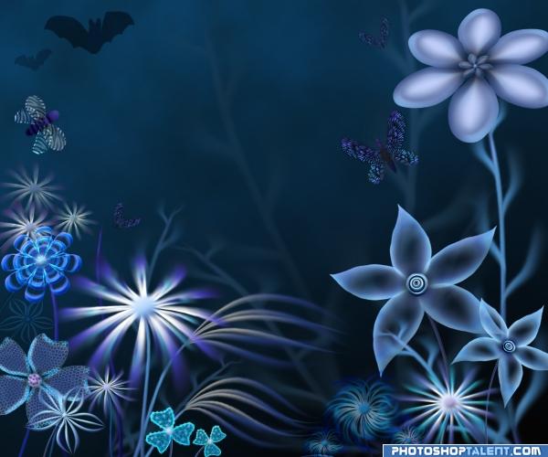
Only PS is used. (5 years and 4035 days ago)
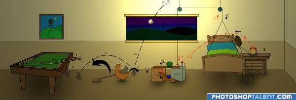
People get really lazy after a long day of tiresome work. So when they go to bed, they forget to switch off the light. Here is solution for these people(marked with black arrows and numbers)..This comes with an added advantage of automatic switching off of your alarm clock (marked with red arrows and numbers)..
You climb onto your bed (1) which is hanging by means of a string. This causes the bed to come down to the floor(2) while the 100.01 kg concerte block rises (3). This causes green ball to roll down(4a) as well as the lever to go down (4b). The green ball falls on the floor(5) and the cat jumps off the basket to play with the ball(6), causing the basket to swing (7) and hit the billaird stick. The stick hits the cue ball(8) and the ball goes along the dotted line (9) and hits the red ball which moves and falls into the hole(10). The red ball bounces on the floor(11) and falls on a spring (12). It moves along 12 and falls on spring 13, bounces off it (14) and hits the glowing bulb(15) thus breaking it, and bringing the room to darkness.. Mission Accomplished..
In the morning, the alarm rings and wakes you up. You get off the bed(16) thus causing the bed to rise up (17), the concrete mass falls down(18). This sudden impact causes the lever to rise up(19) which causes the blue ball to fly along the trajectory (20) and smash into the alarm clock (21) breaking it.. Now u dont have to manually switch it off..
Troubleshooting: In case your cat decides to leave your house some day, do not replace the broken bulb from the previous night..
End of a long manual... :D (5 years and 4037 days ago)
interesting idea good luck!
nice
i need this system... brilliant! 
right on target... good luck
perfectly......perfectly.......perfectly......according to theme........one que. are u best student of ur class ??
Interesting, good luck
GL!
nice
bigggggggggg
Very good work The only minor problem is the shadow from the bed. It is still really good. Good Luck
nice man nice
This is a funny invention! 
 Well thought of, good concept and nice visual presentation.
Haha, reminds me a bit on Der Lauf der Dinge (argggh, had to check Wiki, looks like that documentary is bà sed on such goldberg principle, so nevermind...). I like the addition of the pool table. Pretty interesting,nice execution. Good luck!
excellent device! )))
Well thats one way to turn of a lightbulb lol. How many people does it take to turn off a light bulb, One just really lazy and tired man LOL XD
nice 
Really great work....It is even better in high res!! Good Luck 
Nice work author!! 
Complicated thinking! Well done! 

congrats on 2nd...great entry!
Congratulations for 2nd
Congrats!
Congrats! Way to go! Great entry!
Congratulations.
Congrats on 2nd!
Howdie stranger!
If you want to rate this picture or participate in this contest, just:
LOGIN HERE or REGISTER FOR FREE
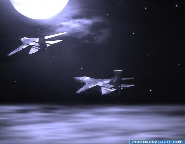
I was inspired by the Toy Story series when I made this entry. Two toy planes flying under the moonlight...
"TO THE INFINITY... AND BEYOND!!!"
P.S. My own sources. (5 years and 4037 days ago)
high High HIGH MARK for using your own images.. just wonderful.. good luck
ohhh just a little more and it is perfect! 
GL!
But thats really not very blue 
i think this needs more blue in it
very nice
it looks more grey than blue??? will hold vote 
Hey, folks... I know that it's not specified in the SBS, but after I composed the image, I desaturated it, then I applied the blue filter. That's it. Therefore, there aren't any other colours than blue there. Thank you...
It's perfect, but you should make it a bit more blue.
I still don't see how it doesn't fit the guidelines; I have tried other tones of blue, but they seemed very artificial for a moonlight feel, that's why I made the choice of just letting it as it is. Hope you understand. Thanks for the feedback anyway 
nice job 
WAY OFF THEME
That's pretty harsh, Christy... and by the way it is NOT off theme, since black and white are just the two extreme tones of ANY colour 
Well, as a matter of fact white may be considered a colour, but if we take this into account we'll have most of the entries removed.
I wish there was less criticism here...
very nice mood
Nice mood indeed. If it's blue enough...ow well, depends on how you see it of course. Maybe on some screens this is more purple. As creation I like it, the only thing that's a bit off in style imo are the stars (a bit too stereotype, maybe if they'd look more like blurred dots it would fit better). But again, just my opinion. Good luck!
Howdie stranger!
If you want to rate this picture or participate in this contest, just:
LOGIN HERE or REGISTER FOR FREE
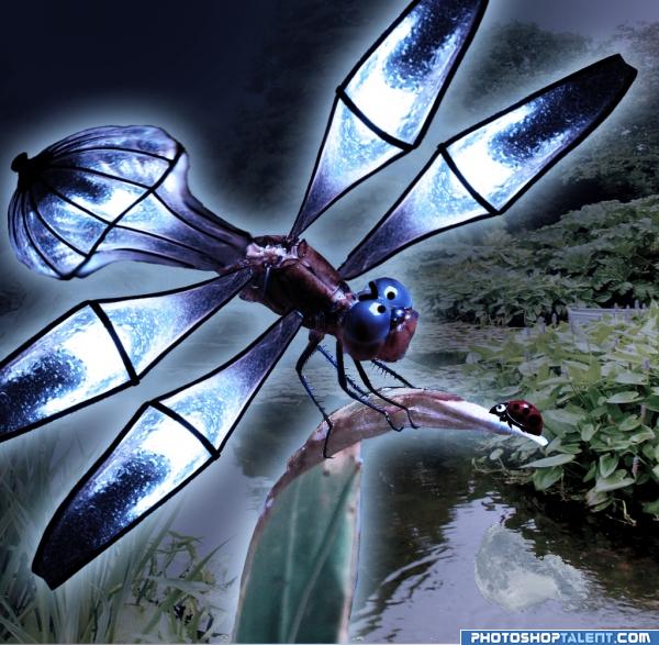
This is a Dragonfirefly :) I've learnt alot making it! (5 years and 4039 days ago)
very nice 
Excellent Excellent.. only if you have time, and DON'T Ruin what you've got .. but if you placed this in Liquify and Froze all the wing area exposing only the dark lines and ran the PINCH tool over them.. carefully.. at a small setting you could thin the lines down so they wouldn't look so much like stainglass borders.... something to try.. the end result right now is excellent.. might want to burn tool his butt a bit to get rid of the flattness.. but HIGH MARKS all around (inho)
nice
Good idea. Would be better if the abdomen wasn't distorted...
nice
Nice use of source!
Great!
Funny image. If you can make the edges from the tail part a bit more smooth& sharp, would be even nicer! Good luck!
that's one mean dragonfly ))))
nice idea .. 
Howdie stranger!
If you want to rate this picture or participate in this contest, just:
LOGIN HERE or REGISTER FOR FREE
(5 years and 4040 days ago)
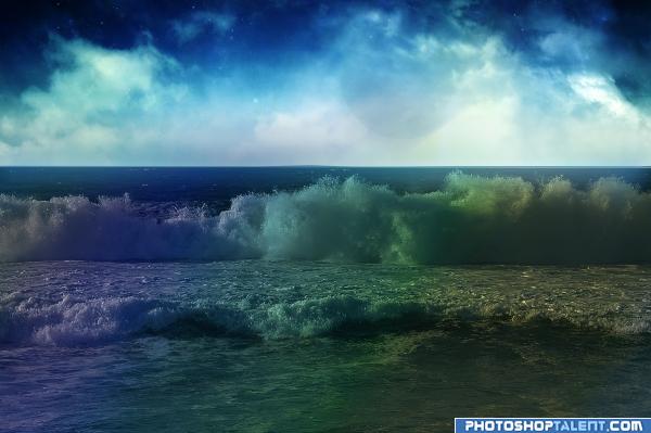
nice close rainbow hee..good job mate maybe make them more lightly
Good color balance! GL!
I think a little more work needs to go into an entry for it to be the best, you have not changed enough in my opinion. 
Howdie stranger!
If you want to rate this picture or participate in this contest, just:
LOGIN HERE or REGISTER FOR FREE
zumzumzumzum i am bee! seriously.
looks like purple is through the image alot..
Too bright for a night scene, but nicely made as usual, author.
SWEET!!!!
Nice mood, I like the barely visible background. Also nice details in the foreground of course. Good luck!
I like this very much for what it is , a very nice piece of digital art that is hand made. I specially like the shading. High marks

Edit: I kinda thought I knew this artist, good job as usual
Great pic
good work. good feel
very nice
lovely!!!
wow!!
Lots of non blue colours, but nice
Music to my eyes! Beautiful job!
Thanks to all for the comments

congrats
Congratulations Cornelia for your beautiful entry and the 2nd place! And also thank you for your votes and selecting mine as "favorite"
Congratulations for 2nd Cornelia
Congrats! , beauttiful work
congrats my friend
Congrats! Way to go! Great entry!
Congratulations.
Congrats!
Congrats!
Howdie stranger!
If you want to rate this picture or participate in this contest, just:
LOGIN HERE or REGISTER FOR FREE