Photoshop Pictures: Nightmare (page 4)


results 16 - 20 of 39

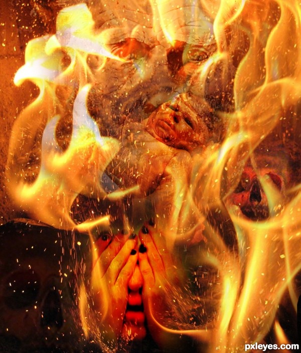
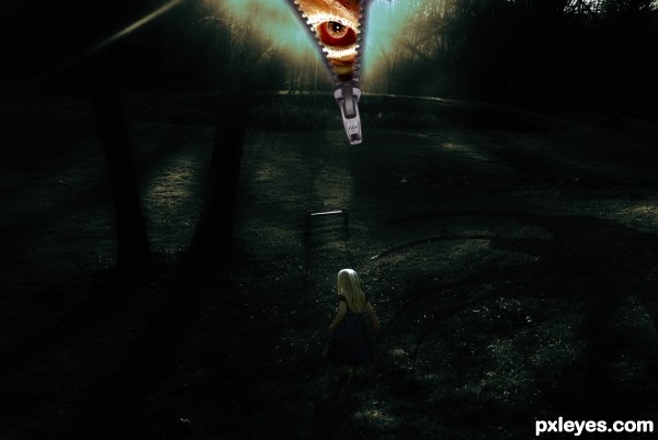
Nightmare - created by TwilightMuse


Nightmare
Favs: 2SBS: 11Hi-resRank: 9/17Score: 54.4% (0)15932 views

Nightmares are always so much more memorable than the pleasant dreams. Oddly enough my nightmares always lack common sense and I often find myself walking into a bad situations.
Thank you to mconnors at Morguefile for the zipper,
JherDan at Deviantart for the Freddy Glove,
The girl in the blue dress is by fallnstock at Deviantart.
The background image and evil eye are mine.
(5 years and 3252 days ago)

3 Sources:

avatar MnMCarta
MnMCarta says:

Great job! I really like the feel on this one...

avatar Augustinaart

It's frightening!

avatar derdevil
derdevil says:

ready or not here i come

Howdie stranger!
If you want to rate this picture or participate in this contest, just:

LOGIN HERE or REGISTER FOR FREE


Nightmare - created by nilknarfsoive


Nightmare
Favs: 1SBS: n/aHi-resRank: 13/17Score: 53.4% (0)7686 views

I don't like the feeling when I see this creation of mine. It's too devilish. (5 years and 3262 days ago)

5 Sources:

avatar jawshoewhah
jawshoewhah [banned] says:

Welcome to PXL author. You might want to take some time to read the rules and guidelines. Entering similar entries is against the rules. I'd flag either this one or the other for removal or the mods will remove them both. Then take some time and read :

http://www.pxleyes.com/guidelines/
http://www.pxleyes.com/blog/2009/07/how-to-participate-in-pxleyes-photoshop-contests/

author says:

Oh really? i thought we are allowed to send upto 3 entries in each category... I did not see it in the guidelines prohibiting to send more than one entry in each category... in fact i have seen some authors with multiple entries in previous categories... anyways, you're the pro... so i guess i need to remove the other one and perhaps move it to mixed manipulations category... thank you for the tip... i appreciate that...

avatar jawshoewhah
jawshoewhah [banned] says:

I think they might have left out that specific rule are far as similar entries in contest. I was there and is still a rule as I know. You are allowed to enter three entries but the similar entries rule is mainly there because if you enter two similar entries and if I can tell they are both yours it makes one of your entries no longer anonymous by voting on one. Besides, it shows more creativity in your entries when you keep them more diverse. Make sense?

avatar CrystleClear

love this! the only thing i have a problem looking at is the skull on the bottom left, its too dark, maybe brightening it up and adding some more contrast would be great!

Howdie stranger!
If you want to rate this picture or participate in this contest, just:

LOGIN HERE or REGISTER FOR FREE


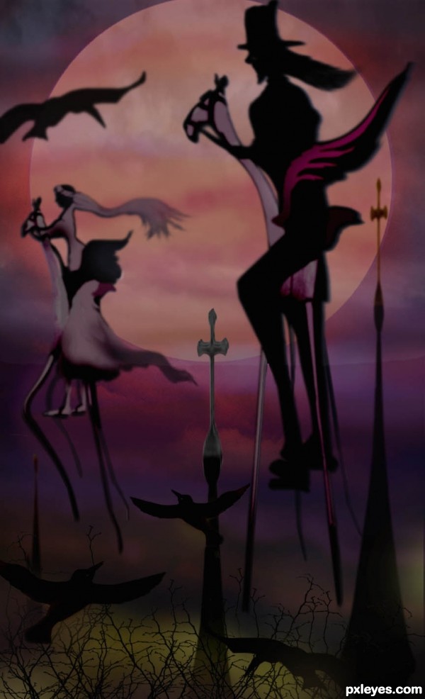
A Nightmare Honeymoon Trip - created by artgirl1935


A Nightmare Honeymoon Trip
Favs: 0SBS: 12Hi-resRank: 17/17Score: 53% (0)8336 views

Thanks to betbele at flickr.com for the red sky source; to trailbog at pxleyes.com for the church steeples source; The figures and birds are hand drawn with brush tools. My own rocking horse source became their nightmare 'steeds'. Thanks to cgtextures.com for the trees used at the bottom. (5 years and 3294 days ago)

3 Sources:

avatar CMYK46
CMYK46 says:

I can see this maybe being silhouettes, but "dark surrealism?"...nah.
(Try to figure out which layer should be blurred most).

avatar Drivenslush

Really reminds me of The Nightmare Before Xmas or the Corpse Bride.. wonderful imagination and creations

avatar arca
arca says:

Very original and unusual ... interesting and surreal image!

Howdie stranger!
If you want to rate this picture or participate in this contest, just:

LOGIN HERE or REGISTER FOR FREE


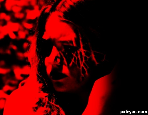
Red nightmare - created by Gransbergis


Red nightmare
Favs: 0SBS: 2Hi-resRank: 13/17Score: 45.7% (0)6019 views

(5 years and 3331 days ago)

1 Source:

avatar MossyB
MossyB says:

The final result is very blurry, and the overlay of the organic texture turned into a strange shape and lost almost all the interest from when you first applied it to your background image. It looked quite interesting at that stage, but then became overdone.

avatar velkanx
velkanx says:

Its too blurry and the texture from the source image does not blend nicely. It looks like you cropped it and just put it there

author says:

i agree

avatar Geexman
Geexman says:

Good attempt, maybe learned a few things for next time?..... good luck author

Howdie stranger!
If you want to rate this picture or participate in this contest, just:

LOGIN HERE or REGISTER FOR FREE


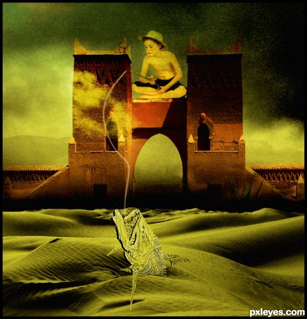
fishing nightmare - created by nanaris


fishing nightmare
Favs: 0SBS: 1Hi-resRank: 8/17Score: 53.8% (0)5503 views

thanks all for the source files. (5 years and 3407 days ago)

3 Sources:

avatar ponti55
ponti55 says:

lighting clashes between the skeleton, tower and sand. The shadow the fish is casting is also incorrect. I'm not too sure what that spike is beneath the fish either... you should upload a high res version so it can be seen better.

author says:

its surealism ponti , the fish is not casting any shadow, the grain and the overall color composition for me is the title "nightmare fishing" , i apreciate your comment.

no avatar
Keiley22 says:

i love surealism images some of my favourites are ones with shadows, they just dont match the object they come from ;p maybe give that a go too...

avatar ponti55
ponti55 says:

Surrealistic or not, lighting is a basic principle in all images... it may never be 100% right but something as simple as flipping the tower would improve your image. If you'd like to go into more depth then i also suggest trying to make the strong dark shadow from the original source much softer and brighter to fit in with the surroundings. (look at how soft the shadows on the sand are)

avatar Tuckinator

um, not bad

avatar erathion
erathion says:

cool idea....gl

Howdie stranger!
If you want to rate this picture or participate in this contest, just:

LOGIN HERE or REGISTER FOR FREE