(5 years and 3077 days ago)

(5 years and 3120 days ago)
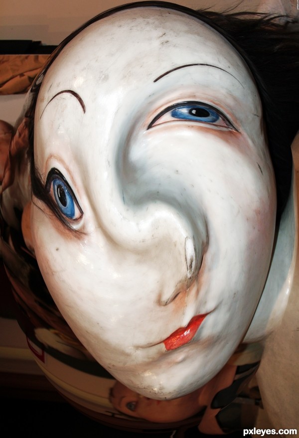
hehehe.. sigh.. I love twirl  good luck author
Howdie stranger!
If you want to rate this picture or participate in this contest, just:
LOGIN HERE or REGISTER FOR FREE

All other photo stock is my own and in my SBS. (5 years and 3382 days ago)
Good idea & SBS, and gotta love the evil grin!  GL author.
Thanks Bob 
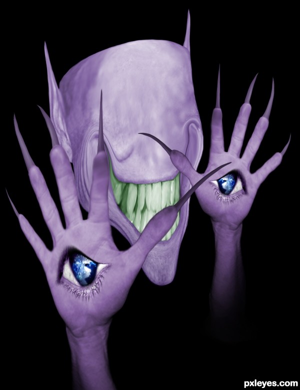
Reminds me of a character in "Pan's Labyrinth".
I've heard of "Pan's Labyrinth" but I've never seen it. Apparently you are not the only one to think so. 
Fantastic work author...u should make more images with this crazy creature...best of luck
Definately like the creature from Pans Labyrinth. I shudder at the thought... Great creation and very creative.
creative and interesting
Completely KILLER! insta fav!
Great job ! 
Ok, I googled some Pan's Labyrinth monster movie stills. I can see the resemblance, especially the monster with the eyes for hands.
Thanks for all the comments and favs! 
Great work ... love the grin too! The whole image is such a great blend or the creepy, the strange and the just plain crazy it is greatt!
Ahhhh ... I should have known ... I can see your touch in this Author... you definitely have and eye for the bizarre (which is a great thing IMO)
OMG THIS IS GREAT!!! Your imagination is so WOW! 
Good work.
LOL, looks like this character evolved from the One-Eyed One-Horned Flyin' Purple People Eater!!
http://www.lyricsbay.com/one_eyed_one_horned_flying_purple_people_eater_lyrics-halloween.html
Love how you distorted the face, especially the grin. 
GREAT!!
Congrats 
Congrats for 3rd
congratulations...
Congrats!!!
Congrats buddy...fantastic entry...
Hey congrats !! 
Nice! Congrats!
Howdie stranger!
If you want to rate this picture or participate in this contest, just:
LOGIN HERE or REGISTER FOR FREE
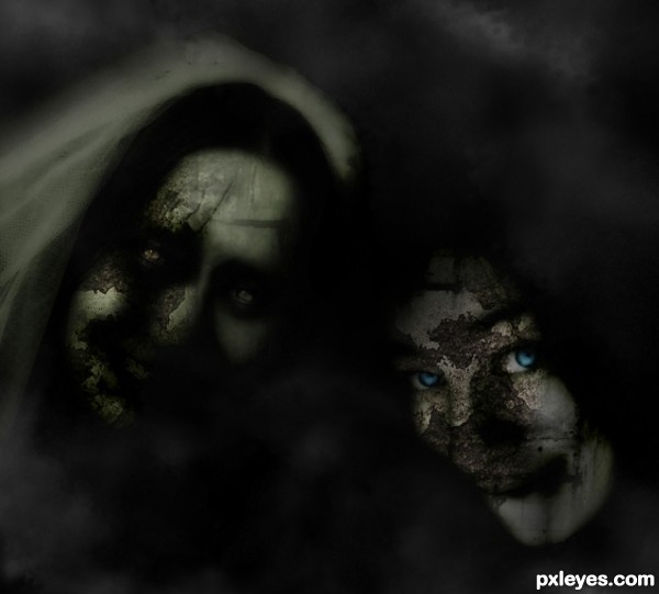
It's so dark, you can't tell who it is (or is supposed to be). Could be any two faces coverd up with textures. The bright blue eyes work well as a focal point, but there's just not enough clarity to give the composition much direction.
why there is stuf in "black" background, not profesional, it's beginner work, blend is not good, textures are to flat, you was tired when cuting face from background, because they are with smooth edges.
Helloooo..Gransbergis..take it easy partner!..i put a simple blackground to focus the main pics..about the tired thing?..mmm maybe u saw it that way..sometimes i like to do simple pics..if u call this picture beginner work..i invite u to see my profile and portfolio...Thanks for commenting,im gonna try to fix the background later on.
yes you have good works in your profile, and this work now is better with that background, i just say what i see when first time see a picture
thats spooky...
Howdie stranger!
If you want to rate this picture or participate in this contest, just:
LOGIN HERE or REGISTER FOR FREE