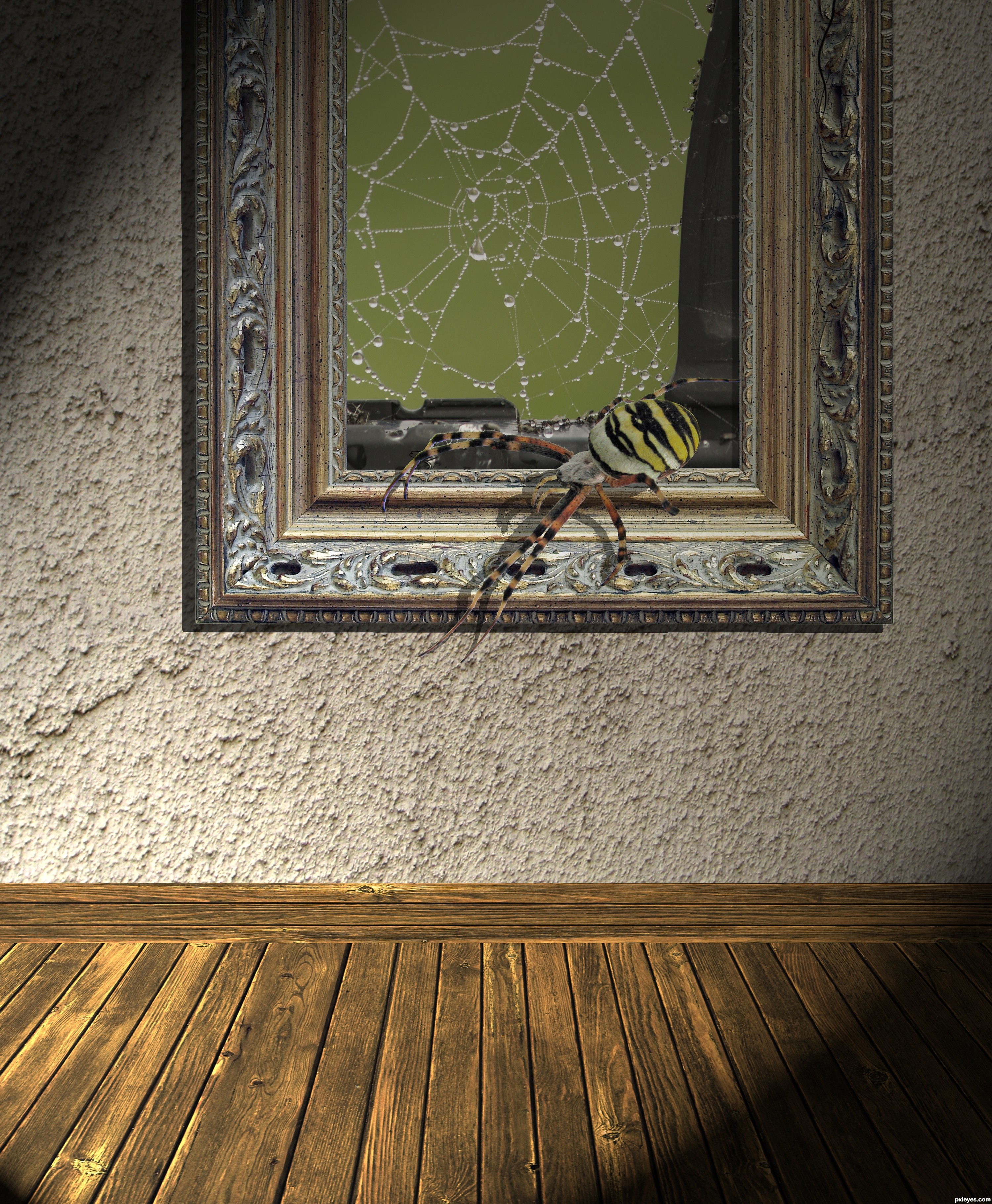
Thanks to gabrielaaa (Wall), kovik (floor), GMDee (web has been notified) and ftibor (Spider) and Dorne (Frame)
Note lighting was added using Render lighting in CS3
CS3 & Bamboo Fun (5 years and 3636 days ago)
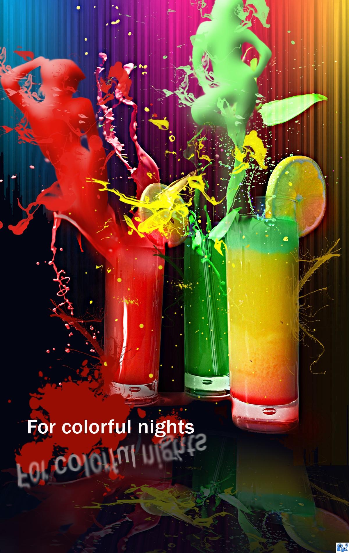
Used the threshold option for turning the images into opaque silhouettes. Than, in order to offer them a glossy effect I've used the bevel and embross option. The paint splashes made by http://mediamilitia.com are gorgeous and have been very helpful. The colorful lines in the background have been created using the gradient tool, modified after that with the waves distortion filter. the rest is simple :P
I have been inspired by this tutorial.
http://10steps.sg/tutorials/photoshop/making-of-the-imaginary-paint-dancers/
Check it! Is great!
credits and thanks:
http://katanaz-stock.deviantart.com
http://mediamilitia.com
http://emelody.deviantart.com (5 years and 3881 days ago)
Interesting image. Type & reflection not so interesting...change or remove it, get higher vote.
this would be a great poster for a night club or something  awsome work.
I agree with CMYK, i dont see why the text is there at all. Take that off and fix the reflection and youll have a great image. I think you should pay tribute to the paint dancers (or whatever its called) which clearly looks like the inspiration for this piece. This should really have a proper SBS too - I dont think you can get away with your brief description.
I like it a lot, but in my opinion the splashes should be a little bit more transparent, they are still drinks and no paint.
u should make the shapes a little more defined with a bit of strong shadows and not just bevel and emboss the layer. Doesn't look realistic. The idea is great. Also u should make the liquid a bit more transparent give it some reflections. Good luck and all the best to u
Excellent, I adore this work . All the best
the background is too much vivid and attract too much attention
text is too much,everything else damn good...gl author
interesting and colourful use of source, i agree with other commenters on the few changes required.
Wow this is stunning! Since a long time I intend to try that great "Making of the Imaginary Paint Dancers" tut and now I am inspired to do it at last
Agrees with removing type.
The title says it all, no need for the text in my opinion, but i really like the work put in here, the depth on the figures is very well done. G'luck!
would have given a higher vote if text was removed, it pretty much ruined it for me.
Congrats, well done
congrats on your first place
Congrats!
Congrats!!
WOW...a first place with major flaws...standards are definitely sinking fast...
Howdie stranger!
If you want to rate this picture or participate in this contest, just:
LOGIN HERE or REGISTER FOR FREE
(5 years and 4045 days ago)
hahah! this is sooo cool !
haha funny one, nice
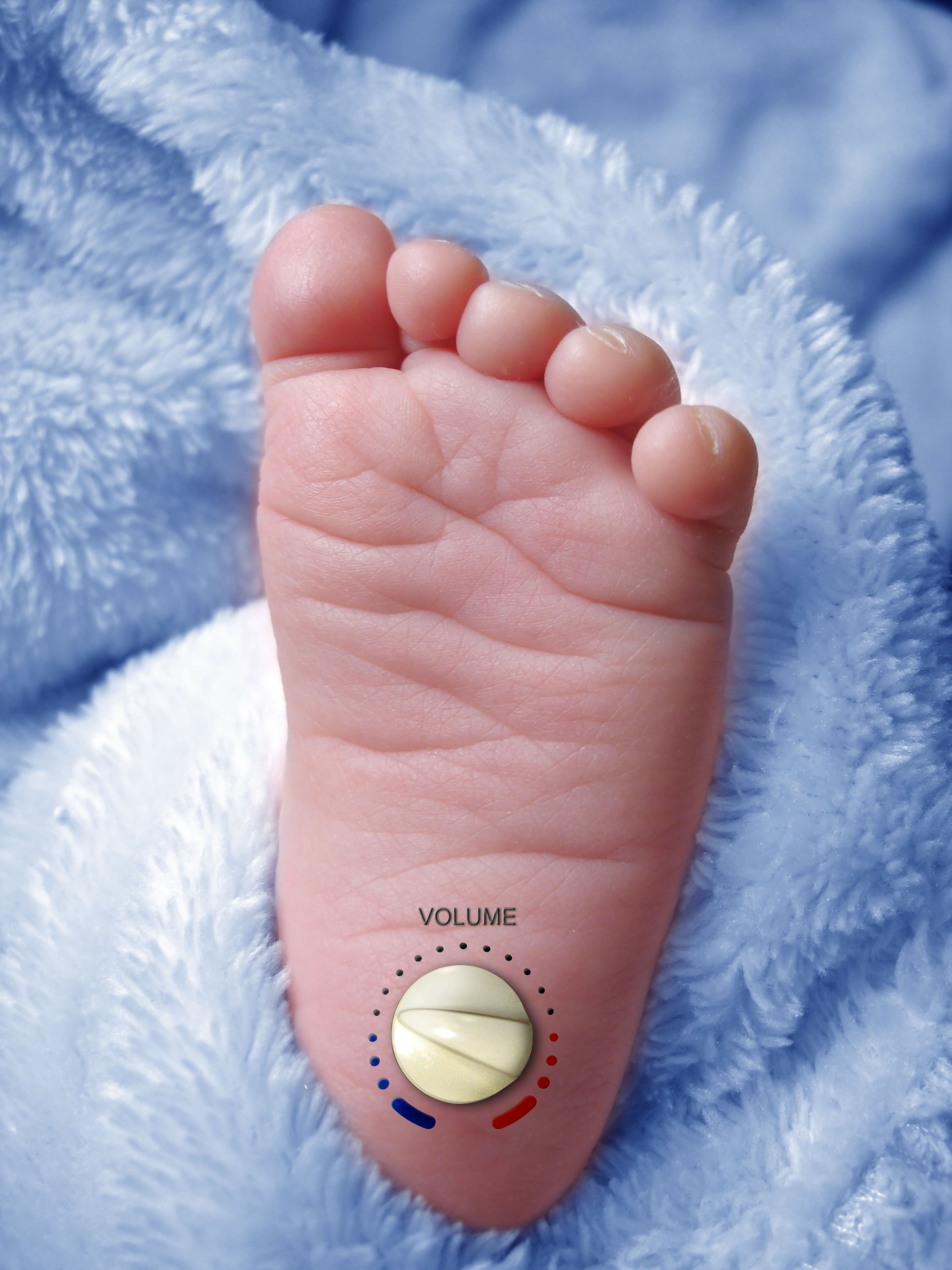
It's a very funny idea! But you need to blend it better, it looks a little bit off. I wish my son had this knob when he was 6 months old 
 GL
GL
 Great idea!
!  ! Sooo funny! Well done
I can identify with this.
Good idea
Very clever. With this lighting, I would expect the bottom half of the knob to be darker portion. The markings look more like they're floating on top of the foot rather than painted on to the foot. The blue and red are colorful but are associated with cold and hot, not loudness. Maybe the circles could grow increasingly bigger as volume grows.
LOL maybe if babies came with one of those I might have had children...Nicely Done and Good Luck
If you can manage this! You will be the richest person on the planet!!! Just watch the contours where your controls go over the wrinkles in the foot. GL
ROFL!!
forcely fixed
I agree with dan The volume would scale from small to big to identify what is quite and loud. Funny though good luck I know alot of people will associate with this one :P
great
hahaha.nice ne
this solve the prob indeed, hahaha, nice idea, and well done, good luck.
Creative idea for sure
Howdie stranger!
If you want to rate this picture or participate in this contest, just:
LOGIN HERE or REGISTER FOR FREE
Photography and photoshop contests
We are a community of people with
a passion for photography, graphics and art in general.
Every day new photoshop
and photography contests are posted to compete in. We also have one weekly drawing contest
and one weekly 3D contest!
Participation is 100% free!
Just
register and get
started!
Good luck!
© 2015 Pxleyes.com. All rights reserved.


Nice idea, a few little things about the spiders shadow you might like to think about. Firstly, where ever the spider's feet are touching the frame, the shadow should join the feet of the spider. Secondly these types of frames are not flat, so the spiders shadow needs to follow the contours of the frame, try using the warp tool to adjust the shadow. Good luck
Cool idea BUT: The spider has a white-edge residue around it (see hi-res; need to refine edge). All of the spider is 'out of bounds' which makes it look like it's just crawling on (not out of) the picture of a cobweb and thus this image is not on theme. The spider does not stand out even though it is supposed to be the focus per the title.
Adjusted the spider legs and shadows to touch along the frame.
Adjusted the edge masking
Some adjustments to drop shadow of the spider to be a bit more in the frame
very very nice i like it a lot
it is very nice one ,good luck
Much better
very nice work author...good luck
Very cool idea and work, do have a suggestion for consideration it is a very big frame and the top part is not really adding anything to the image so I would move it up a bit given more space between the frame and floor to add a molded skirting board just to finish the wall off and to give a more realistic feel.
Added a molding to the wall and adjusted the framing of the image -- thanks warlock for the suggestion
Glad it helped.....much improved good job!
Looks Good!
Howdie stranger!
If you want to rate this picture or participate in this contest, just:
LOGIN HERE or REGISTER FOR FREE