(5 years and 3656 days ago)
(5 years and 3656 days ago)
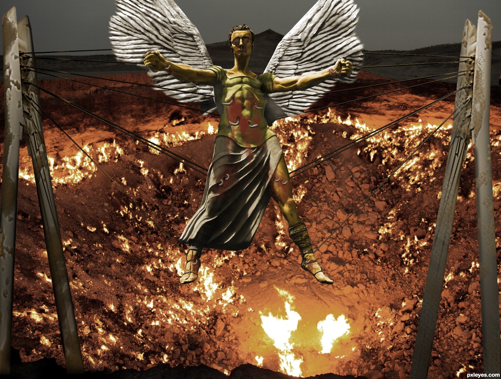
Quite dramatic image, well done for that. For me I just miss some connection between the background (which is an impressive shot!) and the bridge parts, it's like they have complete different perspectives. Any way to fix that? Good luck!
It reminds me "Hellraiser", but in angel version!... Very impressive work, author! 

You`re quite right Waz, it was bugging me too...I tried to change the perpective by re-drawing one of the struts but I felt there wasn`t enough source image on show.So I opted for him being suspended in front of the pit rather than over it. I have however grunged the struts to be more in keeping with the image. Hope its better  ........and thank you sweet Erikuri!
Howdie stranger!
If you want to rate this picture or participate in this contest, just:
LOGIN HERE or REGISTER FOR FREE
this one is fun..
source from Maxnot @ Flickr (5 years and 3662 days ago)
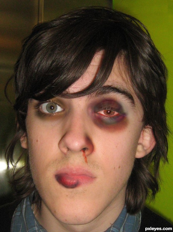
It's on theme, but try and see if you can fatten up the lip and maybe make it so the eye is semi swollen shut. GL!
maybe better?
Looked much better before, you don't need to please everyone. The edit you did distorted the image in unrealistic ways, mostly in the eye (the iris/pupil is now an odd shape) and eyebrow area, the change to the nose could be interesting, if corresponding injury marks were made.
Agree with annabat. Eye is too much distorted. I have not seen that wound can change color of iris. Change right eye color to it original. Good Luck
Very true,u did very nice work on the mouth,nose and his right eye,but left one now look unrealistic and distorted...try to fix that author,because this entry have a lot of potential...good luck
Better!
Lip looks more convincing but the eye pupil is a little small on the black eye.

Howdie stranger!
If you want to rate this picture or participate in this contest, just:
LOGIN HERE or REGISTER FOR FREE
(5 years and 3662 days ago)
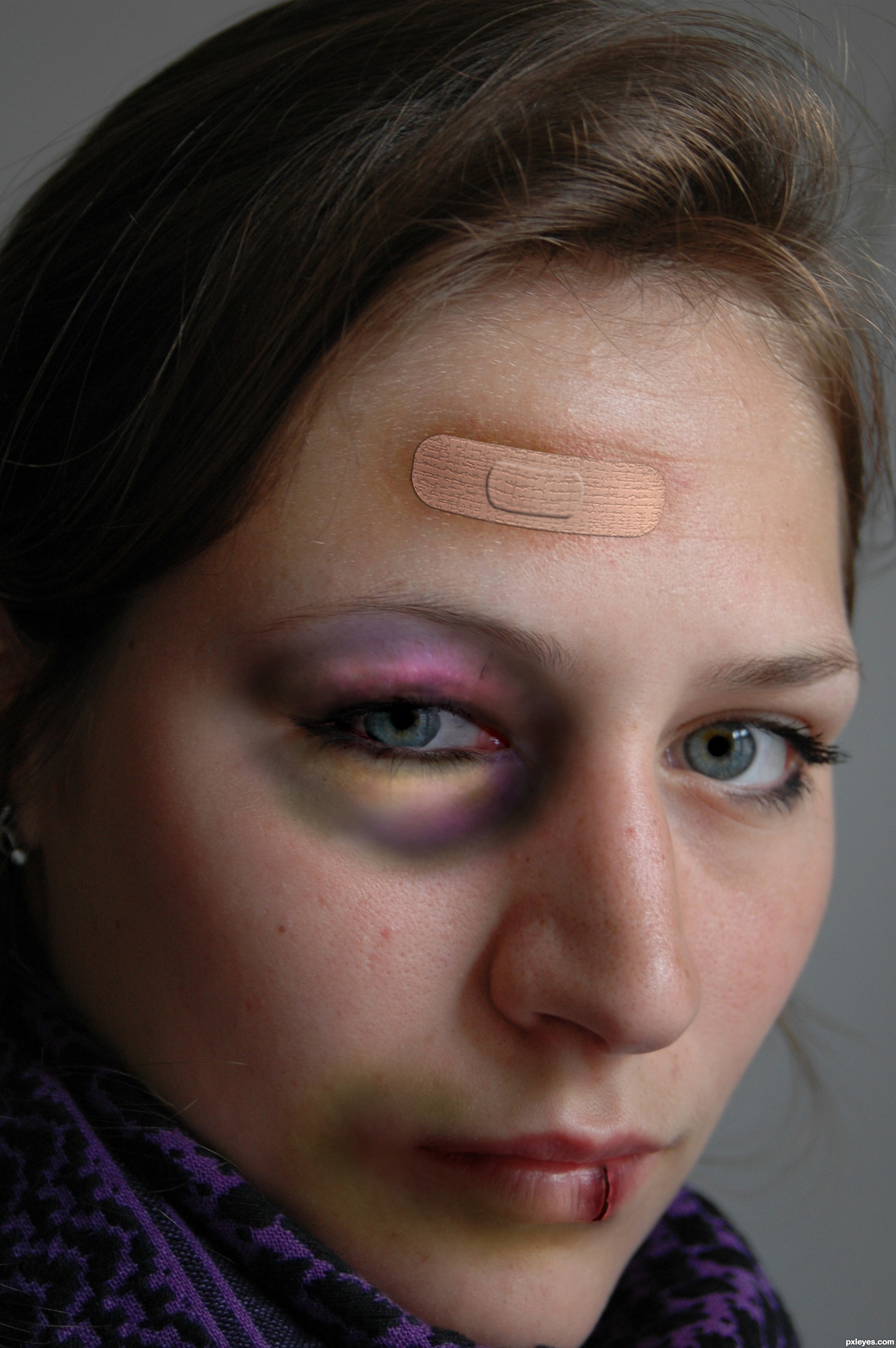
Everything's good but the band-aid...look at a real one for reference. GL.
agrees with both. GL!
i fixed the band aid and tried to make her eye look more swollen, thx everyone for the tips!
Domestic violence? My wish is doing the same thing to the monster who did that to her!!! Oops, sorry, author! 
Very convincent effects, but band-aid is a bit tiny for me. 
lol erikuri, I did that to her, thank you very much! :P
as for the aid band, don't they come in different sizes?
Re: band-aid. I think to my eye it's the pad that's out of proportion vertically, but it's just a nitpick. You've done a great job on the flesh discolorations...I know, because I got hit over my right eye by a falling ladder a while ago, and my shiner turned all of those colors...good luck!
@CMYK: hmmm... falling ladder, huh!...  Just kidding!... You must have seen stars!
>CMYK,......yes spinning blurry colored stars,....LOL,.....great work, master...

Looks much better than the first, when using layer effects for things, remember to change the color of the bevel to a darker color of what the color of the thing you're beveling. When you you use black, it tends to have a weird effect. If you use the actual color but darker, it's more realistic.
thx all for the tips and comments, thx anna (you told me that layer effects thingy before but i forgot). i think the easiest way would be to just replace the aid band i made with a real one. but i don't have the time now. 
P.S. I do believe CMYK's story with the ladder... 
Eye looks perfect,and very realistic,bruise in the corner of the mouth is great too,but the crack on the lips is not that convincing...i will hold my vote author,because i like this work very much and i want to give more points...
i've made some changes to that cut on her lip, i hope it looks better now, thx a lot erathion!
way better author...now is great...all is very very realistic...high marks from me and best of luck
This is very realistic and this chop draws my eye totally in.
Author I give you high marks for this also
Excellent idea and choice of source image for this.
Great idea Good luck!
Very nice job. The cut on the lip looks excellent! The colors on the bruised eye look just a tad too bright (almost cartoonish). Other than that, great job! GL.
Howdie stranger!
If you want to rate this picture or participate in this contest, just:
LOGIN HERE or REGISTER FOR FREE
(5 years and 3684 days ago)
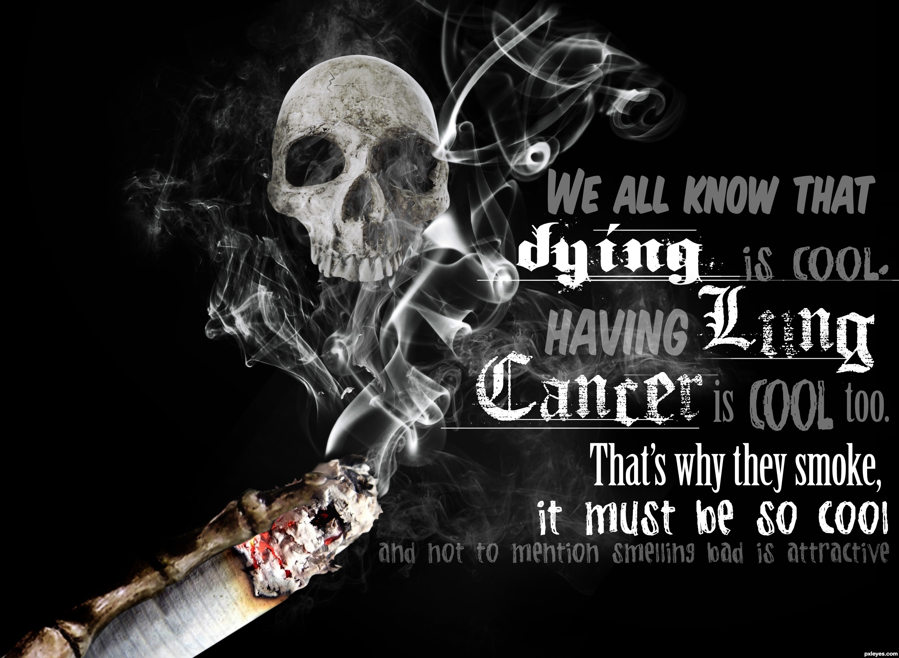
Nice illustration, although a bigger skull (even going beyond the borders of the image) might be more dramatic. The text has too many different fonts which confuses the message. I would put "Lung Cancer" all on the same line. A punchier message might be: "Stinking is cool. Lung cancer is cooler. Dying is coolest."
For your information, Dan, this is actually a recognized STYLE of typography, it's called 'grunge'. Nice job with this, author - a great sarcastic piece! And Dan, you 'would put' - this is not your chop, if it was your chop, you do it that way. Why is it that you are always putting others down for their effort? It's old - find something decent to say for once, or go back to your corner.

I hate anti smoking ads..... 
I like it
nice .............
Best of luck
Howdie stranger!
If you want to rate this picture or participate in this contest, just:
LOGIN HERE or REGISTER FOR FREE
Photography and photoshop contests
We are a community of people with
a passion for photography, graphics and art in general.
Every day new photoshop
and photography contests are posted to compete in. We also have one weekly drawing contest
and one weekly 3D contest!
Participation is 100% free!
Just
register and get
started!
Good luck!
© 2015 Pxleyes.com. All rights reserved.


Howdie stranger!
If you want to rate this picture or participate in this contest, just:
LOGIN HERE or REGISTER FOR FREE