Created with source only. (5 years and 3647 days ago)

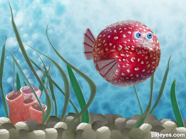
As you can guess from its colors, you'd better not eat this fish.... (5 years and 3648 days ago)
Pretty funny & well done. 
Perfect eyes! 
I like this fish... for watching only!!! 
very nice work 
cool fish
Funny entry. Author is it "Baloon Fish" ? 
Great! And very creative! Nice work! 
very expresive. very well done, author!
Good work author...best of luck
Very sweet. A fav for sure.
fine fish..................... gooddluck author
good work
nice fish lol 
excellent work 
very good and nice entry.good luck.
cool underwater effect
cute
Congrats for your first place, Dustfinger!
congrats, very creative use of source!
Thank you all for the nice comments!  I've been away from the site for a while: Daily work demanded a lot of energy. But is very encouraging when your fist entry get such a positive response!
Congrats for 1st, great character.
Congrats!
Congrats, this is so cool 
congrats......... 
congratulations!! good work....
Congratulations!! 
Congrats!! Well done!
Congratulations!
congrats..totally skipped this entry and have no idea why.. hehehe.. to many shrooms hehehe.. great job
Howdie stranger!
If you want to rate this picture or participate in this contest, just:
LOGIN HERE or REGISTER FOR FREE

Source and My Photograph (5 years and 3652 days ago)
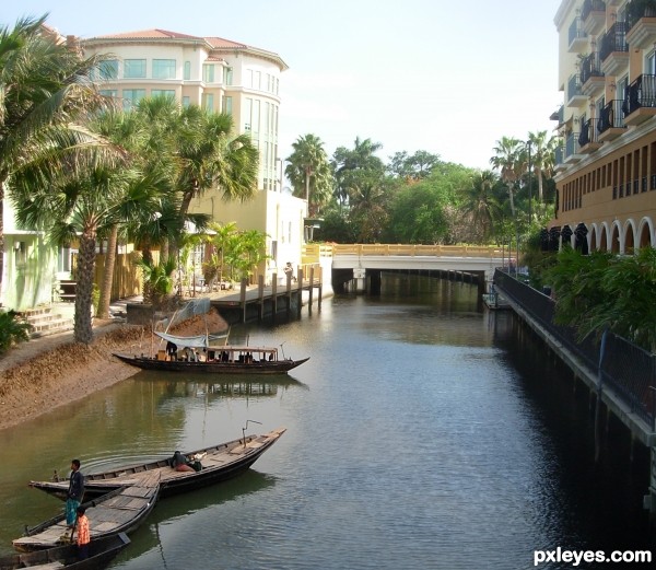
Very cool realistic work author...One minor observation's,guy that is in front of the house at the left side is the way bigger then a guy at the boat who is nearest...Still,high marks from me and best of luck for u author...
Great use of source! 
got it erathion.. just removed him completely.. he really wasn't needed.. THANKS!!! (that's what I get for working to late)
nice chop and good luck 
very well done!
i like it, so nice
It seems like the boats always were there! Perfect blending... 
And nice pic too! 
Yes great blending, nice job!
this looks very realistic
nice blending ,amazing work 
awesome work ! very well done 
awesome blending
excellent work
wow
beautiful! great job author!
awesome--the only thing is that the far boat looks way too small in comparison to the surroundings so you could have taken that out--great job though!
Very nice entry author.good luck.
Congrats for your first place, Ernest! 
congrats, very nice blend! 
congrats 
Congrats for 1st, nice one.
Congrats
Congrats! for your win. Great blending 

Congrats! for your win. Great blending 

Congrats, really nice work 
congrats for your win.........
Congrats!!
Howdie stranger!
If you want to rate this picture or participate in this contest, just:
LOGIN HERE or REGISTER FOR FREE
This icon was mad single without any tutorial :D (5 years and 3655 days ago)
click click click click... NOTHINGS HAPPENING...hehehehe.. couldn't resist..Nice Idea!!!
Hey, Slushy! You did 4 clicks; one more and something can happen... hehehe... boom? 
KABOOM!
quirky.... welldone
uugh, what does this button do? 
Howdie stranger!
If you want to rate this picture or participate in this contest, just:
LOGIN HERE or REGISTER FOR FREE

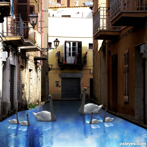
I used vm natural for water reflection link in source box.
Spec Thanks to Reap Revenge a PXLEyes Member for use of his swan picture found in member stock on this site. (5 years and 3661 days ago)
Nice idea, but the water reflection is too clear and rigid. It looks more like a mirror than water.
Hey Thanks. Your right I changed it. How's This!
I think gamemastertips is quite right. The reflection still looks too uniform and mechanical.
No, but I think it may be much better now. However, the frontmost section of the water looks quite odd...like it may have been distored a tad much. I'd also suggest making the water a bit murky, possibly by making a slightly transparent overlay blend of the original water texture. Not sure how this would look, but you could give it a try.
EDIT: I'd go with what blindscientist is saying.
The ripples are cool, but usually water ripples in response to motion of an object in the water - in this case the swans. The ripples shown tend to suggest that the motion might be coming from something else in the water somewhere out of the frame (perhaps a person or boat causing the waves). My only suggestion would be to smooth the ripples out a bit (soften them), and perhaps add small "ring" ripples emanating from each swan that is moving. Just a thought. Good luck!
My only suggestion would be to find a higher resolution source picture. When in full view you can really tell the source image is pixilated.
Howdie stranger!
If you want to rate this picture or participate in this contest, just:
LOGIN HERE or REGISTER FOR FREE
good entry. gl author!
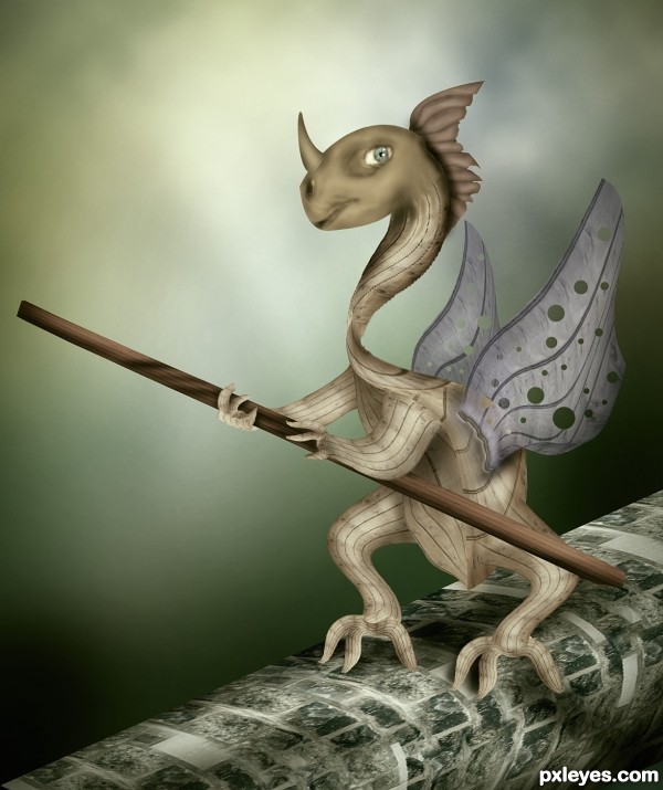
the grasp of the right hand is not looking fine... palm and figures need work.... but its a nice work... and good luck.....
Love the work on the brick walkover thingy.. very cool.. nice result.. good LUCK!!!
Good work author.
nice....and a little 3d here...just a little...!!!!!
Cool...gl author
Lovely!
Thanks to all for your comments. My main concept was to give him a digger look with spade in his hand. But it does not work, then I decide to create well from source brick and distorted it with free transform to looks like well. It also does't work for me. The wall was already distorted so I reduce it size and by accident got this walkway design and finally completed my entry with following concept,

"creature crossing walkway with the help of balancing stick, because his wings are not working".
If you look to my sketch there is no walkway
he have such a nice wings ,so bad they are not working lol
Great work and great SBS! :d
Pretty cool and cute at the same time... gl, author.
amazing
beautiful work ! gl
nice work.................
cute
Like it a lot............G/L Author.
Howdie stranger!
If you want to rate this picture or participate in this contest, just:
LOGIN HERE or REGISTER FOR FREE